1

I have a section where I have floated content on the left and right. The left content is gonna be bigger that the right (on height) so I want the right content to be vertically centered/aligned to the left content. How can I make that ?

Example image:

enter image description here

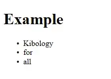
The blue content is gonna be mostly h1 and p and the red one just one small image and 1-2 words below it.

Code:

.inner {
  background: none repeat scroll 0 0 #FFFFFF;
  max-width: 576px;
  width: 100%;
  padding: 37px 34px 37px 34px;
}
.leftSide {
  width: 80%;
  float: left;
  border-right: 1px solid #f2f2f2;
}
.leftSide a h1 {
  font-size: 20px;
  color: #3c3c3c;
  text-transform: none;
  font-family: 'Open Sans light';
}
.leftSide span p {
  font-size: 12px;
  padding-top: 2px;
}
.leftSide .description {
  font-size: 13px;
  padding: 15px 0 25px 0;
  color: #6a6868;
  line-height: 1.4;
  font-family: 'Open Sans';
}
.leftSide .button {
  background-color: #8D1313;
  border-radius: 3px;
  color: #FFFFFF;
  font-family: 'Open Sans light';
  font-size: 13px;
  margin-top: 20px;
  padding: 7px 10px;
}
.rightSide {
  float: right;
  width: 15%;
  height: 100%;
  text-align: center;
}
.rightSide p {
  text-align: center;
  color: #565656;
  font-size: 14px;
  font-family: 'Open Sans';
}
<div class="inner clearfix">

  <div class="leftSide">

    <a href="#">

      <h1>Jsut a simple Headline</h1>

    </a>

    <span> 
       
                                <p> 15 April / 4 Comments / 434Views </p> 
        
       </span>

    <p class="description">Lorem ipsum dolor sit amet, consectetur adipisicing elit, sed do eiusmod tempor incididunt ut labore et dolore magna aliqua. Ut enim ad minim veniam, quis nostrud exercitation ullamco laboris nisi ut aliquip ex ea commodo consequat.</p>

    <a class="button" href="#">learn more...</a>

  </div>

  <div class="rightSide">

    <img src="img/author.png" alt="author" />
    <p>J.Smith</p>

  </div>

</div>
Ruslan López
  • 4,433
  • 2
  • 26
  • 37
user2013488
  • 363
  • 2
  • 6
  • 16
  • JSfiddle: http://jsfiddle.net/GC8F8/ – user2013488 Feb 27 '14 at 23:28
  • Similar solution exist at http://stackoverflow.com/questions/1022795/vertically-align-floating-divs – Meet Mehta Feb 27 '14 at 23:30
  • With CSS 3 you can use [flex boxes](https://developer.mozilla.org/en-US/docs/Web/Guide/CSS/Flexible_boxes) . It has many features, one of them is the ability to vertically align nodes. Here's the [playground](http://demo.agektmr.com/flexbox/) – Ruan Mendes Feb 27 '14 at 23:34
  • Flex-boxes don't support IE10 or older. – Adam Zuckerman Feb 27 '14 at 23:39
  • @AdamZuckerman This is tagged with CSS3, that's why I'm asking the OP if it's OK... [Here's a working link](http://jsfiddle.net/GC8F8/2/) For IE, I'd fall back to using tables... I think it's much better than misusing floats or other techniques that aren't meant for vertical centering... – Ruan Mendes Feb 27 '14 at 23:45

1 Answers1

1

I found a method that works. You will have to tweak it based on your code. JsFiddle here.

HTML:

<div id="myrow">
    <div id="content">Content<br/>alpha</div>
    <div id="rightside">Right Side</div>
</div>

CSS:

body {
    font-family: sans-serif;
    font-size: 20pt;
    box-sizing: border-box;
}
#myrow {
    vertical-align: middle;
    width: 100%;
    border: solid 1px black;
    position: relative;
}
#myrow:after {
    content: "";
    display: table;
    clear: both;
}
#content, #rightside {
    display: inline-block;
    float: left;
    margin: 0 auto;
    height: 3em;
    text-align: center;
    vertical-align: middle;
    color: white;
}
#content {
    width: 55%;
    background-color: #307FFF;
    line-height: 1.5em;
}
#rightside {
    width 45%;
    min-width: 45%;
    background-color: #F56362;
    line-height: 3em;
}

The line-height is what centers the text or image. You may need to adjust your line-heights to accommodate your content.

Adam Zuckerman
  • 1,633
  • 1
  • 14
  • 20