0

Here is the demo (resize to see effects).

(Note: at this moment this demo doesn't work with Firefox 27 and below and Safari 7 and below - use Firefox 28+, Chrome 31+ , Opera 19 or IE11)

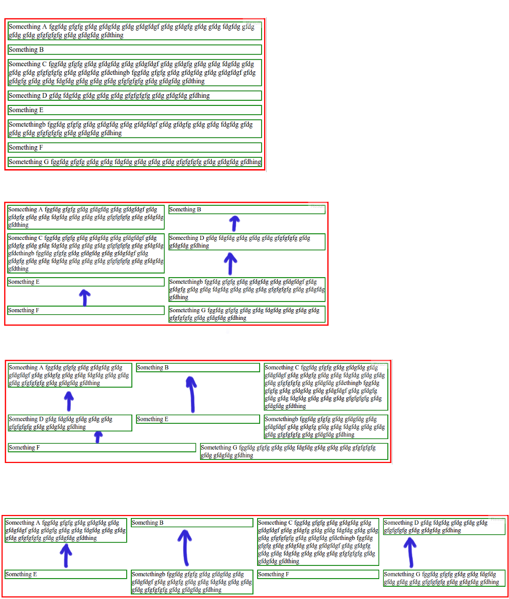
The issue is that when the wrapping div grows and we drop into multi-line mode there is extra space generated between my individual article entries. Is there any way to force the articles to all pack to the top of the given "column"?

This is illustration of my question:

http://sirmium.org/bmp/fleksboks.png
(source: sirmium.org)

Can this be accomplished with flexbox?

Existing code from JSFiddle:

HTML

<div class="section">
    <div class="article">Someething A</div>
    <div class="article">Something B</div>
    <div class="article">Some content C</div>
    <div class="article">Some content D</div>
    <div class="article">Something E</div>
    <div class="article">Some content</div>
    <div class="article">Something F</div>
    <div class="article">Some content G</div>
</div>

CSS

.section {
    border :3px solid red;
    width:100%;

    display: flex;
    flex-wrap: wrap;
    align-items: flex-start;
}
.article {
    width:300px;
    border:2px solid green;
    margin: 5px 5px 5px 5px;

    flex-grow: 1;
}
Glorfindel
  • 21,988
  • 13
  • 81
  • 109
skulptron
  • 21
  • 7
  • 1
    I'm not sure if it is doable with flexbox but you could have a look at CSS columns - https://developer.mozilla.org/en-US/docs/Web/Guide/CSS/Using_multi-column_layouts – Mathias Mar 03 '14 at 17:41
  • 1
    Possible duplicate: http://stackoverflow.com/questions/20977390/set-flexbox-children-to-have-different-heights-to-use-up-available-space – cimmanon Mar 03 '14 at 17:43
  • What Mathias suggested is a very simple and sophisticated way. You should try that. – Lokesh Suthar Mar 03 '14 at 18:00

1 Answers1

0

Thank you Mathias, cimmanon and Lokesh Suthar you give me good direction. Thank you so much. I think that I accomplished (with your help) what I was trying to do...

Here is the DEMO (resize to see effects)

HTML

    <!DOCTYPE html>
<html>
<head>
    <meta content="text/html; charset=UTF-8" http-equiv="content-type">
    <title>TEST</title>
    <link href="00_layout.css" rel="stylesheet" type="text/css">
</head>

  <body>
    <div class="header"> header HEADER </div>
    <div class="nav"> nav TOP MENU </div>
    <div class="konteiner">
    <div class="aside">
    aside <br>
    LEFT MENU LINK 1<br>
    LEFT MENU LINK 2<br>
    LEFT MENU LINK 3<br>
    LEFT MENU LINK 4<br>
    LEFT MENU LINK 5<br>
    </div>
    <div class="main">
    <div class="section">

    <div class="article">
article1 1111 2222 1111 2222 11111  1111 2222  1111 2222  1111 2222  1111 2222  1111 2222  1111 2222  1111 2222  1111 2222  1111 2222  1111 2222  1111 2222  1111 2222  1111 2222  1111 2222  1111 2222  1111 2222  1111 2222  1111 2222 </div>
    <div class="article">
article2&nbsp; 1111 2222  1111 2222  1111 2222  1111 2222  1111 2222  1111 2222  1111 2222  1111 2222  1111 2222  1111 2222  1111 2222  1111 2222  1111 2222  11111 22222  11111 22222  11111 22222  11111 22222  11111 22222  11111 22222  11111 22222  11111 22222  111111 222222  111111 222222  111111 222222  111111 222222  111111 222222  111111 222222  111111 222222  111111 222222  1111111 2222222  1111111 2222222  1111111 2222222  11111111 22222222 11111111 22222222 11111111 22222222</div>
    <div class="article">
article3 1111 2222  aaaaaaaaaaaaaaaaaaaaaaaaaaaaaaaaaaaaaaaaaaaaaaaaaa 1111 2222  1111 2222  1111 2222  1111 2222  1111 2222  1111 2222  1111 2222  11111 22222  11111 22222  11111 22222  11111 22222  11111 22222  11111 22222  11111 22222  11111 22222  111111 222222  111111 222222  111111 222222  111111 222222  111111 222222  111111 222222  111111 222222  111111 222222  1111111 2222222  1111111 2222222  1111111 2222222  11111111 22222222 11111111 22222222 11111111 22222222</div>
    <div class="article">
article4 1111 2222 </div>
    <div class="article">
article5 1111 2222  1111 2222  1111 2222  1111 2222  1111 2222  1111 2222  1111 2222  1111 2222  11111 22222  11111 22222  11111 22222  11111 22222  11111 22222  11111 22222  11111 22222  11111 22222  111111 222222  111111 222222  111111 222222  111111 222222  111111 222222  111111 222222  111111 222222  111111 222222  1111111 2222222  1111111 2222222  1111111 2222222  11111111 22222222 11111111 22222222 11111111 22222222 
    </div>
    <div class="article">
article6 1111 2222  1111 2222  1111 2222  1111 2222  1111 2222  1111 2222  1111 2222  1111 2222  11111 22222  11111 22222  11111 22222  11111 22222  11111 22222  11111 22222  11111 22222  11111 22222  111111 222222  111111 222222  111111 222222  111111 222222  111111 222222  111111 222222  111111 222222  111111 222222  1111111 2222222  1111111 2222222  1111111 2222222  11111111 22222222 11111111 22222222 11111111 22222222</div>

</div>
</div>
</div>
</body></html>

CSS

    body {
    font-family: sans-serif;
    border: none; 
    margin: 0px; 
    padding: 0;
    background: #3F3F7B; 
}

.header {
    width: 100%; 
    height: 70px;
    min-width: 670px; 
    background-color: #1E1E3D; 
}

.nav {
    width: 100%; 
    height: 30px;
    background-color: #2C2C5C; 
}

.aside {
    float: left;
    width: 220px; 
        background-color: #3A3A71; 
}

.konteiner {
    min-width: 670px;
}

.main {
    position: relative;
    top: 0;
    left: 0;
    right: 0;
    bottom: 0;
    width: auto;
    overflow: auto;
        padding-left: 30px;
        padding-right: 30px;
        border-radius: 20px 0 0 20px;
        background-color: #B8C68B;

}

.section {
    width: 100%;  
    min-width: 270px; /* column width + column-gap x 2 */
    -ms-columns: auto 250px; 
    -moz-columns: auto 250px; 
    -webkit-columns: auto 250px; 
    columns: auto 250px; 

    -ms-column-gap: 10px; 
   -moz-column-gap: 10px; 
   -webkit-column-gap: 10px; 
   column-gap: 10px;

        background-color: #CDDAA4; 
}

.article {
    width: auto; 
    overflow: hidden; /* Firefox fix */
    margin: 0px 0px 10px 0px; 
    padding: 10px; 
        background-color: #E3F1B7; 
        border-radius: 8px; 
        word-wrap: break-word; 

    break-inside: avoid-column; 
    -ms-column-break-inside: avoid; 
    page-break-inside: avoid; /* Firefox fix */
    -moz-column-break-inside: avoid; 
    -webkit-column-break-inside: avoid; 
    column-break-inside: avoid; 
    break-inside: avoid; 
}

        .article:first-child {
    margin-top: 0; 
}

I tested on desktop browsers: Firefox 24+, Chrome 32+, Opera 19+, IE10+ (IE 7,8,9 not supports columns - doesn't work in IE6 at all!). I need Safari test to do...

marc_s
  • 732,580
  • 175
  • 1,330
  • 1,459
skulptron
  • 21
  • 7