1

I apologize if this is too 'discussion' oriented, but I'm not looking for 'the best' answer, just at least one way to solve this issue.

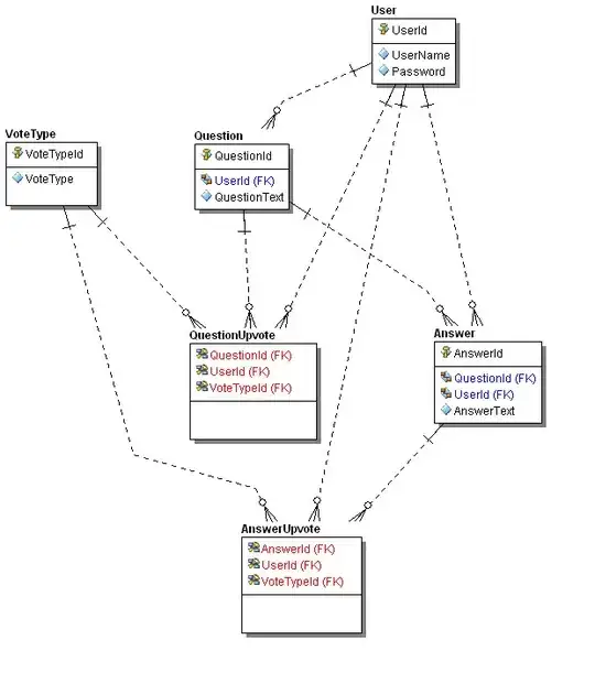
I currently have the following diagram. I'm wondering if there's a good way to visually depict summary statistics, like mean, median, std, skew, and kurtosis on the side. I was thinking a box to the side that would allow for quick comparison between the summary statistics of the two graphs, but I wasn't sure what that would be called. Something like a legend for summary stats would be nice. I'm using matplotlib enter image description here

user3314418
  • 2,903
  • 9
  • 33
  • 55
  • You might be interested in matplotlib.pyplot.figtext http://matplotlib.org/api/pyplot_api.html#matplotlib.pyplot.figtext – Cory Kramer Mar 06 '14 at 16:34
  • Thanks a lot! I got a basic version up. However, I was looking at this because I've been facing this line break issue: http://stackoverflow.com/questions/4018860/text-box-in-matplotlib how would I place his function inside my matplot lib space? Whenever I put the function in there, it creates a separate blank box. – user3314418 Mar 06 '14 at 17:00

0 Answers0