0

Here is my font on localhost:

enter image description here

Here is the same font on Chrome (Windows 7) when the site is live:
enter image description here

I've tried appliying: -webkit-font-smoothing:antialiased to the #header's font from This fix

I've also tried using text-shadow:0 0 0 transparent from this

Is there anything I can do to fix this?

EDIT:

Here is another example of the difference between my local machine:
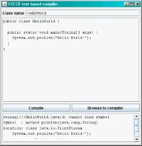
Looks great on Localhost!

and how bad it looks on Chrome (windows) below!
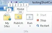
Looks Jagged and poor quality!

Community
  • 1
  • 1
TarDavis
  • 117
  • 1
  • 3
  • 12
  • share url, I think its just bold nothing else; try adding font-weight:normal – Jack Mar 10 '14 at 04:33
  • The URL is www.getcitylights.com @Jack. And thanks for the suggestion! It looks alot better! I just think it's a bit weird that I can't achieve the same look on my development localhost chrome (ubuntu 10.04) and a live version of the site, even if it is font-weight:bold ;) – TarDavis Mar 10 '14 at 04:43
  • @Jack also check out the main header in the top div "100% satisfaction guaranteed". That text shadow looks sooo much worse than on my local dev machine. Chrome (windows) is like making it jagged :( – TarDavis Mar 10 '14 at 04:45
  • and increasing font size to 13px gives it readability and clearness, I can not see your local output, and there is less chance if it looks okay in local it should look okay in live too, nothing changes in-between, and in bigger resolution " 100% Satisfaction Guaranteed! Call Anytime!" runs over the logo :( – Jack Mar 10 '14 at 05:03
  • @Jack check out the new comparison from my edit: The first one is from my localhost where the font looks great on the site. The second is the live version where the font has a crooked look to it. – TarDavis Mar 10 '14 at 05:19
  • let us [continue this discussion in chat](http://chat.stackoverflow.com/rooms/49369/discussion-between-tardavis-and-jack) – TarDavis Mar 10 '14 at 05:27

0 Answers0