Xaml code
<Window x:Class="Multiple_Colum_Cmb.MainWindow"
    xmlns="http://schemas.microsoft.com/winfx/2006/xaml/presentation"
    xmlns:x="http://schemas.microsoft.com/winfx/2006/xaml"
    xmlns:local="clr-namespace:Multiple_Colum_Cmb"
    Title="MainWindow" Height="350" Width="525">
<Window.Resources>

    <local:ComboboxData x:Key="ComboboxData"></local:ComboboxData>

    <!--datatemplate-->
    <DataTemplate x:Key="Datatemplate">
        <Grid  SnapsToDevicePixels="True" Margin="0,0,30,0">
            <Grid.ColumnDefinitions>
                <ColumnDefinition></ColumnDefinition>
                <ColumnDefinition></ColumnDefinition>
                <ColumnDefinition></ColumnDefinition>
                <ColumnDefinition></ColumnDefinition>
            </Grid.ColumnDefinitions>
            <TextBlock Text="{Binding Firstname}" HorizontalAlignment="Center" VerticalAlignment="Center" Grid.Column="0" FontSize="15" TextTrimming="CharacterEllipsis" Foreground="Black" />
            <TextBlock Text="{Binding LastName}" HorizontalAlignment="Center" VerticalAlignment="Center" Grid.Column="1" FontSize="15" TextTrimming="CharacterEllipsis" Foreground="Black" />
            <TextBlock Text="{Binding Age}" Grid.Column="2" VerticalAlignment="Center"  HorizontalAlignment="Center" FontSize="20"  Foreground="Black"/>
            <TextBlock Text="{Binding Country}" Grid.Column="3" VerticalAlignment="Center"  HorizontalAlignment="Center" FontSize="20"  Foreground="Black"/>
        </Grid>
    </DataTemplate>

    <!--header text-->
    <TextBlock x:Key="header1" Text="FirstName"></TextBlock>
    <TextBlock x:Key="header2" Text="LastName"></TextBlock>
    <TextBlock x:Key="header3" Text="Age"></TextBlock>
    <TextBlock x:Key="header4" Text="Country"></TextBlock>

    <!--Toggle Button Template-->
    <ControlTemplate x:Key="ComboBoxToggleButton" TargetType="ToggleButton">
        <Grid x:Name="gd">
            <Grid.ColumnDefinitions>
                <ColumnDefinition />
                <ColumnDefinition Width="30" />
            </Grid.ColumnDefinitions>
            <ContentPresenter Grid.Column="0"></ContentPresenter>
            <Grid Grid.Column="0">
                <Grid.ColumnDefinitions>
                    <ColumnDefinition></ColumnDefinition>
                    <ColumnDefinition></ColumnDefinition>
                    <ColumnDefinition></ColumnDefinition>
                    <ColumnDefinition></ColumnDefinition>
                </Grid.ColumnDefinitions>
                <TextBlock Grid.Column="0" Text="{Binding Source={StaticResource header1},Path=Text}"  HorizontalAlignment="Center" VerticalAlignment="Center" Foreground="Black" FontFamily="Segoe Ui Dark" FontSize="15" ></TextBlock>
                <TextBlock Grid.Column="1" Text="{Binding Source={StaticResource header2},Path=Text}"  HorizontalAlignment="Center" VerticalAlignment="Center" Foreground="Black" FontFamily="Segoe Ui Dark" FontSize="15"></TextBlock>
                <TextBlock Grid.Column="2" Text="{Binding Source={StaticResource header3},Path=Text}"  HorizontalAlignment="Center" VerticalAlignment="Center" Foreground="Black" FontFamily="Segoe Ui Dark" FontSize="15"></TextBlock>
                <TextBlock Grid.Column="3" Text="{Binding Source={StaticResource header4},Path=Text}"  HorizontalAlignment="Center" VerticalAlignment="Center" Foreground="Black" FontFamily="Segoe Ui Dark" FontSize="15"></TextBlock>
            </Grid>
            <Border x:Name="Border" SnapsToDevicePixels="True" Grid.ColumnSpan="2" Background="Transparent" BorderBrush="LightGray" BorderThickness="1"/>
            <Border x:Name="Boredr1" SnapsToDevicePixels="True" Grid.Column="0"  Margin="1" Background="Transparent" BorderBrush="LightGray" BorderThickness="0,0,1,0" />
            <Path x:Name="Arrow" SnapsToDevicePixels="True" Grid.Column="1" Fill="Black" HorizontalAlignment="Center" VerticalAlignment="Center" Data="M 0 0 L 6 6 L 12 0 Z"/>
        </Grid>
        <ControlTemplate.Triggers>
            <Trigger Property="ToggleButton.IsMouseOver" Value="True">
                <Setter TargetName="Border" Property="BorderBrush" Value="Black"/>
                <Setter TargetName="Boredr1" Property="BorderBrush" Value="Black"/>
            </Trigger>
            <Trigger Property="ToggleButton.IsChecked" Value="True">
                <Setter TargetName="Arrow" Property="Data" Value="M 0 0 L 5 5 L 10 0"/>
                <Setter TargetName="Arrow" Property="Fill" Value="White"/>
                <Setter TargetName="Arrow" Property="Stroke" Value="Black"/>
                <Setter TargetName="Arrow" Property="StrokeThickness" Value="1.5"/>
            </Trigger>
            <Trigger Property="IsEnabled" Value="False">
                <Setter TargetName="gd" Property="Visibility" Value="Visible"/>
            </Trigger>
        </ControlTemplate.Triggers>
    </ControlTemplate>

    <!--TextBox Template-->
    <ControlTemplate x:Key="ComboBoxTextBox" TargetType="TextBox">
        <ScrollViewer x:Name="PART_ContentHost" Focusable="False" />
    </ControlTemplate>

    <!--Multiple column combobox-->
    <Style x:Key="Multiple_Column_Cmb" TargetType="ComboBox">
        <Setter Property="SnapsToDevicePixels" Value="true"/>
        <Setter Property="OverridesDefaultStyle" Value="true"/>
        <Setter Property="ScrollViewer.HorizontalScrollBarVisibility" Value="Auto"/>
        <Setter Property="ScrollViewer.VerticalScrollBarVisibility" Value="Disabled"/>
        <Setter Property="Height" Value="40"/>
        <Setter Property="MinWidth" Value="120"/>
        <Setter Property="MinHeight" Value="20"/>
        <Setter Property="Template">
            <Setter.Value>
                <ControlTemplate  TargetType="ComboBox">
                    <Grid>
                        <ToggleButton Name="ToggleButton" Foreground="Black" Template="{StaticResource ComboBoxToggleButton}" Focusable="false" IsChecked="{Binding Path=IsDropDownOpen,Mode=TwoWay,RelativeSource={RelativeSource TemplatedParent}}" ClickMode="Press">
                        </ToggleButton>
                        <ContentPresenter Name="ContentSite" IsHitTestVisible="False" Content="{TemplateBinding SelectionBoxItem}" ContentTemplate="{TemplateBinding SelectionBoxItemTemplate}" ContentTemplateSelector="{TemplateBinding ItemTemplateSelector}" Margin="3,3,23,3"  VerticalAlignment="Center" HorizontalAlignment="Left" />
                        <TextBox OverridesDefaultStyle="True" SelectionBrush="Gray" CaretBrush="Black" Margin="0,0,30,0" TextWrapping="NoWrap"   x:Name="PART_EditableTextBox" FontFamily="Segoe UI Dark"   Foreground="Black" Style="{x:Null}" Template="{StaticResource ComboBoxTextBox}" HorizontalAlignment="Left" Focusable="True"  VerticalAlignment="Center"  FontSize="15"   Visibility="Hidden" IsReadOnly="{TemplateBinding IsReadOnly}"/>
                        <Popup Name="Popup"  Grid.ColumnSpan="2" Placement="Bottom"  IsOpen="{TemplateBinding IsDropDownOpen}" AllowsTransparency="True" Focusable="False" PopupAnimation="Slide">
                            <ContentControl Name="DropDown"   SnapsToDevicePixels="True" MaxWidth="{TemplateBinding ActualWidth}" MinWidth="{TemplateBinding ActualWidth}" MaxHeight="{TemplateBinding MaxDropDownHeight}">
                                <Grid  Background="White" SnapsToDevicePixels="True" MaxWidth="{TemplateBinding ActualWidth}" MinWidth="{TemplateBinding ActualWidth}" MaxHeight="{TemplateBinding MaxDropDownHeight}">
                                    <Border  x:Name="DropDownBorder" SnapsToDevicePixels="True" Background="Transparent" MaxWidth="{TemplateBinding ActualWidth}" BorderThickness="1" BorderBrush="LightGray"/>
                                    <ScrollViewer ScrollViewer.CanContentScroll="False" Grid.Row="1" Margin="0,0,0,0" SnapsToDevicePixels="True">
                                        <StackPanel IsItemsHost="True" Background="Transparent">
                                        </StackPanel>
                                    </ScrollViewer>
                                </Grid>
                            </ContentControl>
                        </Popup>
                    </Grid>
                    <ControlTemplate.Triggers>
                        <Trigger Property="IsEditable" Value="true">
                            <Setter Property="IsTabStop" Value="false"/>
                            <Setter  TargetName="PART_EditableTextBox" Property="Background" Value="White"/>
                            <Setter TargetName="PART_EditableTextBox" Property="Visibility" Value="Visible"/>
                            <Setter TargetName="PART_EditableTextBox" Property="Foreground" Value="Black"/>
                            <Setter TargetName="ContentSite" Property="Visibility" Value="Hidden"/>
                        </Trigger>
                        <Trigger Property="HasItems" Value="false">
                            <Setter TargetName="DropDownBorder" Property="MinHeight" Value="95"/>
                        </Trigger>
                        <Trigger Property="IsEnabled" Value="false">
                            <Setter Property="IsTabStop" Value="false"/>
                            <Setter TargetName="PART_EditableTextBox" Property="Visibility" Value="Visible"/>
                            <Setter TargetName="PART_EditableTextBox" Property="Foreground" Value="Black"/>
                            <Setter  TargetName="PART_EditableTextBox" Property="IsEnabled" Value="False"/>
                            <Setter  TargetName="PART_EditableTextBox" Property="Background" Value="White"/>
                            <Setter TargetName="ContentSite" Property="Visibility" Value="Hidden"/>
                        </Trigger>
                        <Trigger Property="IsGrouping" Value="true">
                            <Setter Property="ScrollViewer.CanContentScroll" Value="false"/>
                        </Trigger>
                        <Trigger SourceName="Popup" Property="Popup.AllowsTransparency" Value="true">
                            <Setter TargetName="DropDownBorder" Property="Margin" Value="0,2,0,0"/>
                        </Trigger>
                    </ControlTemplate.Triggers>
                </ControlTemplate>
            </Setter.Value>
        </Setter>
        <Style.Triggers>
        </Style.Triggers>
    </Style>

    <!--combobox item style-->
    <Style x:Key="Column_CmbItem" TargetType="ComboBoxItem">
        <Setter Property="SnapsToDevicePixels" Value="True"/>
        <Setter Property="OverridesDefaultStyle" Value="True"/>
        <Setter Property="Template">
            <Setter.Value>
                <ControlTemplate TargetType="ComboBoxItem">
                    <Grid x:Name="Border" Grid.ColumnSpan="2" Margin="1,0,1,1" Background="White">
                        <ContentPresenter></ContentPresenter>
                    </Grid>
                    <ControlTemplate.Triggers>
                        <Trigger Property="ComboBoxItem.IsSelected" Value="True">
                            <Setter TargetName="Border" Property="Background" Value="Gray"></Setter>
                        </Trigger>
                        <Trigger Property="ComboBoxItem.IsMouseOver" Value="True">
                            <Setter TargetName="Border" Property="Background" Value="LightBlue"></Setter>
                        </Trigger>
                    </ControlTemplate.Triggers>
                </ControlTemplate>
            </Setter.Value>
        </Setter>
    </Style>

</Window.Resources>

<ComboBox x:Name="Combobox1" IsReadOnly="True"  ItemTemplate="{StaticResource Datatemplate }" Margin="0,0,50,0" HorizontalAlignment="Right"  IsEditable="False"  ItemsSource="{Binding Source={StaticResource ComboboxData}}" Style="{StaticResource Multiple_Column_Cmb}" Height="30" ItemContainerStyle="{StaticResource Column_CmbItem}"  Width="400"/>
</Window>
C# code
InitializeComponent();
List<ComboboxData> cmb = new List<ComboboxData>();
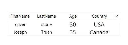
cmb.Add(new ComboboxData("oliver", "stone", "30", "USA"));
cmb.Add(new ComboboxData("Joseph", "Truan", "35", "Canada"));
Combobox1.ItemsSource = cmb;
public class ComboboxData
{
public string Firstname { get; set; }
public string LastName { get; set; }
public string Age { get; set; }
public string Country { get; set; }
public ComboboxData(string Firstname, string LastName, string Age, string Country)
{
this.Firstname = Firstname;
this.LastName = LastName;
this.Age = Age;
this.Country = Country;
}
public ComboboxData() { }
}
Output
Update :
I have designed two tempale for togglebutton
1) When combobox item is not selected ie.selectdeindex=-1 (NoItemselected)
2) Default template(ShowselectedItem)
 <!--header text-->
    <TextBlock x:Key="header1" Text="FirstName"></TextBlock>
    <TextBlock x:Key="header2" Text="LastName"></TextBlock>
    <TextBlock x:Key="header3" Text="Age"></TextBlock>
    <TextBlock x:Key="header4" Text="Country"></TextBlock>

    <!--Toggle Button Template1-->
    <ControlTemplate x:Key="NoItemselected" TargetType="ToggleButton">
        <Grid x:Name="gd">
            <Grid.ColumnDefinitions>
                <ColumnDefinition />
                <ColumnDefinition Width="30" />
            </Grid.ColumnDefinitions>
            <ContentPresenter Grid.Column="0"></ContentPresenter>
            <Grid Grid.Column="0">
                <Grid.ColumnDefinitions>
                    <ColumnDefinition></ColumnDefinition>
                    <ColumnDefinition></ColumnDefinition>
                    <ColumnDefinition></ColumnDefinition>
                    <ColumnDefinition></ColumnDefinition>
                </Grid.ColumnDefinitions>
                <TextBlock Grid.Column="0" Text="{Binding Source={StaticResource header1},Path=Text}"  HorizontalAlignment="Center" VerticalAlignment="Center" Foreground="Black" FontFamily="Segoe Ui Dark" FontSize="15" ></TextBlock>
                <TextBlock Grid.Column="1" Text="{Binding Source={StaticResource header2},Path=Text}"  HorizontalAlignment="Center" VerticalAlignment="Center" Foreground="Black" FontFamily="Segoe Ui Dark" FontSize="15"></TextBlock>
                <TextBlock Grid.Column="2" Text="{Binding Source={StaticResource header3},Path=Text}"  HorizontalAlignment="Center" VerticalAlignment="Center" Foreground="Black" FontFamily="Segoe Ui Dark" FontSize="15"></TextBlock>
                <TextBlock Grid.Column="3" Text="{Binding Source={StaticResource header4},Path=Text}"  HorizontalAlignment="Center" VerticalAlignment="Center" Foreground="Black" FontFamily="Segoe Ui Dark" FontSize="15"></TextBlock>
            </Grid>
            <Border x:Name="Border" SnapsToDevicePixels="True" Grid.ColumnSpan="2" Background="Transparent" BorderBrush="LightGray" BorderThickness="1"/>
            <Border x:Name="Boredr1" SnapsToDevicePixels="True" Grid.Column="0"  Margin="1" Background="Transparent" BorderBrush="LightGray" BorderThickness="0,0,1,0" />
            <Path x:Name="Arrow" SnapsToDevicePixels="True" Grid.Column="1" Fill="Black" HorizontalAlignment="Center" VerticalAlignment="Center" Data="M 0 0 L 6 6 L 12 0 Z"/>
        </Grid>
        <ControlTemplate.Triggers>
            <Trigger Property="ToggleButton.IsMouseOver" Value="True">
                <Setter TargetName="Border" Property="BorderBrush" Value="Black"/>
                <Setter TargetName="Boredr1" Property="BorderBrush" Value="Black"/>
            </Trigger>
            <Trigger Property="ToggleButton.IsChecked" Value="True">
                <Setter TargetName="Arrow" Property="Data" Value="M 0 0 L 5 5 L 10 0"/>
                <Setter TargetName="Arrow" Property="Fill" Value="White"/>
                <Setter TargetName="Arrow" Property="Stroke" Value="Black"/>
                <Setter TargetName="Arrow" Property="StrokeThickness" Value="1.5"/>
            </Trigger>
            <Trigger Property="IsEnabled" Value="False">
                <Setter TargetName="gd" Property="Visibility" Value="Visible"/>
            </Trigger>
        </ControlTemplate.Triggers>
    </ControlTemplate>

    <!--Toggle Button Template2-->
    <ControlTemplate x:Key="ShowselectedItem" TargetType="ToggleButton">
        <Grid x:Name="gd">
            <Grid.ColumnDefinitions>
                <ColumnDefinition />
                <ColumnDefinition Width="30" />
            </Grid.ColumnDefinitions>
            <ContentPresenter Grid.Column="0"></ContentPresenter>
            <Border x:Name="Border" SnapsToDevicePixels="True" Grid.ColumnSpan="2" Background="Transparent" BorderBrush="LightGray" BorderThickness="1"/>
            <Border x:Name="Boredr1" SnapsToDevicePixels="True" Grid.Column="0"  Margin="1" Background="Transparent" BorderBrush="LightGray" BorderThickness="0,0,1,0" />
            <Path x:Name="Arrow" SnapsToDevicePixels="True" Grid.Column="1" Fill="Black" HorizontalAlignment="Center" VerticalAlignment="Center" Data="M 0 0 L 6 6 L 12 0 Z"/>
        </Grid>
        <ControlTemplate.Triggers>
            <Trigger Property="ToggleButton.IsMouseOver" Value="True">
                <Setter TargetName="Border" Property="BorderBrush" Value="Black"/>
                <Setter TargetName="Boredr1" Property="BorderBrush" Value="Black"/>
            </Trigger>
            <Trigger Property="ToggleButton.IsChecked" Value="True">
                <Setter TargetName="Arrow" Property="Data" Value="M 0 0 L 5 5 L 10 0"/>
                <Setter TargetName="Arrow" Property="Fill" Value="White"/>
                <Setter TargetName="Arrow" Property="Stroke" Value="Black"/>
                <Setter TargetName="Arrow" Property="StrokeThickness" Value="1.5"/>
            </Trigger>
            <Trigger Property="IsEnabled" Value="False">
                <Setter TargetName="gd" Property="Visibility" Value="Visible"/>
            </Trigger>
        </ControlTemplate.Triggers>
    </ControlTemplate>

    <!--TextBox Template-->
    <ControlTemplate x:Key="ComboBoxTextBox" TargetType="TextBox">
        <ScrollViewer x:Name="PART_ContentHost" Focusable="False" />
    </ControlTemplate>

    <!--Multiple column combobox-->
    <Style x:Key="Multiple_Column_Cmb" TargetType="ComboBox">
        <Setter Property="SnapsToDevicePixels" Value="true"/>
        <Setter Property="OverridesDefaultStyle" Value="true"/>
        <Setter Property="ScrollViewer.HorizontalScrollBarVisibility" Value="Auto"/>
        <Setter Property="ScrollViewer.VerticalScrollBarVisibility" Value="Disabled"/>
        <Setter Property="Height" Value="40"/>
        <Setter Property="MinWidth" Value="120"/>
        <Setter Property="MinHeight" Value="20"/>
        <Setter Property="Template">
            <Setter.Value>
                <ControlTemplate  TargetType="ComboBox">
                    <Grid>
                        <ToggleButton Name="ToggleButton" Template="{StaticResource ShowselectedItem}" Focusable="false" IsChecked="{Binding Path=IsDropDownOpen,Mode=TwoWay,RelativeSource={RelativeSource TemplatedParent}}" ClickMode="Press"/>
                        <ContentPresenter  Name="ContentSite"  IsHitTestVisible="False" Content="{TemplateBinding SelectionBoxItem}" ContentTemplate="{TemplateBinding SelectionBoxItemTemplate}" ContentTemplateSelector="{TemplateBinding ItemTemplateSelector}" Margin="3,3,23,3"  VerticalAlignment="Center" HorizontalAlignment="Left" />
                        <TextBox OverridesDefaultStyle="True" SelectionBrush="Gray" CaretBrush="Black" Margin="0,0,30,0" TextWrapping="NoWrap"   x:Name="PART_EditableTextBox" FontFamily="Segoe UI Dark"   Foreground="Black" Style="{x:Null}" Template="{StaticResource ComboBoxTextBox}" HorizontalAlignment="Left" Focusable="True"  VerticalAlignment="Center"  FontSize="15"   Visibility="Hidden" IsReadOnly="{TemplateBinding IsReadOnly}"/>
                        <Popup Name="Popup"  Grid.ColumnSpan="2" Placement="Bottom"  IsOpen="{TemplateBinding IsDropDownOpen}" AllowsTransparency="True" Focusable="False" PopupAnimation="Slide">
                            <ContentControl Name="DropDown"   SnapsToDevicePixels="True" MaxWidth="{TemplateBinding ActualWidth}" MinWidth="{TemplateBinding ActualWidth}" MaxHeight="{TemplateBinding MaxDropDownHeight}">
                                <Grid  Background="White" SnapsToDevicePixels="True" MaxWidth="{TemplateBinding ActualWidth}" MinWidth="{TemplateBinding ActualWidth}" MaxHeight="{TemplateBinding MaxDropDownHeight}">
                                    <Border  x:Name="DropDownBorder" SnapsToDevicePixels="True" Background="Transparent" MaxWidth="{TemplateBinding ActualWidth}" BorderThickness="1" BorderBrush="LightGray"/>
                                    <ScrollViewer ScrollViewer.CanContentScroll="False" Grid.Row="1" Margin="0,0,0,0" SnapsToDevicePixels="True">
                                        <StackPanel IsItemsHost="True" Background="Transparent">
                                        </StackPanel>
                                    </ScrollViewer>
                                </Grid>
                            </ContentControl>
                        </Popup>
                    </Grid>
                    <ControlTemplate.Triggers>
                        <Trigger Property="IsEditable" Value="true">
                            <Setter Property="IsTabStop" Value="false"/>
                            <Setter  TargetName="PART_EditableTextBox" Property="Background" Value="White"/>
                            <Setter TargetName="PART_EditableTextBox" Property="Visibility" Value="Visible"/>
                            <Setter TargetName="PART_EditableTextBox" Property="Foreground" Value="Black"/>
                            <Setter TargetName="ContentSite" Property="Visibility" Value="Hidden"/>
                        </Trigger>
                        <Trigger Property="HasItems" Value="false">
                            <Setter TargetName="DropDownBorder" Property="MinHeight" Value="95"/>
                        </Trigger>
                        <Trigger Property="IsEnabled" Value="false">
                            <Setter Property="IsTabStop" Value="false"/>
                            <Setter TargetName="PART_EditableTextBox" Property="Visibility" Value="Visible"/>
                            <Setter TargetName="PART_EditableTextBox" Property="Foreground" Value="Black"/>
                            <Setter  TargetName="PART_EditableTextBox" Property="IsEnabled" Value="False"/>
                            <Setter  TargetName="PART_EditableTextBox" Property="Background" Value="White"/>
                            <Setter TargetName="ContentSite" Property="Visibility" Value="Hidden"/>
                        </Trigger>
                        <Trigger Property="IsGrouping" Value="true">
                            <Setter Property="ScrollViewer.CanContentScroll" Value="false"/>
                        </Trigger>
                        <Trigger Property="SelectedIndex" Value="-1">
                            <Setter Property="Template" TargetName="ToggleButton" Value="{StaticResource NoItemselected}"></Setter>
                        </Trigger>
                        <Trigger SourceName="Popup" Property="Popup.AllowsTransparency" Value="true">
                            <Setter TargetName="DropDownBorder" Property="Margin" Value="0,2,0,0"/>
                        </Trigger>
                    </ControlTemplate.Triggers>
                </ControlTemplate>
            </Setter.Value>
        </Setter>
    </Style>