I would like to create a paradoxical effect via the z-index CSS property.
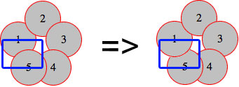
In my code I have five circles, like in the image below, and they are all absolutely positioned with no defined z-index. Therefore, by default, every circle overlaps the previous one.
Right now, circle 5 overlaps circle 1 (left image). The paradox I'd like to achieve is to have, at the same time, circle 1 under the circle 2 and on top of circle 5 (as in the right image).
(source: schramek.cz)
Here's my code
Markup:
<div class="item i1">1</div>
<div class="item i2">2</div>
<div class="item i3">3</div>
<div class="item i4">4</div>
<div class="item i5">5</div>
CSS
.item {
    width: 50px;
    height: 50px;
    line-height: 50px;
    border: 1px solid red;
    background: silver;
    border-radius: 50%;
    text-align: center;
}

.i1 { position: absolute; top: 30px; left: 0px; }
.i2 { position: absolute; top: 0px; left: 35px; }
.i3 { position: absolute; top: 30px; left: 65px; }
.i4 { position: absolute; top: 70px; left: 50px; }
.i5 { position: absolute; top: 70px; left: 15px; }
A live example is also available at http://jsfiddle.net/Kx2k5/.
I tried a lot of techniques with stacking orders, stacking context and so on. I read some articles about these techniques, but no success. How can I solve this?

