22

I using custom switch for support of API 8. I am using THIS Libarary for Custom Switch. But I want to make something Like show in figure.I have tried to change the color ,though changing the color in the style but doesn't effect as i want.

enter image description here

Please help me , Thanks in advance.

Mayur Raval
  • 3,250
  • 6
  • 34
  • 57
  • Does this answer your question? [How to custom switch button?](https://stackoverflow.com/questions/23358822/how-to-custom-switch-button) – C.F.G Dec 26 '22 at 19:26

5 Answers5

11

Here's a full, working solution, after a fun day implementing this.

Custom switch example

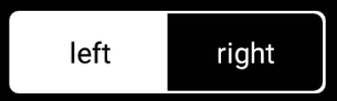
Use the following to set the drawable for the track of the switch. The track is the container within which the thumb slides left and right.

mMessengerSwitch.setTrackDrawable(new SwitchTrackTextDrawable(this,
        "LEFT", "RIGHT"));

Here's the implementation of the SwitchTrackTextDrawable, which writes the text in the background exactly in the right position (well, I've only tested it for API 23 on a Nexus 5):

/**
 * Drawable that generates the two pieces of text in the track of the switch, one of each
 * side of the positions of the thumb.
 */
public class SwitchTrackTextDrawable extends Drawable {

    private final Context mContext;

    private final String mLeftText;

    private final String mRightText;

    private final Paint mTextPaint;

    public SwitchTrackTextDrawable(@NonNull Context context,
            @StringRes int leftTextId,
            @StringRes int rightTextId) {
        mContext = context;

        // Left text
        mLeftText = context.getString(leftTextId);
        mTextPaint = createTextPaint();

        // Right text
        mRightText = context.getString(rightTextId);
    }

    private Paint createTextPaint() {
        Paint textPaint = new Paint();
        //noinspection deprecation
        textPaint.setColor(mContext.getResources().getColor(android.R.color.white));
        textPaint.setAntiAlias(true);
        textPaint.setStyle(Paint.Style.FILL);
        textPaint.setTextAlign(Paint.Align.CENTER);
        // Set textSize, typeface, etc, as you wish
        return textPaint;
    }

    @Override
    public void draw(Canvas canvas) {
        final Rect textBounds = new Rect();
        mTextPaint.getTextBounds(mRightText, 0, mRightText.length(), textBounds);

        // The baseline for the text: centered, including the height of the text itself
        final int heightBaseline = canvas.getClipBounds().height() / 2 + textBounds.height() / 2;

        // This is one quarter of the full width, to measure the centers of the texts
        final int widthQuarter = canvas.getClipBounds().width() / 4;
        canvas.drawText(mLeftText, 0, mLeftText.length(),
                widthQuarter, heightBaseline,
                mTextPaint);
        canvas.drawText(mRightText, 0, mRightText.length(),
                widthQuarter * 3, heightBaseline,
                mTextPaint);
    }

    @Override
    public void setAlpha(int alpha) {
    }

    @Override
    public void setColorFilter(ColorFilter cf) {
    }

    @Override
    public int getOpacity() {
        return PixelFormat.TRANSLUCENT;
    }
}
espinchi
  • 9,144
  • 6
  • 58
  • 65
3

Try using

android:textOn="On"
android:textOff="Off"

instead of

android:text="On"

in switches.

You can also go through this if it helps.

MysticMagicϡ
  • 28,593
  • 16
  • 73
  • 124
3

After struggling to find the right solution for this, I found this neat little library. I found it easy to use and it met my needs perfectly. It can even be used to display more than 2 values.

UPDATE: In the meanwhile this library has stopped being maintained, so you may want to try the one they recommend.

This is how I made it look eventually with some more styling, like white border which I put around a FrameLayout that wraps it (I needed to make it look exactly like this, you need not use border):

enter image description here

Here's the xml for this:

<FrameLayout
            android:layout_width="wrap_content"
            android:layout_height="wrap_content"
            android:padding="1dp"
            android:background="@drawable/white_border">

            <belka.us.androidtoggleswitch.widgets.ToggleSwitch
                android:layout_width="wrap_content"
                android:layout_height="wrap_content"
                custom:activeBgColor="@color/white"
                custom:activeTextColor="@color/black"
                custom:inactiveBgColor="@color/black"
                custom:inactiveTextColor="@color/white"
                custom:textToggleLeft="left"
                custom:textToggleRight="right"/>
        </FrameLayout>

And @drawable/white_border looks like this:

<shape xmlns:android="http://schemas.android.com/apk/res/android" android:shape="rectangle" >
<solid android:color="@android:color/transparent" />
<stroke android:width="2dip"
    android:color="@color/white" />
<corners
    android:radius="3dp"/>

Vucko
  • 7,371
  • 2
  • 27
  • 45
  • thanks for suggestion of good library but it's deprecated now a days if you want this kind of switch then use : https://github.com/llollox/Android-Toggle-Switch, which is quite similar and working well. – Hardik Kubavat Aug 07 '18 at 11:16
  • 1
    Yeah I notice that. I've used this one with no problems though, but it may be a smart idea to go to the maintained one. I'll edit my answer. – Vucko Aug 07 '18 at 23:41
2

I created a custom layout that contain a linear layout (will be used as a track of the switch) in this layout I placed two texts to simulate the track "on"/"off" texts, and on top of it, it has a regular switch but without a track, just a thumb with transparent track.

Anyway this is the code:

colors.xml

<color name="switch_selected_text_color">#FFFFFF</color>
<color name="switch_regular_text_color">#A8A8A8</color>

settings_switch_color_selector

<?xml version="1.0" encoding="utf-8"?>
<selector xmlns:android="http://schemas.android.com/apk/res/android">
    <item android:color="@color/switch_selected_text_color" android:state_checked="true" />
    <item android:color="@color/switch_regular_text_color" />
</selector>

styles.xml

<style name="SwitchTextAppearance" parent="@android:style/TextAppearance.Holo.Small">
    <item name="android:textColor">@color/settings_switch_color_selector</item>
</style>

new_switch.xml - used in the custom view

<?xml version="1.0" encoding="utf-8"?>
<RelativeLayout xmlns:android="http://schemas.android.com/apk/res/android"
    android:layout_width="wrap_content"
    android:layout_height="wrap_content">

    <LinearLayout
        android:id="@+id/track_layout"
        android:layout_width="wrap_content"
        android:layout_height="wrap_content"
        android:background="@drawable/settings_track"
        android:weightSum="1">

        <TextView
            android:id="@+id/left_text"
            android:layout_width="0dp"
            android:layout_height="match_parent"
            android:textColor="@color/switch_regular_text_color"
            android:layout_weight="0.5"
            android:gravity="center"
            android:text="OFF" />

        <TextView
            android:id="@+id/right_text"
            android:layout_width="0dp"
            android:layout_height="match_parent"
            android:textColor="@color/switch_regular_text_color"
            android:layout_weight="0.5"
            android:gravity="center"
            android:text="ON" />
    </LinearLayout>

    <Switch
        android:layout_width="wrap_content"
        android:layout_height="wrap_content"
        android:thumb="@drawable/thumb_selector"
        android:switchTextAppearance="@style/SwitchTextAppearance"
        android:textOn="ON"
        android:textOff="OFF"
        android:checked="true"
        android:showText="true"
        android:track="@android:color/transparent"/>
</RelativeLayout>

this is custom view - it`s just for inflating the custom view layout

public class DoubleSidedSwitch extends RelativeLayout {

    private TextView _leftTextView;
    private TextView _rightTextView;
    private Switch   _switch;

    public DoubleSidedSwitch(Context context) {
        super(context);
        init(context);
    }

    public DoubleSidedSwitch(Context context, AttributeSet attrs) {
        super(context, attrs);
        init(context);
    }

    private void init(Context context) {
        View view = LayoutInflater.from(context).inflate(R.layout.new_switch, this, true);
        initViews(view);
        initListeners();
    }

    private void initListeners() {

    }

    private void initViews(View view) {

    }
}
beresfordt
  • 5,088
  • 10
  • 35
  • 43
Anton Makov
  • 825
  • 2
  • 9
  • 25
0

There is one made by 2 Standard buttons and a LinearLayout. There are bunch of xml files to import but it works perfect on all versions and very easy to use. Check the following Github Page

Custom Switch With 2 Buttons

usage

  1. Copy XML files under res/drawable to your project's res/drawable folder.
  2. Copy LinearLayout from layout.xml to your layout file.
  3. Copy values from values/colors.xml and values/dimens to your own files.
  4. Initilize the switch with following code

SekizbitSwitch mySwitch = new SekizbitSwitch(findViewById(R.id.sekizbit_switch));
            mySwitch.setOnChangeListener(new SekizbitSwitch.OnSelectedChangeListener() {
                @Override
                public void OnSelectedChange(SekizbitSwitch sender) {
                    if(sender.getCheckedIndex() ==0 )
                    {
         System.out.println("Left Button Selected");
                    }
                    else if(sender.getCheckedIndex() ==1 )
                    {
                        System.out.println("Right Button Selected");
                    }
                }
            });
Amir Dora.
  • 2,831
  • 4
  • 40
  • 61
Eren Demir
  • 119
  • 1
  • 4