-1

I am trying to understand how facebook makes image without losing it's ratio but still use standard image size.

Have any idea?

This is basicly what i want to do:

Edit:

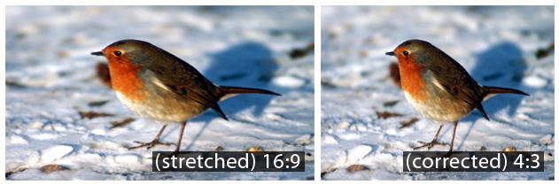
Lets say we have 16:9 image and i want it to fit a square lets say 200x200px, the image will stretch, i dont want that.. i want that the image is resized to fit the 200x200px but "slice" it and show a part of the image.

Example Stretched: http://img.movavi.com/how-to/ar3/01.jpg

Example corrected: http://img.movavi.com/how-to/ar3/02.jpg

Thanks

TiagoF
  • 25
  • 9
  • Hi mate, you may want to add a explanation in words of what exactly you want to do. The image is a little vague and leaves room for misinterpretation. I think...what you may want to do something like a wrapping div with the overflow:hidden and then set the image width/height to max-width:100%; max-height:100%; respectively. Otherwise for a sure fire way, you could use something like php's getimagesize() to work out whether its portrait or landscape then calculate the exact scaled dimensions accordingly (with overflow:hidden to crop excess). – frankstuner Mar 26 '14 at 10:18
  • When you go to a album on Facebook the images are 206x206 but hey still keep the ratio, what i want is for example an widescreen image when resized to a 206x206 dont get stretch and keep the aspect ratio – TiagoF Mar 26 '14 at 10:35
  • what are you asking? I suggest you attempt to code it, and then come back with your code then people will be able to help you. – frankstuner Mar 26 '14 at 10:36
  • sorry but i cant open image here coz ur exmple image is (o).. – Anant Dabhi Mar 26 '14 at 11:29
  • I've edited the post and made a more detailed explanation of what i want to do.. – TiagoF Mar 26 '14 at 11:47
  • Are you talking about images that you post to Facebook and that get resized by them? – CBroe Mar 26 '14 at 11:59

1 Answers1

0

I think what you're after is an image inside a wrapper div using 'overflow:hidden'.

Check out this example of it in use with your image provided earlier: http://jsfiddle.net/92R4H/9/

.clipped-sml { width:200px; height:100px; overflow:hidden; }
.clipped-sml img { width:auto; height:100%; float:right; }

/* Pls note: the float:right is only there to show the corrected image is scaling correctly :) */

Essentially you can scale down an image to conform with the parent div. The overflow:hidden specification will cause some clipping if your images are changing ratios, ie 16:9 to 4:3 without stretching.

frankstuner
  • 4,380
  • 2
  • 16
  • 15
  • It works, but i want also that images that are vertical don't get affected by that.. :/ i'm not sure how to do that proply :/ – TiagoF Mar 26 '14 at 17:34
  • The best would be resizing the picture (that i can do it by php) and then somehow senter the image into the div with the overflow hidden – TiagoF Mar 26 '14 at 17:35
  • The way I've accomplished this in the past is by using getimagesize() in php to find out which is bigger (width or height) then use an if statement for each. I then use the results from that calculation to work out how much will be cut off by the overflow:hidden, I halve that amount and apply it to a negative margin (so if its a portrait image, I would scale to the width and then use margin-top:-[however much it calculates to bring it to the centre]. I'm not exactly sure if this is best practise, but this is the way i've worked it in the past. – frankstuner Mar 27 '14 at 04:49
  • http://stackoverflow.com/questions/6594089/calculating-image-size-ratio-for-resizing?rq=1 – frankstuner Mar 27 '14 at 12:05