18

I have implemented bootstrap dialog in my project. I have some delete functionality in that dialog, and the delete confirmation message opens another bootstrap dialog. But when the second confirmation dialog is open, the first dialog is not disabled and all the events work.

Is there any solution to disable the original dialog when another dialog opens?

Here's my code:

function OpenDialogForSelectionAdmItem(title, content, callback) {
    var dlg = new BootstrapDialog({
        title: title,
        content: content,
        buttons: [{
            label: 'Save',
            cssClass: 'btn-primary',
            id: 'btnSave',
            onclick: function (dialog) {

            }
        },
        {
            label: 'Close',
            cssClass: 'btn',
            id: 'btnClose',
            onclick: function (dialog) {
                if (callback != "") {
                    callback(true);
                }
                dialog.close();
            }
        }]
    });

    dlg.open();`
}

Screenshot:

Screenshot

When the dialog for delete confirmation is open, I want to disable the first dialog.

KyleMit
  • 30,350
  • 66
  • 462
  • 664
Abhijit Pandya
  • 705
  • 2
  • 12
  • 33
  • 1
    "Overlapping modals not supported. Be sure not to open a modal while another is still visible. Showing more than one modal at a time requires custom code." http://getbootstrap.com/javascript/#modals – isherwood Mar 28 '14 at 14:27
  • 1
    You could try putting a page mask behind the second dialog, and removing it when the second dialog is closed. – isherwood Mar 28 '14 at 14:29
  • @isherwood, a page mask is definitely the right direction. When the new modal is created, it comes with it's own `modal-backdrop`. When the second modal is shown, you can have it appear above the original by incrementing its `z-index` relative to the first modal. Check out my answer for full details. – KyleMit Apr 25 '14 at 23:59
  • @Abhijit, I'm guessing you're using [bootstrap3-dialog](http://nakupanda.github.io/bootstrap3-dialog/). In the future, if you're using a relatively uncommon third party library it would be really helpful to link to it directly instead of having people guess. On that same note, a working fiddle would have really saved some time here, instead of having to duplicate your efforts. Providing a [mcve] so someone can run their own version of your code and reproduce it makes troubleshooting easier by about a factor of ten. – KyleMit Feb 21 '19 at 03:44

4 Answers4

59

The Problem:

In order to understand the intricacies of modal dialogs in web development, you'll need to understand a bit more about the z-index property and stacking contexts.

In short, the dialog works by adding two principal components to the DOM: a background that takes up the entire screen, and a div comprising your dialog. Each of those stand out from the rest of the page because they are put at the the root level of the DOM and given a high value for their z-index property. How high? Well, try adding a blank modal to a blank page and you'll see the following DOM elements:

<div class="modal-backdrop fade in"></div>  <!-- z-index: 1030; -->
<div class="modal bootstrap-dialog">        <!-- z-index: 1040; -->
    <div class="modal-dialog">              <!-- z-index: 1050; -->

The modal-backdrop gives the illusion of a true modal process because it renders above all the other content which prevents clicks from firing anywhere below. The only reason the modal-dialog is allowed to receive clicks is because it is stacked on top of the background, by providing a higher z-index.

That's it! That's the whole bag of tricks. So when bootstrap cautions against use multiple dialogs, they're doing so because stacking becomes tricky. If you add another element, it gets rendered with the same exact z-index, meaning that it will be above the regular page content, but on the same plane as the original dialog. If it doesn't completely cover the original, then the original will still be clickable because there is no backdrop above it.

The Solution:

In order to resolve this, you need to come up with your own way of disabling clicks on background modals. This issue appears to have been (partially) resolved. See the following example:

Demo in jsFiddle

Bootstrap Dialog made it so that clicking off of a dialog simply closes the last dialog in the DOM and marks the event as handled so it won't fire anything else. If the second modal is up and you click off of it, the only thing that will happen is the second modal will close.


More Advanced Handling:

If you want the second modal to look like it's over the first one, you'll have to do that manually.

When the new modal is created, it comes with it's own modal-backdrop. When the second modal is shown, you can have it appear above the original by incrementing its z-index relative to the first modal. In the onshown event, we just have to grab the current modal and it's overlay and modify the z-index using the .CSS method. We want this to appear above any existing modals, so first we'll count the number of modals in the DOM ($('.bootstrap-dialog').length) and then increment the z-index so it's higher than the next highest dialog.

Call like this:

function OpenDialogForSelectionAdmItem(title, content, callback) {
    var dlg = new BootstrapDialog({
        title: title,
        message: content,
        onshown: function(dialog) {
            var tier = $('.bootstrap-dialog').length - 1;
            dialog.$modal.prev(".modal-backdrop")
                .css("z-index", 1030 + tier * 30);
            dialog.$modal
                .css("z-index", 1040 + tier * 30);
        } 
        // More Settings
    }).open();
}

Working Demo in jsFiddle

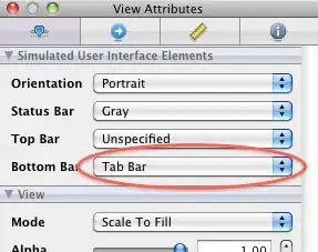
Screenshot:

screenshot


As a proof of concept, here's a Demo that allows you to continually add dialogs on top of other dialogs

Infinite Dialogs Fiddle


UX Caution:

While this is technically possible to achieve, modals within modals can create a confusing UX, so the right answer if you have the problem might be to try to avoid it altogether by taking the original workflow and promoting it to a full page design with a url and state.
Community
  • 1
  • 1
KyleMit
  • 30,350
  • 66
  • 462
  • 664
  • Yes, colossal effort. coughzebkitcough – Alan B Feb 04 '15 at 12:31
  • 2
    @AlanB, are you promoting an huge third party library that has nothing to do with the question because it would save 7 lines of code? Doesn't really make sense. It *would* be a colossal amount of effort to convert your entire app to a canvas based library. There was a lot of effort in explaining this question and answer, but it's rather trivial to implement once you know the answer. – KyleMit Feb 04 '15 at 13:20
  • I'm not promoting anything. I was pointing out that trying to do this in a toolkit that was not designed to do it is effort. Zebkit is 85KB minified so hardly colossal. – Alan B Feb 04 '15 at 16:21
  • @AlanB, how is Bootstrap modal not designed to display modals? I think you are severely overestimating the difficulty of adding a dozen lines of code. But since it's so easy to do in Zebkit, feel free to attach a working demo in jsFiddle as a comment and I'll check it out! – KyleMit Feb 04 '15 at 17:00
  • I had to use a z-index of 50000 instead of 1040. The fiddle also didn't work for me. In addition, I set the visibility of the dialog to hidden onshow and visible onshown to prevent the dialog from animating in from the top under my current dialog, then popping to the front. YMMV. – John Naegle May 25 '16 at 18:36
  • https://github.com/nakupanda/bootstrap3-dialog this is the repository you need to make it work... The best one I have ever found! This author should get some major donations! – Sol Dec 30 '17 at 20:02
1

First add class to primary modal so:<div class="modal-content kk"> I simply use:

$('#myModal1').on('shown.bs.modal', function () {
  $('.kk').addClass('magla');
  $('#myModal').modal('hide');
 });
$('#myModal1').on('hidden.bs.modal', function () {
  $('.kk').removeClass('magla');
  $('#myModal').modal('show');


});

where .magla css is:

.magla {
     -webkit-filter: blur(5px);
  -moz-filter: blur(5px);
  -o-filter: blur(5px);
  -ms-filter: blur(5px);
  filter: blur(5px);

}

Try looks good for me.

milemilic mile
  • 87
  • 1
  • 11
0

Just hide the actual modal using the onclick method

<button data-toggle="modal" data-target="#modal-to-show-id" onclick="$('#actual-modal-id').modal('hide');">
    Text Button
</button>
Ivanus
  • 1
0

My humble solution: Generate a new ID for each new modal. Then just manage everything through one variable. It's working for my purposes, btw.

var _MODAL_LAST;
$( document ).on( 'show.bs.modal' , '.modal' , function(){
    _MODAL_LAST = $(this);
});
$( document ).on( 'hide.bs.modal' , '.modal' , function(){
    if( _MODAL_LAST.attr('id') !== $(this).attr('id') ){
        return false;
    }else{
        _MODAL_LAST = $(this).prevAll('.modal:first');
    }
});