22

My application is made using QML+JS and I am looking to create a circular progress bar widget. I can create the circle using a QML Rectangle and settings its radius equal to its width/2 to make it into a circle. How do I create a progress bar out of it?

I am planning to implement the following mockup.

enter image description here

eyllanesc
  • 235,170
  • 19
  • 170
  • 241
Nik
  • 759
  • 3
  • 10
  • 24
  • Canvas maybe? I fiddled with that a bit when working on some UI stuff for the Ubuntu Stock Ticker app, and I think that it might work for what you want. – iBelieve Apr 04 '14 at 21:51
  • @iBelieve Yeah I am realising that. Hoping someone has some code with a circular progress bar ready since I have used Canvas before, so it makes it much harder for me to implement. – Nik Apr 04 '14 at 22:44

7 Answers7

23

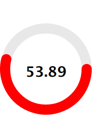
I've implemented a basic circular progress using a Canvas.

enter image description here

import QtQml 2.2
import QtQuick 2.0

// draws two arcs (portion of a circle)
// fills the circle with a lighter secondary color
// when pressed
Canvas {
    id: canvas
    width: 240
    height: 240
    antialiasing: true

    property color primaryColor: "orange"
    property color secondaryColor: "lightblue"

    property real centerWidth: width / 2
    property real centerHeight: height / 2
    property real radius: Math.min(canvas.width, canvas.height) / 2

    property real minimumValue: 0
    property real maximumValue: 100
    property real currentValue: 33

    // this is the angle that splits the circle in two arcs
    // first arc is drawn from 0 radians to angle radians
    // second arc is angle radians to 2*PI radians
    property real angle: (currentValue - minimumValue) / (maximumValue - minimumValue) * 2 * Math.PI

    // we want both circle to start / end at 12 o'clock
    // without this offset we would start / end at 9 o'clock
    property real angleOffset: -Math.PI / 2

    property string text: "Text"

    signal clicked()

    onPrimaryColorChanged: requestPaint()
    onSecondaryColorChanged: requestPaint()
    onMinimumValueChanged: requestPaint()
    onMaximumValueChanged: requestPaint()
    onCurrentValueChanged: requestPaint()

    onPaint: {
        var ctx = getContext("2d");
        ctx.save();

        ctx.clearRect(0, 0, canvas.width, canvas.height);

        // fills the mouse area when pressed
        // the fill color is a lighter version of the
        // secondary color

        if (mouseArea.pressed) {
            ctx.beginPath();
            ctx.lineWidth = 1;
            ctx.fillStyle = Qt.lighter(canvas.secondaryColor, 1.25);
            ctx.arc(canvas.centerWidth,
                    canvas.centerHeight,
                    canvas.radius,
                    0,
                    2*Math.PI);
            ctx.fill();
        }

        // First, thinner arc
        // From angle to 2*PI

        ctx.beginPath();
        ctx.lineWidth = 1;
        ctx.strokeStyle = primaryColor;
        ctx.arc(canvas.centerWidth,
                canvas.centerHeight,
                canvas.radius,
                angleOffset + canvas.angle,
                angleOffset + 2*Math.PI);
        ctx.stroke();


        // Second, thicker arc
        // From 0 to angle

        ctx.beginPath();
        ctx.lineWidth = 3;
        ctx.strokeStyle = canvas.secondaryColor;
        ctx.arc(canvas.centerWidth,
                canvas.centerHeight,
                canvas.radius,
                canvas.angleOffset,
                canvas.angleOffset + canvas.angle);
        ctx.stroke();

        ctx.restore();
    }

    Text {
        anchors.centerIn: parent

        text: canvas.text
        color: canvas.primaryColor
    }

    MouseArea {
        id: mouseArea

        anchors.fill: parent
        onClicked: canvas.clicked()
        onPressedChanged: canvas.requestPaint()
    }
}
Charles
  • 733
  • 3
  • 7
  • 19
  • Hey thanks. This is what I ended up implementing few days back after finding a tutorial online. Do you mind adding some comments to your code especially in the onPaint() function to make it clear for everyone? I can then accept your answer. Thanks in advance. – Nik Apr 07 '14 at 11:41
  • Done. Does the change suit you ? – Charles Apr 08 '14 at 09:20
  • the four sides are slightly cutoff.. how to make it a perfect circle – George Thomas Oct 18 '16 at 09:15
  • @GeorgeThomas It's because of the radius size and it being too big. If you take for example `Math.min(canvas.width, canvas.height)/4` it will fit perfectly (but will be smaller than the whole parent component that it fills up). Just adjust it according to the size of its parent and make it smaller (also take into account the width of the lines). – rbaleksandar Mar 18 '17 at 15:05
18

I found a kinda elegant solution in plain QML which can be also used for styling a regular QtQuick ProgressBar component. The idea behind this is to use a ConicalGradient on a border-only Rectangle.

Here is the code:

import QtQuick 2.3
import QtQuick.Controls.Styles 1.2
import QtGraphicalEffects 1.0

ProgressBarStyle
{
   panel : Rectangle
   {
      color: "transparent"
      implicitWidth: 80
      implicitHeight: implicitWidth

      Rectangle
      {
         id: outerRing
         z: 0
         anchors.fill: parent
         radius: Math.max(width, height) / 2
         color: "transparent"
         border.color: "gray"
         order.width: 8
      }

      Rectangle
      {
         id: innerRing
         z: 1
         anchors.fill: parent
         anchors.margins: (outerRing.border.width - border.width) / 2
         radius: outerRing.radius
         color: "transparent"
         border.color: "darkgray"
         border.width: 4

         ConicalGradient
         {
            source: innerRing
            anchors.fill: parent
            gradient: Gradient
            {
               GradientStop { position: 0.00; color: "white" }
               GradientStop { position: control.value; color: "white" }
               GradientStop { position: control.value + 0.01; color: "transparent" }
               GradientStop { position: 1.00; color: "transparent" }
            }
         }
      }

      Text
      {
         id: progressLabel
         anchors.centerIn: parent
         color: "black"
         text: (control.value * 100).toFixed() + "%"
      }
   }
}

enter image description here

BaCaRoZzo
  • 7,502
  • 6
  • 51
  • 82
warranty_void
  • 246
  • 2
  • 4
  • Nice idea and nicer overall look! – BaCaRoZzo Mar 25 '15 at 10:59
  • its drawing a square for me! – George Thomas Oct 18 '16 at 08:56
  • @George: if it's showing a square for you then there's probably a problem associated to this line: "radius: Math.max(width, height) / 2". Does it work if you use an absolute radius value there? – warranty_void Apr 01 '19 at 09:51
  • nice idea, just to mention it can be simplified further by replacing the Inner and outer circles with Image which is circle shape with default color. And you can set `source` to be image of the `ConicalGradient`. – peco Dec 29 '20 at 14:17
  • In `outerRing` it should be `border.width` instead of `order.width`. – applesoup Sep 01 '22 at 15:11
4

I came across an example by Diego Dotta on GitHub using two rotating circles that seems to work nicely for this use case. It involves setting the duration of a PropertyAnimation. So while this works well for a timer that you can set, it would need a different approach for something you didn't know how long it would take. This is tweaked a bit and ported to QtQuick 2.0:

main.qml:

import QtQuick 2.0
import Ubuntu.Components 0.1

Rectangle {
    width: units.gu(50)
    height: units.gu(50)

    property int seconds : 0

    LoadCircle {
        id: circle
        anchors.centerIn: parent
        loadtimer: 10*1000 // 10 seconds
        Component.onCompleted: start();
        onFinishedChanged: {
            timer.stop();
            borderColor = "green"
        }
    }

    Rectangle {
        id : theTimer
        anchors.centerIn: parent
        width : units.gu(10) ; height: units.gu(10)

        Label { 
            text: seconds
            font.bold: true
            fontSize: "x-large"
            anchors.centerIn: parent
        }
    }

    Timer {
        id: timer
        interval: 1000; running: true; repeat: true;
        onTriggered: seconds++;
    }

}

LoadCircle.qml:

import QtQuick 2.0
import Ubuntu.Components 0.1

Row{
    id: circle

    property int loadtimer: 4000
    property color circleColor: "transparent"
    property color borderColor: "red"
    property int borderWidth: 10
    property alias running: initCircle.running
    property bool finished: false;

    width: units.gu(30)
    height: width

    function start(){
        part1.rotation = 180
        part2.rotation = 180
        initCircle.start()
    }

    function stop(){
        initCircle.stop()
    }

    Item{
        width: parent.width/2
        height: parent.height
        clip: true

        Item{
            id: part1
            width: parent.width
            height: parent.height
            clip: true
            rotation: 180
            transformOrigin: Item.Right

            Rectangle{
                width: circle.width-(borderWidth*2)
                height: circle.height-(borderWidth*2)
                radius: width/2
                x:borderWidth
                y:borderWidth
                color: circleColor
                border.color: borderColor
                border.width: borderWidth
                smooth: true
            }
        }
    }

    Item{
        width: parent.width/2
        height: parent.height
        clip: true

        Item{
            id: part2
            width: parent.width
            height: parent.height
            clip: true

            rotation: 180
            transformOrigin: Item.Left

            Rectangle{
                width: circle.width-(borderWidth*2)
                height: circle.height-(borderWidth*2)
                radius: width/2
                x: -width/2
                y: borderWidth
                color: circleColor
                border.color: borderColor
                border.width: borderWidth
                smooth: true
            }
        }
    }
    SequentialAnimation{
        id: initCircle
        PropertyAnimation{ target: part2; property: "rotation"; to:360; duration:loadtimer/2 }
        PropertyAnimation{ target: part1; property: "rotation"; to:360; duration:loadtimer/2 }
        ScriptAction { script: finished = true; }
    }
}

example image

andrewsomething
  • 2,146
  • 2
  • 18
  • 22
  • Thanks for the solution. I found a shorter simpler way to achieve this using QML Canvas. But I can nonetheless keep this solution in mind in case I cannot implement something in the canvas method. – Nik Apr 07 '14 at 11:42
  • How can i get import Ubuntu.Components 0.1 – George Thomas Nov 02 '16 at 08:38
1

I tried Canvas like the accepted answer suggested, but I found it was slow. In my case, I needed the indicator to show how long the user needs to hold the mouse before a state transition will happen, and if the indicator lags behind it is problematic because the user thinks they have more time but really they don't.

I found a faster solution was to use Shape.

import QtQuick 2.15
import QtQuick.Shapes 1.15

Shape {
    id: root

    property real radius: 18
    property alias strokeWidth: path.strokeWidth
    // value between 0 and 1
    property real progress: .75

    // don't set these externally. Set radius instead
    width: radius * 2
    height: width

    // antialiasing
    layer.enabled: true
    layer.samples: 8


    ShapePath {
        id: path
        fillColor: "transparent"
        strokeColor: "#77999999"
        strokeWidth: 3

        startX: radius
        startY: strokeWidth/2

        PathArc {
            x: radiusX * Math.sin(Math.PI * 2 * progress) + radius
            y: -radiusY * Math.cos(Math.PI * 2 * progress) + radius
            radiusX: radius - strokeWidth/2
            radiusY: radius - strokeWidth/2
            useLargeArc: x < radius
        }
    }
}

how it looks enter image description here

0

I know the solution using rotation property. See example

https://gitorious.org/apps-4-me/staq-me/source/fd20fe5b6fec053f364219842905e2afc5cfdc9d:ui.qml#L172

Kakadu
  • 2,837
  • 19
  • 29
  • Hmm, the code author uses 60 rectangle (in the shape of a circle) to simulate the progress. I am not sure how smooth that will appear. I will try it out and comment back here about it. – Nik Apr 04 '14 at 22:43
0

Just use EEIoT (https://github.com/IndeemaSoftware/EEIoT) Knob component. Change parameters fromAngle: 0 and toAngle: Math.PI * 2. Also reverse: true if you need progress to be reversed

Knob {
    id: knob
    x: 0
    y: 83
    width: 100
    height: 100
    from:0
    to: 100
    fromAngle: 0
    toAngle: Math.PI*2
    reverse: false
}

enter image description here

eyllanesc
  • 235,170
  • 19
  • 170
  • 241
Vova Shevchyk
  • 138
  • 10
-4

The best way would be to use PNG file image. Because it runs faster than pure qml, particulary if you use gradient. If you want pure qml only, I didn't find anyway except if you add a custom C++ module to youproject. See http://qt-project.org/doc/qt-4.8/qml-extending.html

DrIDK
  • 7,642
  • 2
  • 14
  • 14