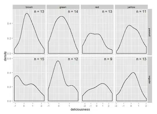
I'm encountering a problem when trying to make a density plot with ggplot. The data look a bit like in the example here.
require(ggplot2)
require(plyr)
mms <- data.frame(deliciousness = rnorm(100),
                  type=sample(as.factor(c("peanut", "regular")), 100, replace=TRUE),
                  color=sample(as.factor(c("red", "green", "yellow", "brown")), 100, replace=TRUE))


mms.cor <- ddply(.data=mms, .(type, color), summarize, n=paste("n =", length(deliciousness)))

plot <- ggplot(data=mms, aes(x=deliciousness)) + geom_density() + facet_grid(type ~ color) + geom_text(data=mms.cor, aes(x=1.8, y=5, label=n), colour="black", inherit.aes=FALSE, parse=FALSE)
Labelling each facet with the labels work quite well unless the scales for each facet vary. Does anyone have an idea how I could achieve putting the labels at the same location when the scales per facet differ?
Best, daniel