0

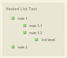
hey i have set some breakpoints and ive set list item in percentage and it fits well in different breakpoints.

but my default one which i haven't set is displayed like this.

enter image description here here is my sass code.

li
        {


            width:20%;
            padding: 2px;
            float:left;
                          @include media($xl-desktop) { // As defined in _grid-settings.scss
                            width:10%;
                          }

                          @include media($mobile) { // As defined in _grid-settings.scss
                            width:33.3333%;
                          }
                        }

Please tell me where am i doing it wrong. thanks. Here is my Demo Demo Link

designerNProgrammer
  • 2,621
  • 5
  • 34
  • 46

2 Answers2

0

can you try this layout? to make images responsive you need to add width: 100% (you did the exact oppsite);

Make an image responsive - simplest way

http://jsfiddle.net/95EfW/

css:

    ul{
    list-style: none;
}

li{
    float: left;
    padding:0;
    margin:0;
    width: 20%;
    padding: 4px;
}

img{
    width: 100%;
    height: 100%;
}

thanks for the demo, it helps. So here is the issue, the issue is each of your image is different size, hence when you float left it brings the remaining pictures down in different screens. To fix the issue, you have two methods, using inline-block (rather than float on li) or setting a static height for different size screens. here is a small demo for setting heights jsfiddle.net/f5cgT/2 – ravitadi 1 hour ago

Community
  • 1
  • 1
РАВИ
  • 11,467
  • 6
  • 31
  • 40
  • i think maybe i have to set the width percentage on all the breakpoints otherwise it may be broken. as i think i did a default 30 percent which was not good. – designerNProgrammer Apr 19 '14 at 04:30
  • Yes, for different size screens you have to mess around to find the right ratio. For this example 20% on the phones won't look good, so you have to change it and mess around with it. Again don't change the images, just change the container of the image. – РАВИ Apr 19 '14 at 04:33
  • don't you think it is more time consuming and verbose to write for every resolution and not set a default and override where necessary.? – designerNProgrammer Apr 19 '14 at 04:47
  • @designerNProgrammer you don't have to write every resolution for desktop and mobile, you should use the one i gave and as your base and use media queries to add so it looks good on phones. It is very hard to come up with a layout such as the one you want without extra css settings for phones. So make it first look good on desktop and then move onto mobile. – РАВИ Apr 19 '14 at 06:07
  • There seems to be some problem.ive set up all the break points but still the problem persists – designerNProgrammer Apr 19 '14 at 08:01
  • here is a demo. can you please tell me where i am doing it wrong, just resize browser to check the bug. http://beautifulsoftwares.com/neat/ – designerNProgrammer Apr 19 '14 at 09:00
  • thanks for the demo, it helps. So here is the issue, the issue is each of your image is different size, hence when you float left it brings the remaining pictures down in different screens. To fix the issue, you have two methods, using inline-block (rather than float on li) or setting a static height for different size screens. here is a small demo for setting heights http://jsfiddle.net/f5cgT/2/ – РАВИ Apr 19 '14 at 23:04
  • Thanks Ravi. Just set ur comment as answer. And I will accept it.thanks – designerNProgrammer Apr 19 '14 at 23:25
  • For responsive images - check this: http://www.456bereastreet.com/archive/201306/how_to_proportionally_scale_images_that_have_dimension_attributes/ – JohanVdR Apr 20 '14 at 00:42
  • I just accepted ur answer.cheers do up vote my question.thanks – designerNProgrammer Apr 20 '14 at 12:27
0

This will prevent the floats to drop as you clear each row.

.galleryList li:nth-child(6n+6) {
  clear: left;
}

But the images original size should be the same 500px x 750px as well. Than you would not have the gaps in the first place...

JohanVdR
  • 2,880
  • 1
  • 15
  • 16
  • Not yet supported by IE9 but with flexbox lay-outs much more is/will be possible. http://www.sitepoint.com/flexbox-css-flexible-box-layout/ – JohanVdR Apr 20 '14 at 00:47