3

I am getting a bit of an odd result here that I can't quite understand.

In jQuery I am logging the window width by:

console.log( $(window).width() );

In my CSS I am changing the background color to red with:

@media only screen and (min-width: 768px) {

    body { background: red!important; }

}

Yet, in Firebug, the console says the window width is 756px wide, but the CSS makes the background red, which shouldn't happen until it reaches a minimum width of 768px.

See this screen grab for further clarification:
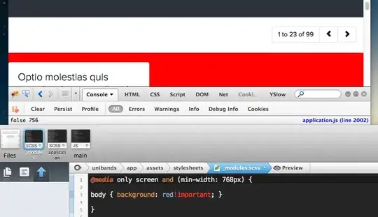
enter image description here

Can anyone explain to me why the background is red and that the CSS seems incorrect? Is it jQuery that's actually incorrect?

Also, would it have anything to do with the vertical scrollbar at all?

cimmanon
  • 67,211
  • 17
  • 165
  • 171
Michael Giovanni Pumo
  • 14,338
  • 18
  • 91
  • 140

6 Answers6

3

You need to check the width of viewport like,

function viewport() {
    var e = window, a = 'inner';
    if (!('innerWidth' in window )) {
        a = 'client';
        e = document.documentElement || document.body;
    }
    return { width : e[ a+'Width' ] , height : e[ a+'Height' ] };
}

Viewport Source

Or you can use innerWidth() like,

if($(window).innerWidth() <= 751) {
   $("body").css('background','red !important'); // background red
} else {
   $("body").removeAttr('style'); // remove style attribute
}

You can use matchmedia if you are not care about IE for egs,

function checkPosition() {
    if (window.matchMedia('(max-width: 767px)').matches) {
        //...
    } else {
        //...
    }
}

For all browsers you can try

if (Modernizr.mq('(max-width: 767px)')) {
    //...
} else {
    //...
}

See modernizr mq

Rohan Kumar
  • 40,431
  • 11
  • 76
  • 106
1

The difference is caused by the width of the scroll bar.

console.log( $(window).width() );

return the width of the viewport area (widthout the srcoll bar) whereas media query includes the scrollbar.

Scrollbar width varies between browsers.
In chrome for example, the background color change appears at 747px you can try in this fiddle with other browsers to see the diference.

web-tiki
  • 99,765
  • 32
  • 217
  • 249
0

// Returns width of browser viewport
$( window ).width();

// Returns width of HTML document
$( document ).width();

Css will take the HTML document width. Go through this link https://api.jquery.com/width/

sreenath
  • 359
  • 2
  • 3
  • 12
0

You should check window width according media query for cross browser solution, something like:

var isWindowWidthMatchingQuery = window.matchMedia("only screen and (min-width: 768px)").matches;

alert(isWindowWidthMatchingQuery ); // returns true or false

See support table: http://caniuse.com/#search=matchMedia

A. Wolff
  • 74,033
  • 9
  • 94
  • 155
0

Don't use JavaScript to check the viewport width. It's unnecessarily complicated and prone to inconsistencies. Instead, simply check a @media-query dependent CSS attribute, i.e. of the class .navbar-toggle to check for the navbar-breakpoint (set by less variable @screen-phone), when using the collapsible bootstrap navbar:

f($(".navbar-toggle").css("display") != "none") {
    alert("Yay! I'm consistent with bootstrap!");
}

If you want to check the @screen-tablet and the @screen-desktop breakpoints, you can check the width of the .container class, or any other css selector in your bootstrap.css that depends on a suitable @media-query. Of course you can also use this technique with your own css.

timar
  • 21
  • 3
0

An update for this question: Since jQuery 3.0 you can now $(window).outerWidth() to get the real window width including the scrollbar. It should be equal to what you can do with your CSS @media selectors

Breaking change: .outerWidth() or .outerHeight() on window includes scrollbar width/height

More informations on https://jquery.com/upgrade-guide/3.0/#breaking-change-outerwidth-or-outerheight-on-window-includes-scrollbar-width-height

Patrick L.
  • 526
  • 6
  • 24