I'm brand new to R-studio and I could use a little help.
I'm collecting accelerometer data and I need to be able to look at 12 hour files in a meaningful way.
What I would like to do is emulate the picture I posted. Every 100,000 data points I would like the plot to wrap around the same way seismic analysts visual their data.
Sorry I couldn't post a picture because I don't have enough points. here is the link
http://eqinfo.ucsd.edu/cacheimages/vncdumps/orbmonrtd/anza24hr_Z.gif
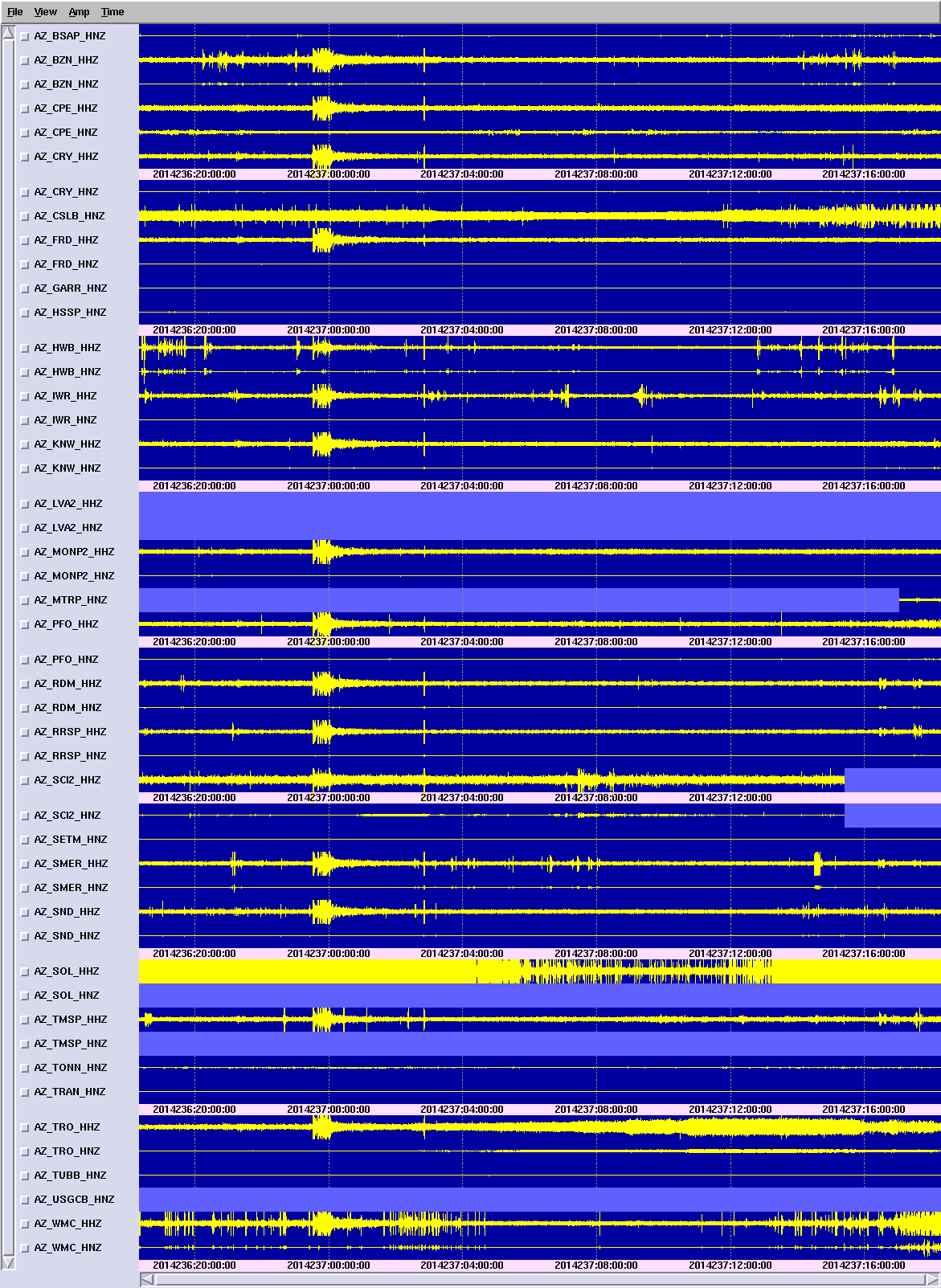
Data looks like this:
millis,x,y,z
2210,502,533,701
2230,499,538,702
2240,502,535,705
2250,500,560,699
Script to create plot line looks like this
data <- read.csv("LOG_141.DAT", skip=2, header = TRUE,
  stringsAsFactors = FALSE)
str(data)
plot(data$millis[1:100000], data$y[1:100000], type = "l", cex = 0.2, ylim=c(100,1000))