I have an infrared spectrum for a compound of interest that I would like to plot, and I have a spectrum.dat file with all of the data points. It is of the form:
    # X  Y
    300  100
    301  100
    302   99
    303   70
    ...
    3999  98
    4000 100
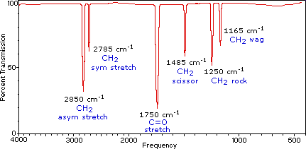
I would like to plot this using an x axis typical of IR spectra, but I am having trouble doing so. If you are unfamiliar, this is what a typical IR spectrum might look like (aside from the labels on the graph itself). Notice that the x-axis is reversed, and that it abruptly doubles its scaling above 2000 units (reciprocal centimeters). Is there a way to coerce Gnuplot into plotting my data this way? I so far have managed to come up with the following script:
    # Make an SVG of size 800x500
    set terminal svg size 800,500 fname 'CMU Sans Serif' fsize '10'
    set output 'ir.svg'
    # Color definitions
    set border linewidth 1.5
    set style line 1 lc rgb '#a0a0a0' lt 1 lw 2 pt 7 # gray
    # Format graph
    unset key
    set xlabel 'Wavenumbers'
    set ylabel 'Transmittance'
    set xrange [4000:300]
    # Plot data
    plot 'spectrum.dat' with lines ls 1
This reverses the x-axis nicely, but I can't figure out how to change the scaling in such an unusual way.
