I am having a small problem with bootstrap trying to cover the full height of the browser window when the content is not enough. I am using bootstrap within Orchard CMS incase this has any relevance.
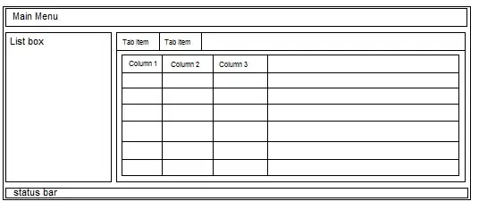
The problem can be seen in the picture here
The page structure is pretty basic:
<body style="background-color: #b0a2b0;">
<div id="layout-wrapper" style="margin: 0px auto -75px; padding: 0px 0px 75px;">
    <div class="container">
        .... stuff ...
    </div>
    <div class="container">
        ... other stuff
    </div>
</div>
<div id="footer" style="height: 75px;">
    <div class="container">
    </div>
</div>
</body>
html, body and the #layout-wrapper all have height set to 100%. My clever idea until now was to add an extra container and resize it accordingly. The problem being that I need to pay attention when the window resizes and also if there is something on the page hiding or showing (as this will change the available height).
I've tried setting this filler div to height: 100% but it seem to shot past the footer, ending up basically longer than the page and scrolling down ends up dragging the footer up.
What I eould like as an ending result is a footer that is stuck to the bottom and the page to be full length tall even when there are things resizing or showing/hiding.
Any ideas?