Here is an example to get started on the left graph using base graphics (there are xspline functions for grid graphics as well if you want to use those, I don't know how to incorporate them with ggplot2, but lattice probably would not be too hard):
plot.new()
par(mar=c(0,0,0,0)+.1)
plot.window(xlim=c(0,3), ylim=c(0,8))
xspline( c(1,1.25,1.75,2), c(7,7,4,4), s=1, lwd=32.8/4.5, border="#0000ff88", lend=1)
xspline( c(1,1.25,1.75,2), c(6,6,4,4), s=1, lwd=19.7/4.5, border="#0000ff88", lend=1 )
xspline( c(1,1.25,1.75,2), c(5,5,4,4), s=1, lwd=16.5/4.5, border="#0000ff88", lend=1 )
xspline( c(1,1.25,1.75,2), c(4,4,4,4), s=1, lwd=13.8/4.5, border="#0000ff88", lend=1 )
xspline( c(1,1.25,1.75,2), c(3,3,4,4), s=1, lwd= 7.9/4.5, border="#0000ff88", lend=1 )
xspline( c(1,1.25,1.75,2), c(2,2,4,4), s=1, lwd= 4.8/4.5, border="#0000ff88", lend=1 )
xspline( c(1,1.25,1.75,2), c(1,1,4,4), s=1, lwd= 4.5/4.5, border="#0000ff88", lend=1 )

text( rep(0.75, 7), 7:1, LETTERS[1:7] )
text( 2.25, 4, 'Tie strength')

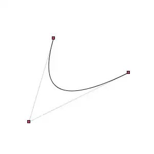
And some starting code for the right graph using a little different approach:
plot.new()
par(mar=rep(0.1,4))
plot.window(xlim=c(0,7), ylim=c(-1,7))
text( 3+0.05, 0:6, 0:6, adj=0 )
text( 4-0.05, 0:6, 0:6, adj=1 )
lines( c(3,3),c(0-strheight("0"), 6+strheight("6")) )
lines( c(4,4),c(0-strheight("0"), 6+strheight("6")) )

xspline( c(3,1,3), c(0,3,6), s= -1, lwd=1, border="#00ff0055", lend=1 )
xspline( c(3,1.25,3), c(0,2.5,5), s= -1, lwd=4, border="#00ff0055", lend=1 )
xspline( c(4,4.5,4), c(5,5.5,6), s= -1, lwd=5, border="#ff000055", lend=1 )

You can modify the control points, colors, etc. to get closer to what you want. Many of the pieces could then be wrapped into a function to automate some of the placing.
 and
and