5

I'm trying to plot multiple time series using a pandas dataframe. The dataframe contains more than 100 registers.

From the panda's documentation I've read that when pandas.df.plot() is executed this is also executed with gcf().autofmt_xdate(). I want to put my custom datetime format but when I tried my custom date format is overlapped over the date given by default by pandas plot. ¿Is there a way to skip gcf().autofmt_xdate() on plot creation? ¿How can i provide to panda a custom datetime format?

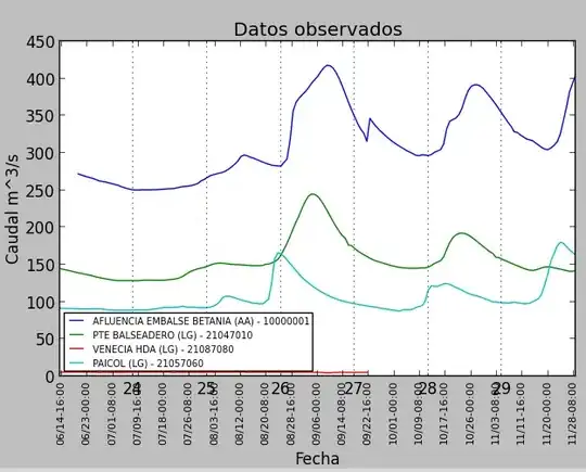
Here is the generated plot.

enter image description here

Here is the python code.

import matplotlib.pyplot as plt
import matplotlib.dates as mdates
import pandas as pd
from pandas import Series
import pickle
datos = pickle.load(open("datos_reporte.pickle", "r"))
reload(plt)
series_o = []
series_p_h = []
series_p_d = []
series_names = []
for cod_estacion in datos.keys():
    x = [d[0] for d in datos[cod_estacion]['historial_semanal']]
    y = [d[1] for d in datos[cod_estacion]['historial_semanal']]
    s = Series(y, x)
    series_o.append(s.groupby(level=0).first())

df1 = pd.concat(series_o, join='outer', axis=1)
interval  = int(len(df1) / 12)
df1.columns = series_names
ax = plt.figure(figsize=(7,5), dpi=100).add_subplot(111)
df1.plot(ax=ax)
ax.xaxis.set_major_locator(mdates.HourLocator(interval=200))
ax.xaxis.set_major_formatter(mdates.DateFormatter('%m/%d-%H:%S'))
ax.xaxis.grid(True, which="minor")
plt.title("Datos observados")
plt.ylabel('Caudal m^3/s')
plt.xlabel('Fecha')
plt.legend(loc=0,prop={'size': 7})
plt.xticks(rotation='vertical', fontsize = 8)
plt.subplots_adjust(bottom=.2)
plt.show()
CT Zhu
  • 52,648
  • 17
  • 120
  • 133
alejo0317
  • 83
  • 2
  • 9

1 Answers1

5

I think you can just clear all the ticks before you make new ones:

df=pd.DataFrame({'A':np.random.random(20), 'B':np.random.random(20)})
df.index=pd.date_range('1/1/2014', periods=20, freq='5H')
ax = plt.figure(figsize=(7,5), dpi=100).add_subplot(111)
df.plot(ax=ax)
ax.set_xticks([])
ax.set_xticks([], minor=True)
ax.xaxis.set_major_locator(mdates.HourLocator(interval=200))
ax.xaxis.set_major_formatter(mdates.DateFormatter('%m/%d-%H:%S'))
ax.xaxis.grid(True, which="minor")
plt.xticks(rotation='vertical', fontsize = 8)
plt.subplots_adjust(bottom=.2)

enter image description here

Edit

Now the labels are off. ax.xaxis.set_major_formatter(mdates.DateFormatter('%y/%m/%d-%H:%S')) will show they are 1991/01/11 and so on.

df=pd.DataFrame({'A':np.random.random(20), 'B':np.random.random(20)})
df.index=pd.date_range('1/1/2014', periods=20, freq='5H')
ax = plt.figure(figsize=(7,5), dpi=100).add_subplot(111)
ax.plot(df.index.to_pydatetime(), df.A, label='A')
ax.plot(df.index.to_pydatetime(), df.B, label='B')
ax.legend()
ax.xaxis.set_major_locator(mdates.HourLocator(interval=5))
ax.xaxis.set_major_formatter(mdates.DateFormatter('%y/%m/%d-%H:%S'))
ax.xaxis.grid(True, which="major")
ax.yaxis.grid(True, which="major")
plt.xticks(rotation='vertical', fontsize = 8)
plt.subplots_adjust(bottom=.2)

enter image description here

Community
  • 1
  • 1
CT Zhu
  • 52,648
  • 17
  • 120
  • 133
  • That's a good solution for overlapping issue, but do you know why the dates are altered?, you have generated dates from 01-01 to 01-04, in the chart the dates are from 01/11 to 04/12 ?, The same problem is happening to me. Any idea? Thanks! – alejo0317 Jun 23 '14 at 02:46
  • 1
    Didn't notice that. It turns out the pandas timeseries is different form python datetime. This issue was (sort of) discussed before, http://stackoverflow.com/questions/12945971/pandas-timeseries-plot-setting-x-axis-major-and-minor-ticks-and-labels. See edit. – CT Zhu Jun 23 '14 at 04:12
  • as as side note, you don't need `set_xticks([])`, setting a formatter will take care of everything. – tacaswell Jun 29 '14 at 01:12