-1

I have 3 sets of values. It's like I have the x-y coordinate plane which constitutes first two sets of values. And I have divided the plane region into small squares of unit size or some size in particular. Then I have another 2-D array that contains values corresponding to each square or small region.

Now, the problem:

I could plot the 2-D array as color points using a colorbar but the x axis and y axis how the column and row indices respectively! Rather than that I wanted to have x and y coordinates shown. I tried searching a lot and didn't get the solution.

It is similar to this. It's just that I want my set of x-y coordinate values instead of the row and column values shown.

Please help. And suggest improvements if needed through comments instead of downvoting. That is very discouraging.

EDIT:

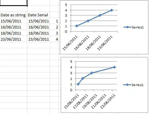
After following the answer provided, I got this enter image description here.

Instead I should have got the figure like this. Of course the axes as the previous figure and unlike below.enter image description here

MycrofD
  • 231
  • 1
  • 6
  • 17
  • Isn't that what [`pcolor(X, Y, C)`](http://matplotlib.org/api/pyplot_api.html#matplotlib.pyplot.pcolor) does? – Lev Levitsky Jun 28 '14 at 08:54
  • can you please give an example. I am really not comfortable with the docs written like in the link you provided.. please – MycrofD Jun 28 '14 at 09:20
  • I can't give an example in the comment. But if you provide examples of `X`, `Y` and `C` in the question, as well as describe specifically the desired result for those values, then I or someone else may be able to provide a more confident answer. – Lev Levitsky Jun 28 '14 at 09:25
  • Ok. I am on it. But can u help me as how to give you the array of 50*50 values here? any link I should use or follow? – MycrofD Jun 28 '14 at 09:32
  • I'd just suggest to make it 5x5. – Lev Levitsky Jun 28 '14 at 09:34
  • Yes. I was doing that, when the answer came up. And it almost solved my problem. But the figure is squeezed along vertical axis. How to fix that? – MycrofD Jun 28 '14 at 09:47
  • 1
    @MycrofD: it may be a problem of the order you do things. First `imshow` then `axis('normal')` and only after that `colorbar`. Look at the edited example code below. If you cannot make it work, please show the code. – DrV Jun 28 '14 at 09:58
  • @MycroftD: Please not that my comment above contained a hideous error, I edited it. The correct command is `plt.axis('normal')`. – DrV Jun 28 '14 at 10:03

1 Answers1

1

If you want to have something similar to the imshow example you linked to but with different coordinate axes, you may want to use the extent keyword of imshow:

import numpy as np
import matplotlib.pyplot as plt

# some random data (10x10)
image = np.random.uniform(size=(10, 10))

plt.figure()

# draw the pixel image
#   interpolation='nearest': draw blocky pixels, do not smooth
#   cmap=pl.cm.gray: use gray scale colormap (autoscale, no vmin or vmax defined
#   origin='lower': draw first row of the array to the bottom if the image
#   extent=[-3,3,-10,10]: draw the image so that it covers area (-3,-10)..(3,10)
plt.imshow(image, cmap=plt.cm.gray, interpolation='nearest', origin='lower', extent=[-3,3,-10,10])

# this is needed to make the pixels non-square if needed
plt.axis('normal')

plt.colorbar()

plt.show()

This way you can create "pixels" whose size is exactly what you want:

enter image description here

Of course, you may plot more information onto the same plot if you want just by using plot or something else.

The image here is an array of scalars and the colouring is defined by the cmap, but it may also be an array of RGB or RGBA values if you want to do fancier coloring. For example:

How to create colormap of confidence estimates for k-Nearest Neighbor Classification

If you want to have transparent areas in your map, put nan values into image.

Community
  • 1
  • 1
DrV
  • 22,637
  • 7
  • 60
  • 72
  • Almost got what I needed.. But now, the y axis is shrunken. How to elongate it? I mean x varies from 4 to 22. And y varies from -75 to -70.5. So the prob is it looks like a rectangle with the figure having squeezed along vertical axis, i.e. y axis. – MycrofD Jun 28 '14 at 09:46
  • @MycrofD: The `extent` keyword gives the size of the image in the plot area coordinates. Remember to give the `plt.axis('normal')` and then you can scale the axis ranges to be what you want by `plt.axis([-100,100,-50,50])` or whatever range you want to have. – DrV Jun 28 '14 at 09:54
  • thank you very much. Thnx to you and @Lev Levitsky for such a quick response. :) – MycrofD Jun 28 '14 at 14:31
  • I was using cbar.ax.set_ylabel('something'). It is not working. I can't label the colorbar. Help plz.. – MycrofD Jun 28 '14 at 17:30
  • @MycrofD: Are you sure you want to set the Y label for the colorbar? That works well with `ax.set_ylabel`. But if you want to set the Y axis tick labels manually, you need `get_yticks().to_list()`, edit the list and `set_yticklabels`. The process has several kinks, see: http://stackoverflow.com/questions/11244514/matplotlib-modify-tick-label-text – DrV Jun 29 '14 at 22:02
  • cbar = plt.colorbar().. cbar.set_label('something').. I did that and it works. :) – MycrofD Jun 30 '14 at 06:22