42

I'm trying to make a grid of thumbnails, where each thumbnail has an image and a label. It works fine if all the labels have the same length, because then all the thumbnails have the same height:

http://www.bootply.com/iSqwWyx5ms

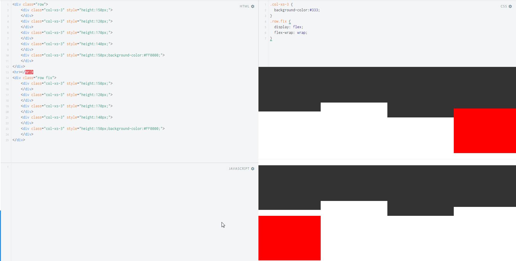
However, if I shorten the rightmost thumbnail's text, part of the row below gets pushed into a new row, as shown here:

http://www.bootply.com/Wqd021aaeM

What I would like is the second row to start from the lowest point in which the first row ended.

I know I can solve it with JavaScript - find the longest thumbnail in each row and set the other thumbnails to have that height. Question is, do I have any way of doing it, or something else that can solve my problem, using only with CSS?

Update: I don't know beforehand how many items I have in one row. For example, on a small screen I'd have 2 items in a row, while on a bigger screen it'll be 3, so solutions which set when a new row starts aren't good for me.

Jason Aller
  • 3,541
  • 28
  • 38
  • 38
haimlit
  • 2,572
  • 2
  • 22
  • 26
  • 3
    I just answered this same question here yesterday: http://stackoverflow.com/questions/24571062/gap-in-bootstap-stacked-rows/24571644#24571644 – jme11 Jul 05 '14 at 20:48
  • Your welcome, I gave you a little more detail in the answer below. – jme11 Jul 05 '14 at 21:04

8 Answers8

39

You should use .clearfix, as described at the Grid responsive resets section of the Bootstrap documentation: https://getbootstrap.com/docs/3.3/css/#grid-responsive-resets

gbellmann
  • 1,945
  • 1
  • 22
  • 27
  • 3
    Thanks gbellmann. Sorry, but I should've been more clear on my question. I don't know how many items there will be in a row, so I can't really know where to put the clearfix. Please let me know if you have any more ideas. – haimlit Jul 05 '14 at 20:53
  • 1
    Combining with @jme11's comment, your solution is valid. I don't know how many items will be in a row, but I do know how many items will be in a row for a specific size, so using "visible-md" on a specific clearfix does the trick. Thanks! – haimlit Jul 05 '14 at 20:57
36

If you don't know how many columns you have, you can do:

.row.fix {
  display: flex;
  flex-wrap: wrap;
  width:100%; /*not always necessary*/
}

Working fiddle: https://jsfiddle.net/wqdm1jjt/

Example: enter image description here

Author: Juan Miguel

Lucas Bustamante
  • 15,821
  • 7
  • 92
  • 86
7

I think it's better to use some few row of js. With CSS you could only have a new "row" using clearfix class (as answered before), but each div will have different height. If you wish to set the same height to each dynamic div, I think you could do it only by js.

  $(document).ready(function() {
    var maxHeight = 0;          
    $(".equalize").each(function(){
      if ($(this).height() > maxHeight) { maxHeight = $(this).height(); }
    });         
    $(".equalize").height(maxHeight);
  }); 

Here is a working demo based on your code.

All what you have to do is giving the same class to each main div inside the col--, and than run a each() function in js that give to them the same height (the max-one).

Your HTML structure should looks like that:

<div class="container">
  <div class="col-md-4">
    <div class="thumbnail equalize">

      <!-- your HTML content -->

    </div> <!-- /.thumbnail equalize -->
  </div> <!-- /.col-md-4 -->
</div> <!-- /.container -->
6

You can use the same trick I described in this answer.

In your case, you'd change the media queries to look like this:

@media (min-width: 768px) and (max-width: 991px) {
    .portfolio>.clear:nth-child(4n+4)::before {
      content: '';
      display: table;
      clear: both;
    }
}
@media (min-width: 992px) {
    .portfolio>.clear:nth-child(6n+6)::before {  
      content: '';
      display: table;
      clear: both;
    }
}

768px - 991px is the sm size, you have col-sm-2, so you want every 4th div to clear. 992px and above relates to the md size, where you have col-md-3, so you want every 6th div to clear at that size. It's way easier than using the responsive resets, although it's based on the exact same premise.

P.S. I added a div with the row class inside your container (because you need one inside a container otherwise you will have double padding on the outside) and I also gave it a class of portfolio for easy targeting. Here's your updated Bootply.

Community
  • 1
  • 1
jme11
  • 17,134
  • 2
  • 38
  • 48
  • 1
    this seems quite ugly as you're rewriting mediaqueries that are originally defined by bootstrap, and manually changing the number of items in a row, additionally to what's defined by `.col-md-*`, for instance. – igorsantos07 Oct 23 '15 at 22:17
  • @igorsantos07 There's no rewriting of the media queries that are defined by Bootstrap, just a new class and corresponding CSS. With this approach, you don't have to use the complicated markup for [Responsive Column Resets](http://getbootstrap.com/css/#grid-responsive-resets) to solve gap issues during wrapping. – jme11 Oct 30 '15 at 10:08
  • You're still defining columns both in the markup and the CSS. The responsive resets are more flexible and makes much more sense than hardcoding stuff in the CSS :( – igorsantos07 Oct 30 '15 at 11:57
6

you could use clear: left and apply it for each first child in row. For example if you have 4 items in row you can use:

.my-row>:nth-child(3n+1) {  
  clear:left;
  background-color: red; // just to see if the first item in row is matched
}
Glogo
  • 2,694
  • 2
  • 23
  • 23
2

You can also do a CSS only clearfix like this. Simply add auto-clear to the row.

@media (min-width:1200px){
    .auto-clear .col-lg-1:nth-child(12n+1){clear:left;}
    .auto-clear .col-lg-2:nth-child(6n+1){clear:left;}
    .auto-clear .col-lg-3:nth-child(4n+1){clear:left;}
    .auto-clear .col-lg-4:nth-child(3n+1){clear:left;}
    .auto-clear .col-lg-6:nth-child(odd){clear:left;}
}
@media (min-width:992px) and (max-width:1199px){
    .auto-clear .col-md-1:nth-child(12n+1){clear:left;}
    .auto-clear .col-md-2:nth-child(6n+1){clear:left;}
    .auto-clear .col-md-3:nth-child(4n+1){clear:left;}
    .auto-clear .col-md-4:nth-child(3n+1){clear:left;}
    .auto-clear .col-md-6:nth-child(odd){clear:left;}
}
@media (min-width:768px) and (max-width:991px){
    .auto-clear .col-sm-1:nth-child(12n+1){clear:left;}
    .auto-clear .col-sm-2:nth-child(6n+1){clear:left;}
    .auto-clear .col-sm-3:nth-child(4n+1){clear:left;}
    .auto-clear .col-sm-4:nth-child(3n+1){clear:left;}
    .auto-clear .col-sm-6:nth-child(odd){clear:left;}
}
@media (max-width:767px){
    .auto-clear .col-xs-1:nth-child(12n+1){clear:left;}
    .auto-clear .col-xs-2:nth-child(6n+1){clear:left;}
    .auto-clear .col-xs-3:nth-child(4n+1){clear:left;}
    .auto-clear .col-xs-4:nth-child(3n+1){clear:left;}
    .auto-clear .col-xs-6:nth-child(odd){clear:left;}
}

http://www.codeply.com/go/lUbs1JgXUd

Carol Skelly
  • 351,302
  • 90
  • 710
  • 624
1

If you know how many thumbnails wide is your arrangement, then you can use <div class="row"></div> to wrap thumbnails in groups of three (or N).

Otherwise, the workaround would be to set a fixed height for the thumbnail element. On your example

.thumbnail {
   height:420px; 
}

However, if your thumbnail height and text can vary a lot, then it will either look awkward or hide part of the img/label.

ffflabs
  • 17,166
  • 5
  • 51
  • 77
0

Why dont you use the <div class="row"></div> Have a look at this http://www.bootply.com/6bIZkSGcA1

Is this what you wanted.??

P.S. This will directly limit the boundaries to a row.

Khushal Dave
  • 507
  • 5
  • 19
  • 1
    Thanks Dave. Sorry that I wasn't clear, but I would like my solution to support various number of items in a row, depending on the screen size. That means I don't know where to put a new row. I updated my question. – haimlit Jul 05 '14 at 20:51
  • @haimlit as you want to support range of columns that .clearfix is the perfect solution. – Khushal Dave Jul 05 '14 at 21:02