92

Im trying to use Flexbox. http://css-tricks.com/almanac/properties/a/align-content/ this shows nice alignment options; but i would actually want a Top-top-bottom situation.

I want a div to stick to the bottom of the parent div using flexbox. With flex-direction: column and align-content: Space-between i can do this, but the middle div will align in the center, i want the middle one to be sticked to the top as well.

[top]

[middle]

-

-

-

[bottom]

align-self: flex-end will make it float right, not bottom.

complete flexbox docs: http://css-tricks.com/snippets/css/a-guide-to-flexbox/

CyanAngel
  • 1,240
  • 1
  • 14
  • 28
Laurens Kling
  • 2,221
  • 1
  • 21
  • 31
  • 2
    [This site could help](http://the-echoplex.net/flexyboxes/?fixed-height=on&legacy=on&display=flex&flex-direction=column&flex-wrap=nowrap&justify-content=flex-start&align-items=center&align-content=stretch&order%5B%5D=0&flex-grow%5B%5D=0&flex-shrink%5B%5D=1&flex-basis%5B%5D=200px&align-self%5B%5D=auto&order%5B%5D=0&flex-grow%5B%5D=0&flex-shrink%5B%5D=1&flex-basis%5B%5D=100%25&align-self%5B%5D=auto&order%5B%5D=0&flex-grow%5B%5D=0&flex-shrink%5B%5D=1&flex-basis%5B%5D=200px&align-self%5B%5D=auto). – misterManSam Jul 11 '14 at 12:20
  • 7
    Tangential to the question, but it seems absurd that this sort of layout isn't easily solved by any of the flex-box properties – coffeecola Jun 14 '16 at 07:49
  • @coffeecola don't say it is not easy to solve when you haven't got the knowledge. Flex is really powerful, Thanks check my answer bellow. – T04435 Jan 19 '17 at 07:38
  • 1
    isn't this possibly a bug? why should the same option push the cell down in row mode, but not in column mode. – Roland Nov 20 '18 at 12:57
  • 2
    No it's not a bug, `flex-end` is a different end in row or column mode. End of the row (bottom) or end of the column (right). – Laurens Kling Nov 27 '18 at 13:13
  • Possible duplicate of [Align an element to bottom with flexbox](https://stackoverflow.com/questions/31000885/align-an-element-to-bottom-with-flexbox) – mfluehr Sep 18 '19 at 13:43

10 Answers10

188

I'm a bit late to the party, but might be relevant for others trying to accomplish the same you should be able to do:

margin-top: auto

on the element in question and it should go to the bottom. Should do the trick for firefox, chrome and safari.

Torbjørn Angeltveit
  • 2,232
  • 2
  • 13
  • 10
  • Yes, to push one element to the end, this will do the trick. Flexbox treats margin's a little different – Laurens Kling May 01 '16 at 15:55
  • 2
    This did trick for me after a couple hours of WTF. It also works in IE(11 anyways, I have yet to test in other version) – Ghostrydr May 12 '17 at 13:57
  • 6
    **To explain why this works:** `auto` tells the browser to put as much space as possible between the element and its nearest sibling element(s). So `margin-top: auto` means, put as much space as possible _above_ the element from its nearest sibling element. As another example, `margin-left: auto` pushes the element as far as possible to the right. – CodeBiker Sep 19 '19 at 16:44
  • This answer certainly will work, but the question specifically calls for flexbox in the answer. Though, knowing margin auto is super helpful. – Maximus Dec 18 '19 at 18:21
67

Basically, the answer is to give to the last of the middle elements a flex grow 1 code as follows:

.middle-last{
  flex-grow: 1; // assuming none of the other have flex-grow set
}

Thanks, T04435.

T04435
  • 12,507
  • 5
  • 54
  • 54
  • I must say, this is actually a better solution for the given example, because you'd want the middle to take all the space, not just the end to margin away. – Laurens Kling Nov 27 '18 at 13:15
13

I found my own solution, i will add it here for documentation value;

If you give the middle block height: 100% it will take up al the room in the middle. So the bottom block will be at the actual bottom and top and middle are on top.

UPDATE: This doesn't work for Chrome...

UPDATE: Found a way that works for FF/Chrome: setting flex-grow on a higher number (1 is enough) for [middle] will make it take full middle size. more info: http://css-tricks.com/almanac/properties/f/flex-grow/

Laurens Kling
  • 2,221
  • 1
  • 21
  • 31
  • I don't follow your answer but this is the exact issue I'm having trouble with right now. Could you share your actual markup and CSS used for the solution? – corradomatt Jul 01 '15 at 19:49
  • i will try to post it soon, any pro stackoverflow tips? Do i add it in my question? – Laurens Kling Jul 02 '15 at 15:00
  • Assuming the other elements have `flex-grow: 0`, which means they will determine their own width, setting the element just prior to the last item to `flex-grow: 1` will cause it to fill the the available space in the container, pushing the last item to the bottom/end. – Seth Dec 04 '15 at 02:48
10

align self property rely on the alignment of an item in respect of the cross axis, not the main axis. So this is not the way to go. You have several options to achieve that using flexbox, though:

1) Use flex-grow:1 on your middle item. This will make it grow taking all remaining space in the container, thus pushing your last div to the bottom.

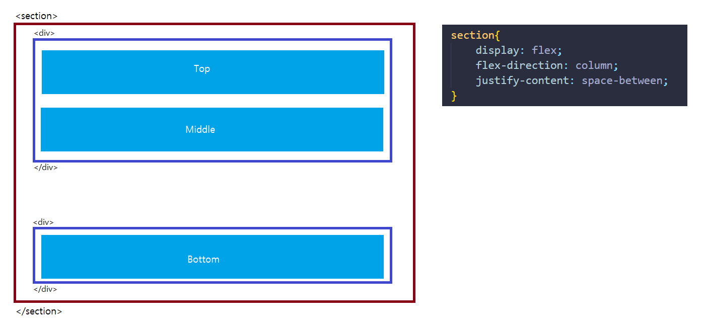
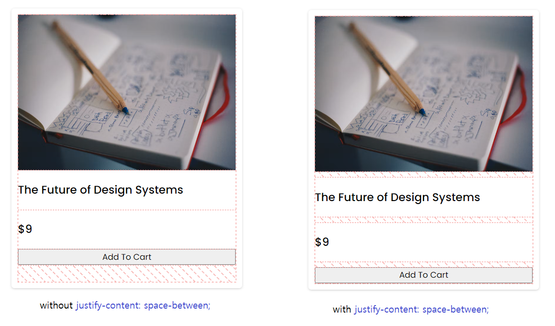
2) Refactor your layout so that there is a main div with justify-content:space-between so that your last div will be sticked to the bottom:

.container{
    display:flex;
    flex-direction:column;
    justify-content:space-between;
}
.body{
    display:flex;
    flex-direction:column;
}
.bottom{
    /* nothing needed for the outer layout */
}

<div class="container">
    <div class="body">
        <div>top content</div>
        <div>middle content</div>
    </div>
    <div class="bottom">
        bottom content
    </div>
</div>

3) This is a bit weird, but you could even do that using align-self but inverting the flex direction and allowing items to wrap:

.container{
    display:flex;
    flex-direction:row;
    flex-wrap:wrap;
}
.body{
    display:flex;
    flex-direction:column;
    flex-basis:100%;
}
.bottom{
    align-self:flex-end
}

I've tested all this out using this free flexbox designer: http://algid.com/Flex-Designer

Mario Vázquez
  • 717
  • 10
  • 9
2

Considering that your website has a basic structure, here's a solution that I used and applied in a similar situation, with just a few lines of code:

HTML

<div class="site-container">
    <header>your header</header>
    <main>your main with little content</main>
    <footer>your footer</footer>
</div>

CSS

.site-container{
    min-height: 100vh;   //not necessary to calculate the height of the footer
    display: flex;
    flex-direction: column;
}

footer{
    margin-top: auto;
}
1

I know this is a old post but the same problem, with Flexbox's single axis alignment, made me nuts for an hour.

The auto margin is a nice trick but i wanted to share my solution with CSS Grid.

The important part is the definition of the grid-template-rows. With auto the rows have the same height as the content and 1fr uses the remaining space for the middle row.

Here a nice overview about CSS Grid: https://css-tricks.com/snippets/css/complete-guide-grid/

.container {
  height: 700px;
  display: grid;
  grid-template-rows: auto 1fr auto;
  grid-gap: 10px;
}

.top {
  height: 30px;
  width: 400px;
  background-color: blue;
}

.middle {
  width: 400px;
  background-color: green;
}

.bottom {
  height: 30px;
  width: 400px;
  background-color: red;
}
<div class="container">

  <div class="top"></div>
  <div class="middle"></div>
  <div class="bottom"></div>
  
</div>
Sebastian Vischer
  • 1,310
  • 10
  • 9
1
.message-container {
    display: flex;
    flex-direction: column;
    place-content: flex-end;
    height: -webkit-fill-available;
}

.message {
    display: table-cell;
}

Try this. I use it for messenger.

.container {
  height: 400px;
}

.message-container {
    display: flex;
    background: #eee;
    flex-direction: column;
    place-content: flex-end;
    height: -webkit-fill-available;
}

.user-message {
    align-self: flex-start;
    display: table-cell;
    padding: 5px;
    margin: 10px;
    border-radius: 10px;
    background-color: rgba(154, 247, 200, 0.692);
}

.friend-message {
    align-self: flex-end;
    display: table-cell;
    padding: 5px;
    margin: 10px;
    border-radius: 10px;
    background-color: rgba(169, 207, 250, 0.692);
}
<div class='container'>
  <div class='message-container'>
    <div class='user-message'>Hello!</div>
    <div class='friend-message'>Hi.</div>
  </div>
</div>
Judik
  • 21
  • 2
1

It's the limitation with flexbox and we have to accept it.

Here are 2 alternate solutions that you can try,

  1. Use div to group [top] [middle] as one and [bottom] as the other one. Also, create a section to cover them together with display flex, direction as column and justify-content as space between.

enter image description here

PS: Apply CSS through class/id, I applied to section for example only.

  1. Since the direction is column, just use justify-content: space-between and it will divide all horizontal space equally with top, middle and bottom. Not the perfect accurate solution but serves the purpose with cards and small components.

enter image description here

Shubham Sarda
  • 539
  • 5
  • 10
0

Align the items of the parent container to the baseline, with child items as inline blocks.

-2

You can do it without flex box, like this:

.footer {
  position: fixed;
  bottom: 0;
  width: 100%;
}