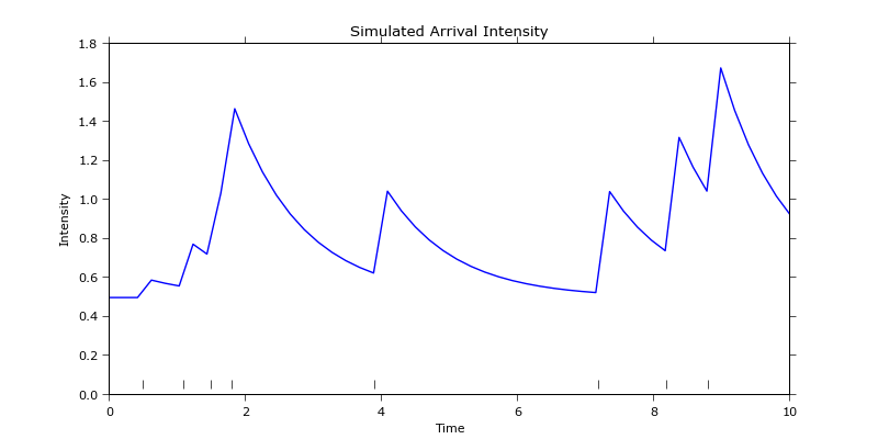
OK, so first thing that you may wish to do is to plot the data. To keep it simple I've reproduced this figure as it only has 8 events occurring so it's easy to see the behaviour of the system. The following code:
import numpy as np
import math, matplotlib
import matplotlib.pyplot
import matplotlib.lines

mu = 0.1 # Parameter values as found in the article http://jheusser.github.io/2013/09/08/hawkes.html Hawkes Process section.
alpha = 1.0
beta = 0.5

EventTimes = np.array([0.7, 1.2, 2.0, 3.8, 7.1, 8.2, 8.9, 9.0])

" Compute conditional intensities for all times using the Hawkes process. "
timesOfInterest = np.linspace(0.0, 10.0, 100) # Times where the intensity will be sampled.
conditionalIntensities = [] # Conditional intensity for every epoch of interest.
for t in timesOfInterest:
     conditionalIntensities.append( mu + np.array( [alpha*math.exp(-beta*(t-ti)) if t > ti else 0.0 for ti in EventTimes] ).sum() ) # Find the contributions of all preceding events to the overall chance of another one occurring. All events that occur after t have no contribution.

" Plot the conditional intensity time history. "
fig = matplotlib.pyplot.figure()
ax = fig.gca()

labelsFontSize = 16
ticksFontSize = 14

fig.suptitle(r"$Conditional\ intensity\ VS\ time$", fontsize=20)
ax.grid(True)
ax.set_xlabel(r'$Time$',fontsize=labelsFontSize)
ax.set_ylabel(r'$\lambda$',fontsize=labelsFontSize)
matplotlib.rc('xtick', labelsize=ticksFontSize)
matplotlib.rc('ytick', labelsize=ticksFontSize)

eventsScatter = ax.scatter(EventTimes,np.ones(len(EventTimes))) # Just to indicate where the events took place.

ax.plot(timesOfInterest, conditionalIntensities, color='red', linestyle='solid', marker=None, markerfacecolor='blue', markersize=12)
 fittedPlot = matplotlib.lines.Line2D([],[],color='red', linestyle='solid', marker=None,  markerfacecolor='blue', markersize=12)

fig.legend([fittedPlot, eventsScatter], [r'$Conditional\ intensity\ computed\ from\    events$', r'$Events$'])
matplotlib.pyplot.show()
reproduces the figure pretty accurately, even though I've chosen the event epochs somewhat arbitrarily:

This can also be applied to the set of example set of data of 5000 trades by binning the data and treating every bin as an event. However, what happens now, every event has a slightly different weight as different number of trades occurs in every bin.
This is also mentioned in the article in Fitting Bitcoin Trade Arrival to a Hawkes Process section with a proposed way to overcome this problem: The only difference to the original dataset is that I added a random millisecond timestamp to all trades that share a timestamp with another trade. This is required as the model requires to distinguish every trade (i.e. every trade must have a unique timestamp). This is incorporated in the following code:
import numpy as np
import math, matplotlib, pandas
import scipy.optimize
import matplotlib.pyplot
import matplotlib.lines

" Read example trades' data. "
all_trades = pandas.read_csv('all_trades.csv', parse_dates=[0], index_col=0) # All trades' data.
all_counts = pandas.DataFrame({'counts': np.ones(len(all_trades))}, index=all_trades.index) # Only the count of the trades is really important.
empirical_1min = all_counts.resample('1min', how='sum') # Bin the data so find the number of trades in 1 minute intervals.

baseEventTimes = np.array( range(len(empirical_1min.values)), dtype=np.float64) # Dummy times when the events take place, don't care too much about actual epochs where the bins are placed - this could be scaled to days since epoch, second since epoch and any other measure of time.
eventTimes = [] # With the event batches split into separate events.
for i in range(len(empirical_1min.values)): # Deal with many events occurring at the same time - need to distinguish between them by splitting each batch of events into distinct events taking place at almost the same time.
    if not np.isnan(empirical_1min.values[i]):
        for j in range(empirical_1min.values[i]):
            eventTimes.append(baseEventTimes[i]+0.000001*(j+1)) # For every event that occurrs at this epoch enter a dummy event very close to it in time that will increase the conditional intensity.

eventTimes = np.array( eventTimes, dtype=np.float64 ) # Change to array for ease of operations.

" Find a fit for alpha, beta, and mu that minimises loglikelihood for the input data. "
#res = scipy.optimize.minimize(loglikelihood, (0.01, 0.1,0.1), method='Nelder-Mead', args = (eventTimes,))
#(mu, alpha, beta) =  res.x
mu = 0.07 # Parameter values as found in the article.
alpha = 1.18
beta = 1.79

" Compute conditional intensities for all epochs using the Hawkes process - add more points to see how the effect of individual events decays over time. "
conditionalIntensitiesPlotting = [] # Conditional intensity for every epoch of interest.
 timesOfInterest = np.linspace(eventTimes.min(), eventTimes.max(), eventTimes.size*10) # Times where the intensity will be sampled. Sample at much higher frequency than the events occur at.
for t in timesOfInterest:
    conditionalIntensitiesPlotting.append( mu + np.array( [alpha*math.exp(-beta*(t-ti))   if t > ti else 0.0 for ti in eventTimes] ).sum() ) # Find the contributions of all preceding events to the overall chance of another one occurring. All events that occur after time of interest t have no contribution.

" Compute conditional intensities at the same epochs as the empirical data are known. "
 conditionalIntensities=[] # This will be used in the QQ plot later, has to have the same size as the empirical data.
for t in np.linspace(eventTimes.min(), eventTimes.max(), eventTimes.size):
    conditionalIntensities.append( mu + np.array( [alpha*math.exp(-beta*(t-ti)) if t > ti else 0.0 for ti in eventTimes] ).sum() ) # Use eventTimes here as well to feel the influence of all the events that happen at the same time.

" Plot the empirical and fitted datasets. "
fig = matplotlib.pyplot.figure()
ax = fig.gca()

labelsFontSize = 16
ticksFontSize = 14

fig.suptitle(r"$Conditional\ intensity\ VS\ time$", fontsize=20)
ax.grid(True)
ax.set_xlabel(r'$Time$',fontsize=labelsFontSize)
ax.set_ylabel(r'$\lambda$',fontsize=labelsFontSize)
matplotlib.rc('xtick', labelsize=ticksFontSize)
matplotlib.rc('ytick', labelsize=ticksFontSize)

# Plot the empirical binned data.
ax.plot(baseEventTimes,empirical_1min.values, color='blue', linestyle='solid',   marker=None, markerfacecolor='blue', markersize=12)
empiricalPlot = matplotlib.lines.Line2D([],[],color='blue', linestyle='solid', marker=None, markerfacecolor='blue', markersize=12)

# And the fit obtained using the Hawkes function.
ax.plot(timesOfInterest, conditionalIntensitiesPlotting, color='red', linestyle='solid',   marker=None, markerfacecolor='blue', markersize=12)
fittedPlot = matplotlib.lines.Line2D([],[],color='red', linestyle='solid', marker=None, markerfacecolor='blue', markersize=12)

fig.legend([fittedPlot, empiricalPlot], [r'$Fitted\ data$', r'$Empirical\ data$'])
matplotlib.pyplot.show()
This generates the following fit to the plot:
 All looking good but, when you look at the detail, you'll see that computing the residuals by simply taking one vector of the number of trades and subtracting the fitted one won't do since they have different lengths:
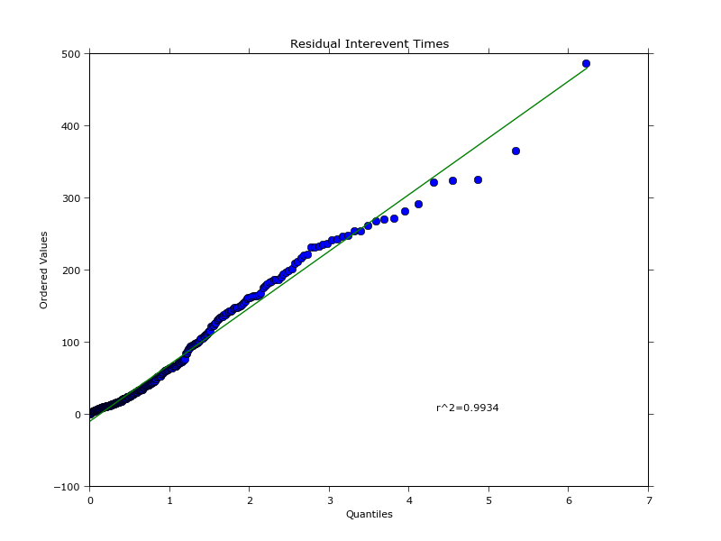
 It is possible, however, to extract the intensity at the same epochs as when it was recorded for the empirical data and then compute the residuals. This enables you to find quantiles of both empirical and fitted data and plot them against each other thus generating the QQ plot:
""" GENERATE THE QQ PLOT. """
" Process the data and compute the quantiles. "
orderStatistics=[]; orderStatistics2=[];
for i in range( empirical_1min.values.size ): # Make sure all the NANs are filtered out and both arrays have the same size.
    if not np.isnan( empirical_1min.values[i] ):
        orderStatistics.append(empirical_1min.values[i])
        orderStatistics2.append(conditionalIntensities[i])
orderStatistics = np.array(orderStatistics); orderStatistics2 = np.array(orderStatistics2);

orderStatistics.sort(axis=0) # Need to sort data in ascending order to make a QQ plot.    orderStatistics is a column vector.
 orderStatistics2.sort()

 smapleQuantiles=np.zeros( orderStatistics.size ) # Quantiles of the empirical data.
 smapleQuantiles2=np.zeros( orderStatistics2.size ) # Quantiles of the data fitted using the Hawkes process.
for i in range( orderStatistics.size ):
    temp = int( 100*(i-0.5)/float(smapleQuantiles.size) ) # (i-0.5)/float(smapleQuantiles.size) th quantile. COnvert to % as expected by the numpy  function.
    if temp<0.0:
        temp=0.0 # Avoid having -ve percentiles.
    smapleQuantiles[i] = np.percentile(orderStatistics, temp)
    smapleQuantiles2[i] = np.percentile(orderStatistics2, temp)

" Make the quantile plot of empirical data first. "
fig2 = matplotlib.pyplot.figure()
ax2 = fig2.gca(aspect="equal")

fig2.suptitle(r"$Quantile\ plot$", fontsize=20)
ax2.grid(True)
ax2.set_xlabel(r'$Sample\ fraction\ (\%)$',fontsize=labelsFontSize)
ax2.set_ylabel(r'$Observations$',fontsize=labelsFontSize)
matplotlib.rc('xtick', labelsize=ticksFontSize)
matplotlib.rc('ytick', labelsize=ticksFontSize)

distScatter = ax2.scatter(smapleQuantiles, orderStatistics, c='blue', marker='o') # If these are close to the straight line with slope line these points come from a normal distribution.

ax2.plot(smapleQuantiles, smapleQuantiles, color='red', linestyle='solid', marker=None, markerfacecolor='red', markersize=12)
normalDistPlot = matplotlib.lines.Line2D([],[],color='red', linestyle='solid', marker=None, markerfacecolor='red', markersize=12)

fig2.legend([normalDistPlot, distScatter], [r'$Normal\ distribution$', r'$Empirical\ data$'])
 matplotlib.pyplot.show()

" Make a QQ plot. "
fig3 = matplotlib.pyplot.figure()
ax3 = fig3.gca(aspect="equal")

fig3.suptitle(r"$Quantile\ -\ Quantile\ plot$", fontsize=20)
ax3.grid(True)
ax3.set_xlabel(r'$Empirical\ data$',fontsize=labelsFontSize)
ax3.set_ylabel(r'$Data\ fitted\ with\ Hawkes\ distribution$',fontsize=labelsFontSize)
matplotlib.rc('xtick', labelsize=ticksFontSize)
matplotlib.rc('ytick', labelsize=ticksFontSize)

distributionScatter = ax3.scatter(smapleQuantiles, smapleQuantiles2, c='blue', marker='x') # If these are close to the straight line with slope line these points come from a normal distribution.

ax3.plot(smapleQuantiles, smapleQuantiles, color='red', linestyle='solid', marker=None,     markerfacecolor='red', markersize=12)
normalDistPlot2 = matplotlib.lines.Line2D([],[],color='red', linestyle='solid',  marker=None, markerfacecolor='red', markersize=12)

fig3.legend([normalDistPlot2, distributionScatter], [r'$Normal\ distribution$', r'$Comparison\ of\ datasets$'])
matplotlib.pyplot.show()
This generates the following plots:

The quantile plot of empirical data isn't exactly the same as in the article, I'm not sure why as I'm not great with statistics. But, from programming standpoint, this is how you can go about all this.