4

I've implemented a multiline label by extending a JTextPane. The constructor sets various properties to make it look like a label, including disabling any border/setting margins to 0 which works well.

Environment:

  • using jgoodies-looks-2.6.0
  • setting the com.jgoodies.looks.windows.WindowsLookAndFeel L&F (also tested with javax.swing.plaf.metal.MetalLookAndFeel, same problem)
  • Windows 8 x64
  • Java SE 1.7

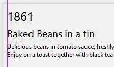
When I increase the font size, the first letter sometimes has "blank space"/a margin of ~1px at 19pt (probably increasing with font size) to its left. This happens at least for letters B, F and L, but certainly not for A. Here's an example:

enter image description here enter image description here

On the left you can clearly see that the layout looks broken with the title having this weird margin on the left. Please note that the first line with the number (1861) is a regular JLabel.

Zooming in confirms this (the pink line is for illustration):

enter image description here enter image description here

So from what I can see the typesetting is improper.

Can this be considered a bug in swing? Is there a way to solve this? Eg. is there an easy and clean (ie. not paint()-ing) way to have fine-grained control over typographic features in swing in this context?

EDIT:

This is similar to what I would expect:

enter image description here enter image description here

vs before:

enter image description here enter image description here

mKorbel
  • 109,525
  • 20
  • 134
  • 319
bfour
  • 160
  • 11
  • 1
    FYI JLabel supports HTML, so you produce a multi lined JLabel using a JLabel and wrapping the text in HTML, for [example](http://stackoverflow.com/questions/14737810/jlabel-show-longer-text-as-multiple-lines/14738193#14738193). Also, I don't see any issue. This is within (my) exceptions of anti aliasing and individual font metrics. You could try different fonts and see what happens – MadProgrammer Aug 02 '14 at 22:04
  • You should also realise, that you are not using a fixed width font, so each character has its own metrics, font designers will often add spacing around characters like 1 to make them look nicer within the context of other characters – MadProgrammer Aug 02 '14 at 22:09
  • The two L&Fs I tried do set different fonts, so it's not about this specific one at least. The problem there is that I am quiet happy with the jgoodies L&F so I'd like to keep it, but in my eyes the typesetting doesn't look right. – bfour Aug 02 '14 at 22:15
  • So, I take it you didn't bother taking a look at the example and simply jumped to conclusions instead...? – MadProgrammer Aug 02 '14 at 22:17
  • Could you aso provide an example of what you expect, perhaps rendered in something out side of Java? – MadProgrammer Aug 02 '14 at 22:27
  • Sorry for that and thx for the suggestion (+1). I've implemented that component quite some time ago and just remembered I concluded the HTML approach didn't suffice. I guess it's that it doesn't allow the text to be centered while having auto-linebreaks (using the StyledDocument of the JTextPane for that, but I suppose something can be done with text-align: center)? – bfour Aug 02 '14 at 22:31
  • I've made an edit to illustrate what I would expect (the vertical line of the B is now rendered a fraction of a pixel too thin as the alpha "shadows" to the left and right would have to be adjusted as well, which I skipped for this illustration). – bfour Aug 02 '14 at 22:41
  • What I'm curious to knowing is if this is an issue with java or the font, attempt to achieve the same result in other applications for example – MadProgrammer Aug 02 '14 at 23:13
  • I've played around with this a little bit, sadly realizing that eg. Word and LateX-PDFs as well as HTML rendered by Windows Help (I guess IE) show the same issue, but again it's about the difference in the font size as the gap on the left increases proportionally (that's why in most cases I guess one doesn't notice) and the factor depends on the font type (haven't found any with factor 1). I've also found that the letter Æ has the opposite "problem" by being placed more to the left, but in that case at least it looks balanced. Conclusion: minimize font size differences and avoid certain fonts. – bfour Aug 04 '14 at 22:28
  • Found two fonts seemingly without this effect: Times New Roman and Minion Pro. So both serif fonts, although eg. Cambria has a bit more padding. I don't expect to find any non-serif fonts, as indeed this effect actually makes sense in most cases, as the perceived "center of weight" of the characters rather than the left-most pixel has to be aligned. *However*, I find that in specific scenarios such as this one, this heuristic approach doesn't fit. A more advanced programmatic way of typesetting (involving context analysis) would be required. – bfour Aug 05 '14 at 03:06
  • The other issue now is, you're going to have to try this on at least a version of Mac, Windows and Linux, cause they all render text slightly differently...you may be over thinking this a little ;) – MadProgrammer Aug 05 '14 at 03:10

1 Answers1

1

If you look at your screenshot here:

The image

And in particular look at the 1861...you can see that there is a larger space on both sides of the 1. In particular the gap between 1 and 8 and between 6 and 1 is larger than that between 8 and 6.

That is just how the layout has been arranged on that particular font. They clearly thought that a 1 was getting pushed too close to the characters around it and so they added more space on both sides.

Your options to "fix" this are limited.

  1. Use a different font.
  2. Render the line to an image, scan for empty columns, shuffle it left
  3. Build in a few manual hacks for common characters (i.e. if string starts with 1 then shuffle the line left 1 pixel
  4. Indent or outdent the title deliberately so it's not lined up and then the offset is no longer visible.

i.e.

1861
    Baked Beans
    dkjfdf skdfjsdlf
Tim B
  • 40,716
  • 16
  • 83
  • 128