First off all, I've searched on StackOverflow, but I couldn't find a solution which fully works for me.
I have a div element and in there I have 2 other div elements that needs to be positioned next to each other.
The first div has a fixed with, while the second div should take the remaining screen space.
Thanks to StackOverflow already, I've found the following:
.element {
    margin-bottom:15px;
    height: 40px;
}
.element div {
    vertical-align: top;
    height: 40px;
}
.element div:first-child {
    float: left;
    width: 100px;
    background-color: red;
}
.element div:last-child {
    margin-left: 100px;
    background-color: green;
}
<div class="container">
    <div class="element">
        <div>col 1</div>
        <div>col 2</div>
    </div>
</div>
This gives me the following output for the HTML:
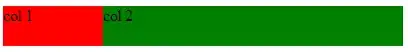
However, when I place an input element in the "col2", the input element is pushed outside the boundaries, see image below:
It's driving me nuts that I don't find a solution here.
I've creates a JsFiddle also.