I have a plot produced with the following code:
plot <- ggplot(lmeans, aes(x=Day, y=value*100, group=variable, colour=variable)) +
  geom_point(aes(shape=variable), size=4) +
  geom_line(aes(linetype=variable), size=1.5) +
  ggtitle(paste("Nausea and Vomitting Frequencies by Day for", group_name)) +
  ylab("Frequency (%)") +
  ylim(0, 40) +
  theme(legend.title=element_blank()) +
  theme(legend.justification = c(1, 1), legend.position = c(1, 1))
Which results in a plot like so:

However I would like the days to be discretely labeled rather than being given as a continuous axis. When I try to achieve this by adding scale_x_discrete(), I get the following result:

In which the 'margins' on the x-axis are altered in an unsightful manner. How can I avoid these unsightly changes?
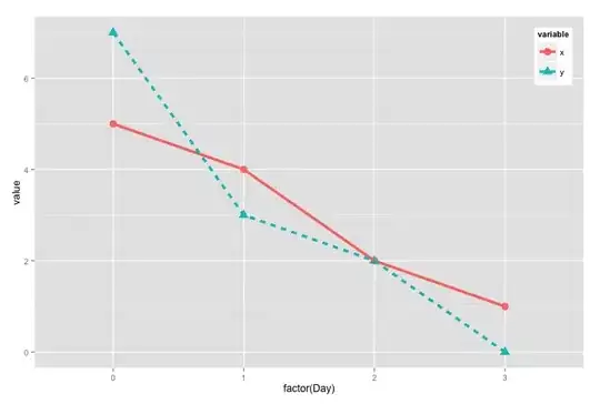
Here's a minimal example for reproduction:
require(ggplot2)

lmeans <- data.frame(Day=c(0,1,2,3,0,1,2,3),
                     variable=c("x","x","x","x","y","y","y","y"),
                     value=c(5,4,2,1,7,3,2,0))

plot <- ggplot(lmeans, aes(x=Day, y=value, group=variable, colour=variable)) +
  geom_point(aes(shape=variable)) +
  geom_line(aes(linetype=variable)) +
  ylim(0, 10) +
  scale_x_discrete() +
  theme(legend.justification = c(1, 1), legend.position = c(1, 1))

print(plot)
Which produces this: