14

I'm trying to combine multiple density plots with overlay. ggplot and geom_density do the job, but the densities are stacked on top of each other.This is overlaid but not 3d

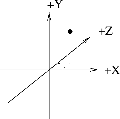
ggplot(all.complete, aes(x=humid_temp)) +  
  geom_density(aes(group=height, colour=height, fill=height.f, alpha=0.1)) + 
  guides(fill = guide_legend(override.aes = list(colour = NULL))) +
  labs(main="Temperature by Height", x="Temperature", y="Density")

Something similar to this is what I'm trying to achieve: Density? with 3d overlay

In my case, the years would be substituted by height.

Thanks!!!

rafaelvalle
  • 6,683
  • 3
  • 34
  • 36
  • And after that, can we see a set of contourplots arranged pseudo-perpendicularly to a time axis? No, really. I'm not being my usual sarcastic self here. I think this one is done in the Lattice book, Figure 14.3 (but not with the pseudo 3D arrangement.) – IRTFM Sep 23 '14 at 00:49
  • 1
    `ggplot` doesn't do 3D graphics. If you want the lower graph, you'll have to use a different package. You could try facets, but with so many groups that might not be informative. – jlhoward Sep 23 '14 at 03:48

3 Answers3

16

The chart you are looking for is called a ridgelineplot. Try the ggridges package with ggplot2.

An example with temporal data:

library(viridis)
ggplot(lincoln_weather, aes(x = `Mean Temperature [F]`, y = `Month`, fill = ..x..)) +
  geom_density_ridges_gradient(scale = 3, rel_min_height = 0.01, gradient_lwd = 1.) +
  scale_x_continuous(expand = c(0.01, 0)) +
  scale_y_discrete(expand = c(0.01, 0)) +
  scale_fill_viridis(name = "Temp. [F]", option = "C") +
  labs(title = 'Temperatures in Lincoln NE',
       subtitle = 'Mean temperatures (Fahrenheit) by month for 2016\nData: Original CSV from the Weather Underground') +
  theme_ridges(font_size = 13, grid = TRUE) + theme(axis.title.y = element_blank())

Here is the result :

enter image description here

Gang Liang
  • 793
  • 1
  • 9
  • 19
4

I know this old, but other people with this kind of issue may stumble upon this post, so I thought I'd add a recently discovered solution. There is a new package that was just created to do exactly this type of visualization and it is called ggjoy and is designed to work with the ggplot2 system.

All of the info can be found here: https://github.com/clauswilke/ggjoy

Hope this can be of help!

Daniel
  • 72
  • 2
2

As @jlhoward mentioned, using facets could work, or using subplots, but either option doesn't scale well with a large number of groups. Consider using an ecdf plot instead.

Without the data in your object all.complete, I can't recreate your plot, so here is a simplified example:

library(ggplot2)

ggplot(iris, aes(x = Sepal.Length)) +  
  geom_density(aes(group = Species, 
                   colour = Species, 
                   fill = Species),
               alpha = 0.2)

density plot

For more than a couple groups, I've found ecdf plots to be much easier to interpret. To make a similar plot:

 ggplot(iris, aes(x = Sepal.Length)) +  
  stat_ecdf(aes(color = Species))

ecdf plot

You can have dozens of ecdf plots on the same plot, and since they are just lines they are still separate enough to view. Density plots or histograms would be too overlapped, as in your example.

This is the blog post that got me to start using ecdf plots and has more info about them: http://allendowney.blogspot.com/2013/08/are-my-data-normal.html

Eric Watt
  • 3,180
  • 9
  • 21