4

I want to arrange several ggplot2-plots. It works perfectly fine for histograms, with this code:

df<-NULL
df$Temp<-rnorm(mean=20,sd=3,n=100) 
df$Modul<-rep(seq(1,4,1),25)
df<-as.data.frame(df)   

qplot(Temp, data=df, geom="histogram",binwidth=1)+
    facet_grid(Modul ~ .)

enter image description here

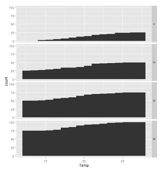
Now that I want cumulative histograms, I followed this recipy. But it gives me wrong sums:

qplot(Temp, data=df, geom="histogram",binwidth=1)+
geom_histogram(aes(y=cumsum(..count..)),binwidth=1)+
facet_grid(Modul ~ .)

enter image description here

Although I roughly understand what is happening, I am not expert enough to solve this. Any hints?

Best regards, Jochen

Community
  • 1
  • 1
Jochen Döll
  • 383
  • 3
  • 11

3 Answers3

5

It is probably a problem of order here : I think you can't do faceting before applying a function to the internal generated variables (here by stat "bin" engine). So as mentioned in others answers you need to do the computation outside.

I would :

  1. use geom_histogram to get the create the data by the statistical internal engine
  2. Use the generated data to compute the cumulative count by group outside of ggplot2.
  3. plot the bar plot of the new data

enter image description here

p <- ggplot(df,aes(x=Temp))+
  geom_histogram(binwidth=1)+facet_grid(Modul~.)

dat <-  ggplot_build(p)$data[[1]]
library(data.table)
ggplot(setDT(dat)[,y:=cumsum(y),"PANEL"],aes(x=x)) +
  geom_bar(aes(y=y,fill=PANEL),stat="identity")+facet_grid(PANEL~.) +
  guides(title="Modul")
agstudy
  • 119,832
  • 17
  • 199
  • 261
2

My understanding is that there is an intended separation between plotting and calculating statistics. So while ggplot can often call simple statistical calculations, this is an example where it's not so easy. With this view, it makes sense to precalculate the statistics of interest.

Here's an example using ddply to precalculate your cumulative histogram:

df <- ddply(df,.(Modul),mutate,count=rank(Temp))
ggplot(df)+geom_ribbon(aes(x=Temp,ymax=count),ymin=0)+facet_grid(Modul~.)

which gives a reasonable graph with an informative but ragged right edge. cumulative histogram by group

PeterK
  • 1,185
  • 1
  • 9
  • 23
1

The best would be to transform the data beforehand and then plot it. Since "cumulative histogram" is not a common chart type, ggplot does not (in my knowledge) have a built in way to deal with it.

This is how I would go about it:

library(ggplot2)
library(dplyr)

# generate counts by binned Temp and Modul, save it as a new data.frame
# trunc() is a quick fix, you can use any aggregating/binning function
df.counts <- as.data.frame(table(trunc(df$Temp), df$Modul))
names(df.counts) <- c("Temp", "Modul", "count")  ## fix names

# generate grouped cumsum using dplyr, you can also use data.table for this
df.counts <- df.counts %>% group_by(Modul) %>% mutate(cumulative = cumsum(count))

# use a barplot to get what you want (geom_histogram is essentially the same)
ggplot(df.counts) + 
  geom_bar(aes(x=Temp, y=cumulative), stat="identity", width=1) + 
  facet_grid(Modul~.)

I hope that helps.

ilir
  • 3,236
  • 15
  • 23