I'm wondering why my TextView size is different for different devices even if I set the text size in sp or dp.
-
1What do you mean by the size is different? What units are you using to do the actual measurement? Inches, dps, pixels, or something else? – Bryan Herbst Sep 30 '14 at 13:41
-
1on which devices did you tested your code ??? – Umair Sep 30 '14 at 13:44
-
do use the following layout files. layout-mdpi, layout-hdpi, layout-xhdpi,layout-xxhdpi,layout-sw600dp,layout-sw720dp . And appropriate text size in each layouts or follow styles ? – Dhinakaran Thennarasu Sep 30 '14 at 13:46
-
I can know that the size is different by the ratio of the textview to the screen resolution – migs Sep 30 '14 at 13:47
-
first I tested in the Android SDK emulator (480x800) then I tested in bluestacks emulator (1366x768). if possible i do not want to modify layout files. I'm getting the ScaledDensity of the DisplayMetrics then maintaining the value of sp and dp. – migs Sep 30 '14 at 13:52
2 Answers
This post explains the difference:
dip/dp (density independent pixels):
an abstract unit that is based on the physical density of the screen. These units are relative to a 160 dpi screen, so one dp is one pixel on a 160 dpi screen. The ratio of dp-to-pixel will change with the screen density, but not necessarily in direct proportion. Note: The compiler accepts both "dip" and "dp", though "dp" is more consistent with "sp".
sp (scale independent pixels):
like the dp unit, but it is also scaled by the user's font size preference. It is recommend you use this unit when specifying font sizes, so they will be adjusted for both the screen density and user's preference.
And this post explains why dp and sp values may differ:
The dp has constant ratio transition to pixels:
dp = px * ratio. Ratio will never change on any particular device.The sp has scalable ratio:
sp = px * ratio * scale. Ratio never changes, but scale is user configurable. This scale can be used by people who need larger font sizes, for example, to use device more comfortably.
It's not different for different devices but it appears to be small while viewing from layout file.
Here is a example -
Viewing from 2.7" QVGA screen (in Layout file) -

Viewing from 10.1" WXGA (Tablet) screen (in Layout file) -

But this is only due to limited amount of space available on your computer's monitor screen. But on viewing from a real devices, the size of text will be the same.
There is a large amount of space available on a tablet's screen so while viewing the tablet layout on layout on Computer screen, the size of tablet's screen is reduced in size to fit the computer monitor's screen.
But in case of a device with small screen, there is a lot of space available on your computer monitor's screen as compared to the device's screen size, so the device's screen is increased in size on PC's layout file to fit properly.
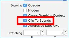
If you want to view actual size of the text on tab and small screen device, click on the icon as given in image below -

This button - 
The size of tab in layout file will increase in size. While size of device with small may decrease in size (it might not decrease if it's already of default size).
Results (tablet) -

A way to deal with it -
It's our job to occupy the large space on tab. So to do that, you can create different layout files for fitting different screen sizes.
Here are layout file names for tab screens-
layout-sw600dp drawable-sw600dp  //For 7" tab

layout-sw720dp drawable-sw720dp  //For 10" tab
- 5,646
- 7
- 36
- 58