3

I was wondering if anyone can help me with this asymmetrical fluid grid I have, but I cannot use Javascript or modify html, it must be CSS only

enter image description here

The html code is this:
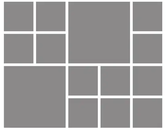
<ul>
  <li class="image"></li>
  <li class="image"></li>
  <li class="image"></li>
  <li class="image"></li>
  <li class="image"></li>
  <li class="image"></li>
  <li class="image"></li>
  <li class="image"></li>
  <li class="image"></li>
  <li class="image"></li>
  <li class="image"></li>
  <li class="image"></li>
  <li class="image"></li>
  <li class="image"></li>
</ul>

And the CSS is something like this:

ul {
width:1200px;
padding:10px;
}
li.image {
float: left;
margin: 10px;
overflow: hidden;
width:220px;
height:220px;
}
Djensen
  • 1,337
  • 1
  • 22
  • 32
CaptainBlue
  • 33
  • 1
  • 4
  • "Fluid" means - image boxes dimensions aren't static (220x220px)? Should grid be responsive? If not, i got solution... – sinisake Oct 12 '14 at 09:00
  • Yes, you are right, my mistake. I need to be responsive, but i will do it width media queries because the bigger item is another as the device/resolution is smaller. I mean, the last 2 boxes of the first row for example are not displayed in smaller resolution (that mean that the bigger items are not the same number). Thanks for take the time to answer me! i'm interested in your solution, even if it is a non responsive one. – CaptainBlue Oct 12 '14 at 09:05

2 Answers2

1

If you will use media queries, this could help, hopefully:

HTML:

<ul>
  <li class="image"></li>
  <li class="image"></li>
  <li class="image2"></li>
  <li class="image"></li>
  <li class="image"></li>
  <li class="image fix1" ></li>
  <li class="image2"></li> 
  <li class="image"></li> 
  <li class="image"></li>
  <li class="image"></li>
  <li class="image"></li>
  <li class="image"></li>
  <li class="image"></li>
  <li class="image fix2"></li>

</ul>

CSS:

ul {
width:1200px;
padding:10px;
}
li.image {
float: left;
margin: 10px;
overflow: hidden;
width:220px;
height:220px;
background-color:black;
}
li.image2 {
float: left;
margin: 10px;
overflow: hidden;
width:460px;
height:460px;
background-color:black;
}
li.fix1 {
    margin-top:-230px;
}
li.fix2 {
    margin-top:-710px;
    margin-left:250px;
}

Demo: http://fiddle.jshell.net/upwxrga3/show/

EDIT: Updated CSS, because HTML can't be changed:

ul {
width:1200px;
padding:10px;
}
li.image {
float: left;
margin: 10px;
overflow: hidden;
width:220px;
height:220px;
background-color:black;
}


ul li:nth-child(3), ul li:nth-child(7) {
   float: left;
margin: 10px;
overflow: hidden;
width:460px;
height:460px;
background-color:black;
} 

ul li:nth-child(6) {
    margin-top:-230px;
}
ul li:nth-child(14) {
    margin-top:-710px;
    margin-left:250px;
}
sinisake
  • 11,240
  • 2
  • 19
  • 27
  • Thanks Nevermind, i forgot to mention that i can not modify html because the code is generated automatically through a javascript file that that is in a server. This is like a gallery widget, but i can only style the result, i can not modify anything else. May be i can use nth-child... what you think? – CaptainBlue Oct 12 '14 at 09:16
  • Thanks Nevermind!!! is working in the fiddle. i'll test i my local file and i answer again. Is there any thank button to thank you or a way to add reputation to you? i do not know this things about stackoverflow... i'll read the help. – CaptainBlue Oct 12 '14 at 09:28
  • Is working like a charm!! Thank you againg for take time to answer me. I'll read about the way to thank you with reputation or votes. – CaptainBlue Oct 12 '14 at 09:32
1

I tried on this and maybe work for you also I made it as below:

this is the CSS:

*{box-sizing: border-box;}

html{height: 100%;}

body{margin: 0;}

.container{
  margin: 0 auto;
  width: 970px;
}

.row{
  width: 100%;
  margin-right: -15px;
  margin-bottom: 20px;
  margin-left: -15px;
}

.container > .row:first-child{
  margin-bottom: 0;
}

.row:before, .row:after{
  content: " ";
  display: table;
}
.row:after{clear: both;}

[class*=column-]{
  float: left;
  min-height: 150px;
  padding: 15px;
  position: relative;
}

[class*=column-] [class*=column-]{
  background-color: lightgrey;
  background-clip: content-box;
  padding: 0;
  width: 100%;
}

[class*=column-] .row{
  margin: 0 0 20px;
}

[class*=column-] .row:last-child{
  margin: 0;
}

.column-1{width: 20%;}
.column-2{
  background-color: lightgrey;
  background-clip: content-box;
  height: 350px;
  width: 40%;
}
<!DOCTYPE html>
<html lang="en">
<head>
 <meta charset="utf-8">
 <title>Asymmetrical Fluid Gride</title>
</head>
<body>
 <div class="container">
  <div class="row">
   <div class="column-1">
    <div class="row">
     <div class="column-1"></div>
    </div>
    <div class="row">
     <div class="column-1"></div>
    </div>
   </div>
   <div class="column-1">
    <div class="row">
     <div class="column-1"></div>
    </div>
    <div class="row">
     <div class="column-1"></div>
    </div>
   </div>
   <div class="column-2"></div>
   <div class="column-1">
    <div class="row">
     <div class="column-1"></div>
    </div>
    <div class="row">
     <div class="column-1"></div>
    </div>
   </div>
  </div>
  <div class="row">
   <div class="column-2"></div>
   <div class="column-1">
    <div class="row">
     <div class="column-1"></div>
    </div>
    <div class="row">
     <div class="column-1"></div>
    </div>
   </div>
   <div class="column-1">
    <div class="row">
     <div class="column-1"></div>
    </div>
    <div class="row">
     <div class="column-1"></div>
    </div>
   </div>
   <div class="column-1">
    <div class="row">
     <div class="column-1"></div>
    </div>
    <div class="row">
     <div class="column-1"></div>
    </div>
   </div>
  </div>
 </div>
</body>
</html>
you can run it in here by pressing "Run code snippet" hope to solve your problem...
MNR
  • 727
  • 1
  • 9
  • 23
  • Thanks Muhammad for your answer! Unfortunately i can not edit or modify the HTML code, only css. But thanks again. – CaptainBlue Oct 12 '14 at 10:02
  • Okay no problem but it was not mentioned in your question you just said than I can not use JavaScript which means that CSS and HTML are good. – MNR Oct 12 '14 at 10:08
  • I mentioned in the comment below the question, in a comment. But i just modified the original question to fix that. Thanks. – CaptainBlue Oct 12 '14 at 20:37