48

I'm using Datatables.net latest, with datatables and bootstrap. I suppose my question is: What does Datatables Responsive Bootstrap use to detect overflow, because it clearly isn't the parent width.
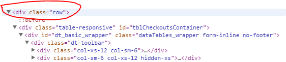
Here is my result: enter image description here

It's a pretty straight forward problem. If I reduce the width of my window 1 more pixel the column will finally collapse. If I then expand it, it returns to this state. I would like to prevent overflow from the parent bootstrap panel. I've removed the bootstrap grid divs (row/col-xs-12, etc) to eliminate potitial problems, but once this is resolved (or I better understand the problem) I intend to utilize the bootstrap grid system as well.

Here is a plunkr that perfectly replicated the problem (collapse the run view): http://plnkr.co/edit/tZxAMOHmdoHNHrzhP5tR?p=preview

<!DOCTYPE html>

<html>
<head>
    <title>Tables - PixelAdmin</title>
    <link rel="stylesheet" href="https://maxcdn.bootstrapcdn.com/bootstrap/3.2.0/css/bootstrap.min.css"/>
    <link rel="stylesheet" href="http://cdn.datatables.net/plug-ins/a5734b29083/integration/bootstrap/3/dataTables.bootstrap.css"/>
    <link rel="stylesheet" href="http://cdn.datatables.net/responsive/1.0.2/css/dataTables.responsive.css"/>
    <style>
        body {
            font-size: 140%;
        }

        table.dataTable th,
        table.dataTable td {
            white-space: nowrap;
        }
    </style>
</head>

<body style="padding-top: 40px;">

<div class="panel panel-primary" style="margin: 51px; padding: 0;">
    <div class="panel-heading">
        <h3 class="panel-title">Panel title</h3>
    </div>
    <div class="panel-body" style="padding: 0;">
        <div style="width: 100%; border: 1px solid red;">
            <table id="example" class="table table-striped table-hover dt-responsive" cellspacing="0" width="100%">
                <thead>
                <tr>
                    <th>Name</th>
                    <th>Position</th>
                    <th>Office</th>
                    <th>Extn.</th>
                    <th>Start date</th>
                    <th>Salary</th>
                </tr>
                </thead>
            </table>
        </div>
    </div>
</div>

<script src="//code.jquery.com/jquery-1.11.1.min.js"></script>
<script type="text/javascript" language="javascript" src="//cdn.datatables.net/1.10.3/js/jquery.dataTables.min.js"></script>
<script type="text/javascript" language="javascript" src="//cdn.datatables.net/responsive/1.0.2/js/dataTables.responsive.js"></script>
<script type="text/javascript" language="javascript" src="//cdn.datatables.net/plug-ins/a5734b29083/integration/bootstrap/3/dataTables.bootstrap.js"></script>

<script>
    $(document).ready(function () {
        $('#example')
                .dataTable({
                    "responsive": true,
                    "ajax": 'data.json'
                });
    });
</script>

</body>
</html>
nograde
  • 2,268
  • 5
  • 22
  • 29
  • 1
    For me this answer solved the problem: http://stackoverflow.com/a/1544925/5921762 – MDummy Apr 17 '16 at 20:37
  • I'm having the same problem now https://stackoverflow.com/questions/44586271/datatable-responsive-width-more-than-parent-width. Have you found a solution? – Nmaster88 Jun 17 '17 at 12:49

10 Answers10

74

Add Div with class "table-responsive" before table start and delete width = "100%" from table tag ,

<div class="panel panel-primary" style="margin: 50px;">
<div class="panel-heading">
    <h3 class="panel-title">Panel title</h3>
</div>
<div class="panel-body">
    <div style="width: 100%; padding-left: -10px; border: 1px solid red;">
    <div class="table-responsive">  <-- add this div
        <table id="example" class="table table-striped table-hover dt-responsive display nowrap" cellspacing="0"> <-- remove width from this
            <thead>
            <tr>
                <th>Name</th>
                <th>Position</th>
                <th>Office</th>
                <th>Extn.</th>
                <th>Start date</th>
                <th>Salary</th>
            </tr>
            </thead>
        </table>
        </div>
    </div>
</div>

coDe murDerer
  • 1,858
  • 4
  • 20
  • 28
  • 1
    Adding table-responsive definitely helped. removing width=100% from the table causes many problems. I've added overflow:hidden to the container to prevent the columns from overflowing, but I'm still seeing a large portion of columns getting hidden before they collapse. – nograde Oct 22 '14 at 18:25
  • I found the solution here http://stackoverflow.com/questions/604933/jquery-datatables-control-table-width?rq=1 –  Oct 18 '15 at 00:24
  • this is a solution for normal table..not working in datatables – Gaurav Aggarwal May 03 '16 at 07:18
  • Removing width from table seems to give more problems than it solves. And wrapping the table in a div i don't now if that's the best especially if you have things that go out of table like a dropdown of options. – Nmaster88 Jun 17 '17 at 12:52
  • autoWidth: false; set this property while rendering the datatable, this fixed my issue – hemanth gali Nov 08 '21 at 08:03
22

i know this post is old, for anyone trying to get this done simply do this

<table id="example" class="display" cellspacing="0" width="100%"></table>

add width="100%" it should take it and make it responsive without any configuration of such

check out Fiddle Working

Theophilus Omoregbee
  • 2,463
  • 1
  • 22
  • 33
10

You need to include responsive css and js

https://cdn.datatables.net/responsive/2.2.3/css/responsive.bootstrap.css
https://cdn.datatables.net/responsive/2.2.3/js/dataTables.responsive.js

 <table class="table table-striped table-bordered dataTable display" cellspacing="0" width="100%">
</table>

This is working for me. One thing always keep in mind that you have to include jquery and datatable css and js.

$('.dataTable').dataTable({
         "responsive": true,

    });
Sumit Kumar Gupta
  • 2,132
  • 1
  • 22
  • 21
  • Adding https://cdn.datatables.net/responsive/2.2.7/css/responsive.dataTables.min.css, and https://cdn.datatables.net/responsive/2.2.7/js/dataTables.responsive.js worked for me. I wasn't using bootstrap.`` `` – Sahil Singh May 28 '21 at 16:37
9

For me the problem got fixed when I put the table container div inside a bootstrap row div.

<div class="row">
 <div class="table-responsive">
   ... //table here
 </div>
</div>

The reason for this was that datatables bootstrap version was adding some col-* to toolbar (in my case) which were falling as direct children under another parent col-. The col- ideally should be children of row rather than col (as far as I understand).enter image description here

ZedBee
  • 2,320
  • 7
  • 39
  • 61
6

I know this post is old, but if someone is having this problem, try the following:

After updating the content of the DataTable use this code (dt_table is my instance of a Responsive DataTable):

dt_table.draw();
dt_table.columns.adjust().responsive.recalc();

More info: https://datatables.net/reference/api/responsive.recalc()

Erick Elizondo
  • 188
  • 3
  • 13
  • 1
    I had an issue with the table overflowing to the right before it would eventually collapse. Adding a tableElement.DataTable().responsive.recalc() call after I bound my data to the dataTable seemed to fix that. I was adding rows to the table with DataTable().row.add(value).draw() previously. I think somehow my technique was not automatically recalculating collapse widths. – Brandon Barkley Jun 11 '19 at 16:05
  • Marry me! LOL, thank you so much. Struggling hours and this is the only solution that worked for me. I was also using `DataTable().row.add(value).draw()` – Harry Oct 29 '21 at 21:34
1

In my case I found that hiding the table or it's container on page load using CSS display:none was avoiding the responsive behaviour.

The (unpreferred) solution is to hide the table or it's container by JavaScript instead of CSS.

cem
  • 11
  • 1
1

What worked for me is placing the table in a container with a custom class dtable-container

HTML

 <div class="dtable-container">
  <table id="datatable" class="table table-striped table-bordered">

  </table>
 </div>

CSS/LESS

.dtable-container {
    max-width: 100% !important;


    table {
        white-space: nowrap !important;
        width:100%!important;
        border-collapse:collapse!important;
    }
}


Ali Kleit
  • 3,069
  • 2
  • 23
  • 39
1

Updating from DataTables version 1.10.12 to 1.10.8 I encountered a similar issue.

An accessibility scan had flagged the width="100%" and cellspacing attributes negatively so I removed them from the html and switch to a css selector in a separate file.

Tables resizing began to fail and started triggering horizontal scroll bars. I noticed the the element was having it's style automatically set to style="width: px;".

I had to set the selector in the css to width: 100% !important. The border-spacing attribute did not require this.

I had seen other answers where the 100% width had been mentioned but what I didn't realize was that in needed the "!important" tag.

I was never able to determine what triggered the change but we're using jquery.dataTables.js and dataTables.responsive.js along with bootstrap.

Jorge Diaz
  • 101
  • 1
  • 3
0

My case is just like cem, but in my case i solved by adding setTimeout to wait a while (around 200 miliseconds) to set datatable

Six
  • 1
0

Html

 <!--Modal-->
 <div id="_modal" class="modal fade" tabindex="-1" role="dialog" aria-labelledby="_modal"
     aria-hidden="true">
     <div class="modal-dialog modal-sm modal-dialog-centered " role="document">
         <div class="modal-content">
             <div class="modal-header">
                    Title
                 <button type="button" class="close" data-dismiss="modal" aria-label="Close">
                     <span aria-hidden="true">&times;</span>
                 </button>
             </div>
             <div class="modal-body" >
                 <!--Datatable-->
                 <table id="_datatable" class="table table-striped table-xl responsive" style="width:100%">
                    <thead>
                        <tr>
                            <th>Field 1</th>
                            <th>Field 2</th>
                            <th>Field 3</th>
                            <th>Field 4</th>
                            <th>Field 5</th>
                            <th>Field 6</th>
                            <th>Field 7</th>
                            <th>Field 8</th>
                            <th>Field 9</th>
                            <th>Field 10</th>
                        </tr>
                    </thead>
                    <tbody>
                       <tr>
                            <th>Data 1</th>
                            <th>Data 2</th>
                            <th>Data 3</th>
                            <th>Data 4</th>
                            <th>Data 5</th>
                            <th>Data 6</th>
                            <th>Data 7</th>
                            <th>Data 8</th>
                            <th>Data 9</th>
                            <th>Data 10</th>
                       </tr>
                    </tbody>
                </table>
             </div>
         </div>
     </div>
 </div>

Javascript

//Trigger when the modal open
$('#_modal').on('shown.bs.modal', function(e) {     
    $("#_datatable").DataTable().columns.adjust().responsive.recalc();
});
//Datatable configuration
$('#_datatable').DataTable({
     responsive: true,
     initComplete: function() {
         //Show datatable when load complete
         $('#_datatable').show();
     }
});

If you need to update responsive of datable when open a modal the right way is calling datatable columns adjust function when the modal opens, like the example! Hope it help someone ^^