1

I would like to ask you for the suggestions how I can edit my plot function to make my graph more clear ?

Here I show you the code which I use for plotting:

# open the pdf file
pdf(file='LSF1_PWD_GWD.pdf')
a <- c('LSF1', 'PWD', 'GWD')
rowsToPlot<-c(1066,2269,109)
matplot(as.matrix(t(tbl_alles[rowsToPlot,])),type=rep("l", length(rowsToPlot)), col=rainbow(length(rowsToPlot)),xlab = 'Fraction Size', ylab = 'Intensity')
legend('topright',a,lty=1, bty='n', cex=.75, col = rainbow(length(rowsToPlot)))
# close the pdf file
dev.off()

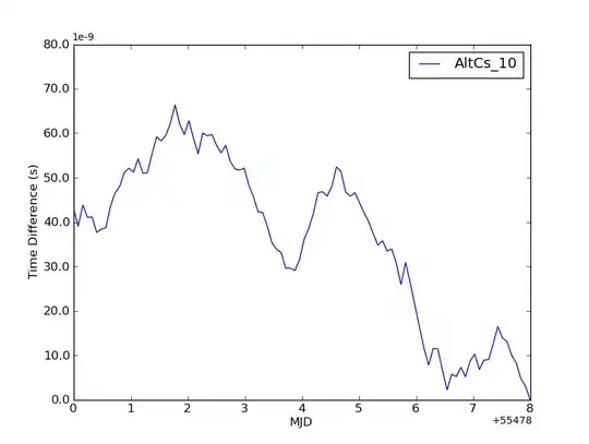
and that's how the graph looks like:

Graph

It's just a basic plot because I have no idea how to edit it. The arrow indicates three lines on one position which you can't see because they overlap... and that's the most important part of this graph for me. Maybe I shouldn't use dotted line ? How to change it ?

Data:

tbl_alles <- 
  structure(list("10" = c(0, 0, 0, 0, 0, 0),
               "20" = c(0, 0, 0, 0, 0, 0),
               "52.5" = c(0, 0, 0, 0, 0, 0),
               "81" = c(0, 0, 1, 0, 0, 0),
               "110" = c(0, 0, 0, 0, 0, 0),
               "140.5" = c(0, 0, 0, 0, 0, 0),
               "189" = c(0, 0, 0, 0, 0, 0),
               "222.5" = c(0, 0, 0, 0, 0, 0 ),
               "278" = c(0, 0, 0, 0, 0, 0),
               "340" = c(0, 0, 0, 0, 0, 0),
               "397" = c(0, 1, 0, 0, 0, 0),
               "453.5" = c(0, 0.66069369, 0, 0, 0, 1),
               "529" = c(0, 0.521435654, 0, 0, 1, 0),
               "580" = c(0, 0.437291195, 0, 0, 1, 0),
               "630.5" = c(0, 0.52204783, 0, 0, 0, 0),
               "683.5" = c(0, 0.52429838, 0, 0, 0, 0),
               "735.5" = c(1, 0.3768651, 0, 1, 0, 0),
               "784" = c(0, 0, 0, 0, 0, 0),
               "832" = c(0, 0, 0, 0, 0, 0),
               "882.5" = c(0, 0, 0, 0, 0, 0),
               "926.5" = c(0, 0, 0, 0, 0, 0),
               "973" = c(0, 0, 0, 0, 0, 0),
               "1108" = c(0, 0, 0, 0, 0, 0),
               "1200" = c(0, 0, 0, 0, 0, 0)),
          .Names = c("10", "20", "52.5", "81",
                     "110", "140.5","189", "222.5",
                     "278", "340", "397", "453.5",
                     "529", "580", "630.5", "683.5",
                     "735.5", "784", "832", "882.5",
                     "926.5", "973", "1108", "1200"),
          row.names = c("at1g01050.1", "at1g01080.1",
                        "at1g01090.1","at1g01220.1",
                        "at1g01420.1", "at1g01470.1"),
          class = "data.frame")

RowsToPlot:

> dput(tbl_alles[rowsToPlot,])
structure(list(`10` = c(0, 0, 0), `20` = c(0, 0, 0), `52.5` = c(0, 
0, 0), `81` = c(0, 0, 0), `110` = c(0, 0, 0), `140.5` = c(0, 
0, 0), `189` = c(0, 0, 0), `222.5` = c(0, 0, 0), `278` = c(0, 
0, 0), `340` = c(0, 0, 0), `397` = c(0, 0, 0), `453.5` = c(0, 
0, 0), `529` = c(0, 0, 0), `580` = c(0, 0, 0), `630.5` = c(0, 
0, 0), `683.5` = c(0, 0, 0.57073483), `735.5` = c(0, 1, 0.85691826
), `784` = c(0, 0, 0.90706982), `832` = c(1, 1, 1), `882.5` = c(0, 
0, 0), `926.5` = c(0, 0, 0), `973` = c(0, 0, 0), `1108` = c(0, 
0, 0), `1200` = c(0, 0, 0)), .Names = c("10", "20", "52.5", "81", 
"110", "140.5", "189", "222.5", "278", "340", "397", "453.5", 
"529", "580", "630.5", "683.5", "735.5", "784", "832", "882.5", 
"926.5", "973", "1108", "1200"), row.names = c("at3g01510.1", 
"at5g26570.1", "at1g10760.1"), class = "data.frame")
Shaxi Liver
  • 1,052
  • 3
  • 25
  • 47
  • 1
    Would it work if each line would be a separate plot (along [these lines](http://docs.ggplot2.org/current/facet_wrap.html))? – Roman Luštrik Nov 01 '14 at 12:16
  • They have to be on the same graph, just to show that they really overlap. How to make it visible ? – Shaxi Liver Nov 01 '14 at 12:34
  • 1
    Could you post your data `tbl_alles`? – Pop Nov 03 '14 at 11:42
  • Too big data set. I can `dput` like a `head` of it. Already done. – Shaxi Liver Nov 03 '14 at 14:39
  • Can you post dput(tbl_alles[rowsToPlot,])? –  Nov 03 '14 at 14:52
  • I would interpolate more points between the current data points. Then plot the different lines with different line styles. Then use matpoints to add one set of symbols at a time, with the symbols being offset. I believe you have 6 lines, so, the first points would be 1:end:6, second points would be 2:end:6, third points would be 3:end:6. This way, the line is drawn in the correct position, and the points are drawn in the interpolated positions, but the symbols are offset so you can see every line. –  Nov 03 '14 at 15:08
  • I added `RowsToPlot` to the first post. – Shaxi Liver Nov 04 '14 at 06:50
  • Have you considered different visualizations? I think a heatmap would work well. – bdecaf Nov 04 '14 at 07:01
  • Could you just show me how it might look ? I believe you have all data needed. – Shaxi Liver Nov 04 '14 at 07:13
  • For @bdecaf's comment, maybe something like this: `d <- tbl_alles[rowsToPlot,]; d2 <- data.frame(z=unlist(d), y=factor(rep(row.names(d), ncol(d))), x=rep(seq_len(ncol(d)), each=nrow(d))); library(lattice); levelplot(z~x*y, data=d2, col.regions=colorRampPalette(rev(heat.colors(200))), at=seq(0, 1, len=51), scales=list(tck=c(1, 0)))` – jbaums Nov 04 '14 at 09:29
  • For @jbaums... I agree on the heat-map approach. I tried out the approach with ... d <- tbl_alles[1:6,]. It was a nice discrete heat-map with what the OP is calling row names in the columns. So to the OP... it seems you have six separate processes you'd like to visualize on a similar scale? – miles2know Nov 06 '14 at 04:36

5 Answers5

3

Okay, here's a way to distinguish the lines clearly, while keeping everything on one plot. I use non solid linetypes and different sizes to 'make room' for the overlayed lines.

library(reshape2)
library(ggplot2)

dat <- as.data.frame(as.matrix(t(tbl_alles)))
dat$x <- as.numeric(row.names(dat))

ggplot(melt(dat, id.vars='x'),  aes(x=x, y=value, group=variable)) +
  geom_line(aes(color=variable, linetype=variable, size=variable)) +

  scale_linetype_manual(values=c('solid', 'dotted', 'dashed')) +
  scale_size_manual(values=c(1,3,1)) +
  scale_color_manual(values=c('black', 'red', 'white')) +

  theme(axis.text = element_text(color='black'),
        panel.background = element_rect('grey'),
        legend.key = element_rect('grey'),
        panel.grid = element_blank()) +

  labs(title='This is not a pretty chart, but you can make out the lines')

enter image description here

I took as a starting point your data from the dput you pasted above:

tbl_alles <- structure(list(`10` = c(0, 0, 0), `20` = c(0, 0, 0), `52.5` = c(0, 0, 0), `81` = c(0, 0, 0), `110` = c(0, 0, 0), `140.5` = c(0, 0, 0), `189` = c(0, 0, 0), `222.5` = c(0, 0, 0), `278` = c(0, 0, 0), `340` = c(0, 0, 0), `397` = c(0, 0, 0), `453.5` = c(0, 0, 0), `529` = c(0, 0, 0), `580` = c(0, 0, 0), `630.5` = c(0, 0, 0), `683.5` = c(0, 0, 0.57073483), `735.5` = c(0, 1, 0.85691826), `784` = c(0, 0, 0.90706982), `832` = c(1, 1, 1), `882.5` = c(0, 0, 0), `926.5` = c(0, 0, 0), `973` = c(0, 0, 0), `1108` = c(0, 0, 0), `1200` = c(0, 0, 0)), .Names = c("10", "20", "52.5", "81", "110", "140.5", "189", "222.5", "278", "340", "397", "453.5", "529", "580", "630.5", "683.5", "735.5", "784", "832", "882.5", "926.5", "973", "1108", "1200"), row.names = c("at3g01510.1", "at5g26570.1", "at1g10760.1"), class = "data.frame")
arvi1000
  • 9,393
  • 2
  • 42
  • 52
1

This is most certainly not what you need, but perhaps it can give you another idea.

X=structure(list(`10` = c(0, 0, 0), `20` = c(0, 0, 0), `52.5` = c(0, 
0, 0), `81` = c(0, 0, 0), `110` = c(0, 0, 0), `140.5` = c(0, 
0, 0), `189` = c(0, 0, 0), `222.5` = c(0, 0, 0), `278` = c(0, 
0, 0), `340` = c(0, 0, 0), `397` = c(0, 0, 0), `453.5` = c(0, 
0, 0), `529` = c(0, 0, 0), `580` = c(0, 0, 0), `630.5` = c(0, 
0, 0), `683.5` = c(0, 0, 0.57073483), `735.5` = c(0, 1, 0.85691826
), `784` = c(0, 0, 0.90706982), `832` = c(1, 1, 1), `882.5` = c(0, 
0, 0), `926.5` = c(0, 0, 0), `973` = c(0, 0, 0), `1108` = c(0, 
0, 0), `1200` = c(0, 0, 0)), .Names = c("10", "20", "52.5", "81", 
"110", "140.5", "189", "222.5", "278", "340", "397", "453.5", 
"529", "580", "630.5", "683.5", "735.5", "784", "832", "882.5", 
"926.5", "973", "1108", "1200"), row.names = c("at3g01510.1", 
"at5g26570.1", "at1g10760.1"), class = "data.frame");

library(ggplot2)
library(reshape2)
library(data.table)

X.dt<-as.data.table(t(X))
X.dt[,X:=1:dim(X.dt)[1]]
X.dt<-melt(X.dt, id='X')
ggplot(X.dt,aes(X, value,group=variable,color=variable))+
 geom_line()+
 facet_wrap(~variable, nrow=3)+
 guides(color=FALSE)+labs(x="X",y="Intensity")

enter image description here

Nikos
  • 3,267
  • 1
  • 25
  • 32
  • Can you upload a picture with how you would like to show this graph? As I see it, you have two data points exactly on top of each other, so on the same cartesian coordinate system, there is no way to distinguish between the two. – Nikos Nov 05 '14 at 14:10
  • You are right, there is not chance to distinguish between first and second line. Do you have any idea what "method" could I use to show that those plots overlap ? – Shaxi Liver Nov 05 '14 at 14:16
  • Maybe a hexbin plot [link](http://docs.ggplot2.org/0.9.3/stat_binhex.html) to show the intensity of each point, but you would lose which IDs are referenced.... But I am not sure that this is what you might need. – Nikos Nov 05 '14 at 14:53
1

Since you have a discrete number of x values, I suggest using a barplot instead. This will make the categories easier to distinguish and highlight the aspect you are most interested in.

First put the data in long format

dat <- structure(list(`10` = c(0, 0, 0), `20` = c(0, 0, 0), `52.5` = c(0, 0, 0), 
                 `81` = c(0, 0, 0), `110` = c(0, 0, 0), `140.5` = c(0, 0, 0), 
                 `189` = c(0, 0, 0), `222.5` = c(0, 0, 0), `278` = c(0, 0, 0), 
                 `340` = c(0, 0, 0), `397` = c(0, 0, 0), `453.5` = c(0, 0, 0), 
                 `529` = c(0, 0, 0), `580` = c(0, 0, 0), `630.5` = c(0, 0, 0), 
                 `683.5` = c(0, 0, 0.57073483), `735.5` = c(0, 1, 0.85691826), 
                 `784` = c(0, 0, 0.90706982), `832` = c(1, 1, 1), 
                 `882.5` = c(0, 0, 0), `926.5` = c(0, 0, 0), `973` = c(0, 0, 0), 
                 `1108` = c(0, 0, 0), `1200` = c(0, 0, 0)), 
                 .Names = c("10", "20", "52.5", "81", "110", "140.5", "189", 
                            "222.5", "278", "340", "397", "453.5", "529", "580", 
                            "630.5", "683.5", "735.5", "784", "832", "882.5", 
                            "926.5", "973", "1108", "1200"), 
             row.names = c("at3g01510.1", "at5g26570.1", "at1g10760.1"), 
             class = "data.frame")

library(tidyr)
dat$rowname <- rownames(dat)
ggdat <- gather(dat, key = "colname", value = "Intensity", -rowname)

Then create the barplot using ggplot2

library(RColorBrewer)
library(ggplot2)
colors <- brewer.pal(nrow(dat), "Dark2")
ggplot(data = ggdat, aes(x = colname, y = Intensity, fill = rowname)) +
    geom_bar(aes(color = rowname), stat = "identity", 
             position = position_dodge(), width = 0.75) +
    scale_fill_manual(values = colors) + 
    scale_color_manual(values = colors) +
    theme(axis.title.x = element_blank(),
          axis.text.x = element_text(angle = 90, hjust = 1, vjust = 0.5),
          legend.position = "bottom")

enter image description here

The code could be used for more than 3 rows, although the bars will get harder to distinguish with more categories. If this is a problem, you could consider dropping/binning x values, or perhaps splitting the plot into two:

ggdat$group <- factor(ggdat$colname %in% colnames(dat)[1:12],
                      levels = c(TRUE, FALSE), labels = c("Low x", "High x"))
ggplot(data = ggdat, aes(x = colname, y = Intensity, fill = rowname)) +
    geom_bar(aes(color = rowname), stat = "identity", 
             position = position_dodge(), width = 0.75) +
    scale_fill_manual(values = colors) + 
    scale_color_manual(values = colors) +
    theme(axis.title.x = element_blank(),
          axis.text.x = element_text(angle = 90, hjust = 1, vjust = 0.5),
          legend.position = "bottom") + 
    facet_wrap(~ group, ncol = 1, scales = "free_x")

enter image description here

Heather Turner
  • 3,264
  • 23
  • 30
0

You can try to play with the line types but this can become really difficult if you have too much lines to see : is 3 the maximum you'll have ? Else, you may consider another way to draw your data.

Here is an example with your data, when I plot it, I can see the 3 lines :

matplot(as.matrix(t(tbl_alles[rowsToPlot,])),type="l",lwd=2,lty=c("solid","48","36"), col=rainbow(length(rowsToPlot)),xlab = 'Fraction Size', ylab = 'Intensity')
legend('topright',c('LSF1', 'PWD', 'GWD'),lty=c("solid","48","36"),lwd=2, bty='n', cex=.75, col = rainbow(length(rowsToPlot)))

the 3 line types :

solid: this is the default type, as you already know...

48: first 4 units of line then a blank of 8 units

36: first 3 units of line then a blank of 6 units.

I also changed the width of the line with lwd=2.

There is another parameter to play with : transparency.

If (keeping the different lty) you change the colors to c("#FF000030","#0000FF50","#00FF0080") for example, it will be easier to see every lines (the two last characters of each hexadecimal code specify the transparency).

If you use transparency, then you can even specify a unique color and ovelapping lines will appear darker : for example, col=#00000044".

Cath
  • 23,906
  • 5
  • 52
  • 86
0

How many records does the dataset have? It seems you are dealing with an overplotting issue. Follow @Nikos method to tidy the data.

Use size and alpha to change the size and transparency of the line.

ggplot(data = X.dt, aes(x = X, y = value, group = variable, color = variable)) +
geom_line(data = X.dt, aes(x = X, y = value, group = variable, color = variable), 
size = 3, alpha = .25)

The color of the line changes as they overlap. However this will only work for smaller datasets. My only other suggestion is to overlay geom_line() with geom_point() that will plot points over the lines. You can use position = position_jitter() to slightly augment the position of the points, that way if they overlap you can see where they overlap.

ggplot(data = X.dt, aes(x = X, y = value, group = variable, color = variable)) +
geom_point(position = position_jitter(w = 0.001, h = 0.02), size = 3, alpha = .5) +
geom_line(data = X.dt, aes(x = X, y = value, group = variable, color = variable), size = 1, alpha = .25)
Mitch
  • 652
  • 1
  • 8
  • 14