1

I would be very appreciative if someone could kindly advise me as to how I can inform R to change data points to circles instead of what appears to be underscores. I am using a Mac computer, and package is 'Quartz.'

For example:

quartz("Quartz", width=8, height=4, pointsize=16)
plot(dframe1$Group, dframe1$Lambda.max,type="p")

Image:

enter image description here

user295691
  • 7,108
  • 1
  • 26
  • 35
KB2
  • 101
  • 1
  • 1
  • 11
  • 2
    You have to earn some reputation before you're allowed to post images. For now, if you post a link to an image (on, say, imgur), someone with enough reputation can edit the image into your question. – Gregor Thomas Dec 02 '14 at 22:16
  • The default for R points are circles. (and I just confirmed this with a run on a Mac.) So you have changed something in your setup. Don't ask multiple unrelated questions. Do some searching first (and do read the introductory SO pages) and then post separate questions. – IRTFM Dec 02 '14 at 22:16
  • This is a link to the plot in imgur http://i.imgur.com/upka23P.png – KB2 Dec 02 '14 at 22:28

1 Answers1

0

I think this is more likely related to what you are plotting rather than the method of display. If you try, for example, plot(rnorm(10), rnorm(10), type="p"), you'll see that you get circles. I'm guessing that dframe1$Group is a factor.

Can you post a sample data set for reference?

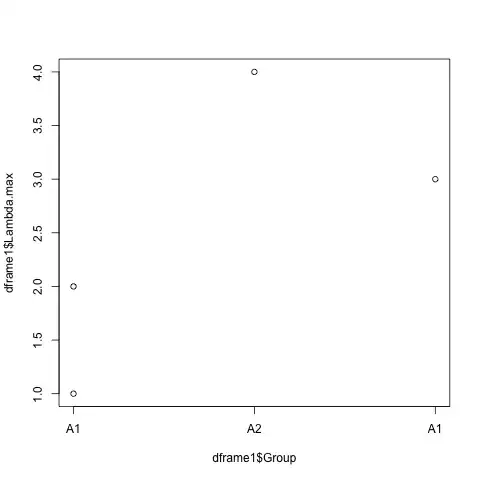
So I'm using this as the dataset

dframe1 <- data.frame(Group=c("A1","A2", "B1", "B2"), Lambda.max=c(1,4,2,3))

which should be close enough.

This is a little tricky because R wants to do things a certain way for factors. The approach I would recommend would be to draw the axes manually.

plot.default(dframe1$Group, dframe1$Lambda.max, type="p", axes=F)
axis(side=2)
axis(side=1, at=seq_along(dframe1$Group), labels=dframe1$Group)

edit: As requested, if you want a box around the plot as is fairly standard for R plots, you also have to manually add it

box()

Now the plot should look like this

plot with box around it

user295691
  • 7,108
  • 1
  • 26
  • 35
  • I am not sure how to format the data so that it is set up in two columns on here? – KB2 Dec 02 '14 at 22:21
  • Edit your original post with the output of `dput(dframe1)`, or if that is too long, do a `dput(head(dframe1))` to get a relevant subset of the data. That will allow your data to be easily imported into anyone else's session – user295691 Dec 02 '14 at 22:23
  • http://stackoverflow.com/questions/5963269/how-to-make-a-great-r-reproducible-example is a great resource for this sort of thing – user295691 Dec 02 '14 at 22:24
  • 1
    @KB2 Data as PDF can be terribly difficult to import, even if it looks pretty. Data from `dput()` may look ugly, but it's copy/pasteable and fully reproducible (it will preserve column classes). – Gregor Thomas Dec 02 '14 at 22:33
  • Thank you very much for the help, would it be alright to keep this question open overnight? As I need to alter the graph a lot and I foresee myself not being able to do it... – KB2 Dec 02 '14 at 23:02
  • @KB2: Up to you. But I think general etiquette would be to close this question if you feel it has been answered adequately, and to post additional questions as necessary. Remember that SO is a resource for the community as well, and too complex a question makes it hard for other users to get use out of this question. – user295691 Dec 02 '14 at 23:08
  • @user295691 Ok. Here is so far what I have added to the graph: http://imgur.com/p3A59vk I was wondering how I could make the axes meet in the bottom left corner? – KB2 Dec 03 '14 at 01:17