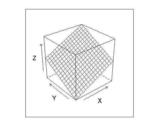
I have a set of (2-dimensional) data points that I run through a classifier that uses higher order polynomial transformations. I want to visualize the results as a 2 dimensional scatterplot of the points with the classifier superimbosed on top, preferably using ggplot2 as all other visualizations are made by this. Pretty much like this one that was used in the ClatechX online course on machine learning (the background color is optional).

I can display the points with colors and symbols and all, that's easy but I can't figure out how to draw anything like the classifiers (the intersection of the classifiing hyperplane with the plane representing my threshold). The only thing I found was stat_function and that only takes a function with a single argument.
Edit:
The example that was asked for in the comments:
sample data:
"","x","y","x","x","y","value"
"1",4.17338115745224,0.303530843229964,1.26674990184152,17.4171102853774,0.0921309727918932,-1
"2",4.85514814266935,3.452660451876,16.7631779801937,23.5724634872656,11.9208641959486,1
"3",3.51938610081561,3.41200957307592,12.0081790673332,12.3860785266141,11.6418093267617,1
"4",3.18545089452527,0.933340128976852,2.97310914874565,10.1470974014319,0.87112379635852,-16
"5",2.77556006214581,2.49701633118093,6.93061880335166,7.70373365857888,6.23509055818427,-1
"6",2.45974169578403,4.56341833807528,11.2248303614692,6.05032920997851,20.8247869282818,1
"7",2.73947941488586,3.35344674880616,9.18669833727041,7.50474746458339,11.2456050970786,-1
"8",2.01721803518012,3.55453519499861,7.17027250203368,4.06916860145595,12.6347204524838,-1
"9",3.52376445778646,1.47073399974033,5.1825201951431,12.4169159539591,2.1630584979922,-1
"10",3.77387718763202,0.509284208528697,1.92197605658768,14.2421490273294,0.259370405056702,-1
"11",4.15821685106494,1.03675272315741,4.31104264382058,17.2907673804804,1.0748562089743,-1
"12",2.57985028671101,3.88512040604837,10.0230289934507,6.65562750184287,15.0941605694935,1
"13",3.99800728890114,2.39457673509605,9.5735352407471,15.9840622821066,5.73399774026327,1
"14",2.10979392635636,4.58358959294856,9.67042948411309,4.45123041169019,21.0092935565863,1
"15",2.26988795562647,2.96687697409652,6.73447830932721,5.15239133109813,8.80235897942413,-1
"16",1.11802248633467,0.114183261757717,0.127659454208164,1.24997427994995,0.0130378172656312,-1
"17",0.310411276295781,2.09426849964075,0.650084557879535,0.0963551604515758,4.38596054858751,-1
"18",1.93197490065359,1.72926536411978,3.340897280049,3.73252701675543,2.99035869954433,-1
"19",3.45879891654477,1.13636834081262,3.93046958599847,11.9632899450912,1.29133300600123,-1
"20",0.310697768582031,0.730971727753058,0.227111284709427,0.0965331034018534,0.534319666774291,-1
"21",3.88408110360615,0.915658151498064,3.55649052359657,15.0860860193904,0.838429850404852,-1
"22",0.287852146429941,2.16121324687265,0.622109872005114,0.0828588582043242,4.67084269845782,-1
"23",2.80277011333965,1.22467750683427,3.4324895146344,7.85552030822994,1.4998349957458,-1
"24",0.579150241101161,0.57801398797892,0.334756940497835,0.335415001767533,0.334100170299295-,1
"25",2.37193428212777,1.58276639413089,3.7542178708388,5.62607223873297,2.50514945839009,-1
"26",0.372461311053485,2.51207412336953,0.935650421453748,0.138727428231681,6.31051640130279,-1
"27",3.56567220995203,1.03982002707198,3.70765737388213,12.7140183088242,1.08122568869998,-1
"28",0.634770628530532,2.26303249713965,1.43650656059435,0.402933750845047,5.12131608311011,-1
"29",2.43812176748179,1.91849716124125,4.67752968967431,5.94443775306852,3.68063135769073,-1
"30",1.08741064323112,3.01656032912433,3.28023980783858,1.18246190701233,9.0996362192467,-1
"31",0.98,2.74,2.6852,0.9604,7.5076,1
"32",3.16,1.78,5.6248,9.9856,3.1684,1
"33",4.26,4.28,18.2328,18.1476,18.3184,-1
The code to generate a classifier:
perceptron_train <- function(data, maxIter=10000) {
    set.seed(839)
    X <- as.matrix(data[1:5])
    Y <- data["value"]
    d <- dim(X)
    X <- cbind(rep(1, d[1]), X)
    W <- rep(0, d[2] + 1)
    count <- 0
    while (count < maxIter){
        H <- sign(X %*% W)
        indexs <- which(H != Y)
        if (length(indexs) == 0){
            break
        } else {
            i <- sample(indexs, 1)
            W <- W + 0.1 * (X[i,] * Y[i,])
        }
        count <- count + 1
        point <- as.data.frame(data[i,])
        plot_it(data, point, W, paste("plot", sprintf("%05d", count), ".png", sep=""))
    }
    W
}
The code to generate the plot:
plot_it <- function(data, point, weights, name = "plot.png") {
    line <- weights_to_line(weights)
    point <- point
    png(name)
    p = ggplot() + geom_point(data = data, aes(x, y, color = value, size = 2)) + theme(legend.position = "none")
    p = p + geom_abline(intercept = line[2], slope = line[1])
    print(p)
    dev.off()
}
