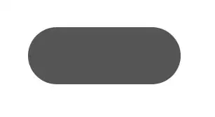
I want to make a button exactly like in this image
I want to use a xml file that will used to produce such button. Can anyone tell me how to do that?
I want to make a button exactly like in this image
I want to use a xml file that will used to produce such button. Can anyone tell me how to do that?
finally I found the way to do it with xml file. here is the code of the xml file that gave me the capsule shape button.
<?xml version="1.0" encoding="utf-8"?>
<shape xmlns:android="http://schemas.android.com/apk/res/android"
android:shape="rectangle" >

  <corners
    android:bottomLeftRadius="30dp"
    android:bottomRightRadius="30dp"
    android:radius="60dp"
    android:topLeftRadius="30dp"
    android:topRightRadius="30dp" />

  <solid android:color="#CFCFCF" />

  <padding
    android:bottom="0dp"
    android:left="0dp"
    android:right="0dp"
    android:top="0dp" />

  <size
    android:height="60dp"
    android:width="270dp" />

</shape>
Just use a MaterialButton using the cornerRadius attribute and your favorite width.
 <com.google.android.material.button.MaterialButton
            android:layout_width="100dp"
            android:layout_height="wrap_content"
            app:cornerRadius="18dp"
            android:text="BUTTON"
            />

You can also use the shapeAppearanceOverlay attribute:
<com.google.android.material.button.MaterialButton
        app:shapeAppearanceOverlay="@style/buttomShape"
        .../>
with:
  <style name="buttomShape">
    <item name="cornerFamily">rounded</item>
    <item name="cornerSize">50%</item>
  </style>
I haven't tried all of the answers here, but I believe some/all of them are works.
The accepted answer is also works, but it can be simplified. Since I love elegant and simple solution, I come up with my own solution. Basically, we just need to add radius big enough compared with your View width and height, so it will create a round corner. In this case I put 1000dp to make it safe. We don't even need to add android:shape="rectangle" at all.
Just follow these 2 simple steps:
Create an XML file in your drawable folder. For example let's name it bg.xml
<?xml version="1.0" encoding="utf-8"?>
<shape xmlns:android="http://schemas.android.com/apk/res/android">
    <corners android:radius="1000dp"/>

    <solid android:color="@color/yourPreferredColor"/>
</shape>
Then you can use it in layout XML file as your View property android:background="@drawable/bg"
or directly in the code view.setBackgroundResource(R.drawable.bg)
It's called a Chip in Material and can be used like so:
<com.google.android.material.chip.Chip
    android:layout_width="wrap_content"
    android:layout_height="wrap_content"
    android:text="@string/hello_world"/>
More info can be found here and here.
To use Material components in your project, you'll to add the appropriate lib to your build.gradle:
dependencies {
    // ...
    implementation 'com.google.android.material:material:1.0.0-beta01'
    // ...
  }
More info on adding Material to your project can be found here.
Alternatively, you can use the latest version of the support design lib:
<android.support.design.chip.Chip
    android:layout_width="wrap_content"
    android:layout_height="wrap_content"
    app:chipText="@string/hello_world"/>
Also pull in the appropriate libs:
dependencies {
    // ...
    implementation 'com.android.support:appcompat-v7:28.0.0-alpha1'
    implementation 'com.android.support:design:28.0.0-alpha1'
    // OR
    implementation 'com.android.support:design-chip:28.0.0-alpha1'
    // ...
}
See this answer for more on the latter approach.
consider customizing a shape to it and use corners inside that shape:
<?xml version="1.0" encoding="utf-8"?>
<shape xmlns:android="http://schemas.android.com/apk/res/android"
    android:shape="rectangle">
    <corners android:radius="10dp"/> <!-- increasing the value, increases the rounding. And as  TTransmit said, to make it like a capsule make the radius half of your button height -->
    <solid android:color="#AAAAAA"/> <!-- the button color -->

</shape>
So, save that shape in your /drawable folder, let's say it will be saved as "button_bg.xml", so when declaring the Button in your layout xml:
<Button
    android:background="@drawable/button_bg"
    android:layout_height="20dp"
                .
                .                          />
Here is code to create button in xml,but if you want to create button as a capsule shaped you have to add the background
        <Button
            android:id="@+id/image"
            android:layout_width="match_parent"
            android:layout_height="wrap_content"
            **android:background="@drawable/button_background"**
            android:text="@string/image" >
        </Button>
create button_background.xml in drawable folder,write the following code in button_background.xml
         <?xml version="1.0" encoding="UTF-8"?>

          <shape xmlns:android="http://schemas.android.com/apk/res/android"

             android:shape="rectangle" android:padding="40dp">

          <!-- you can use any color you want I used here gray color-->

         <solid android:color="#01A9DB"/>

          <corners

          android:bottomRightRadius="20dp"

          android:bottomLeftRadius="20dp"

          android:topLeftRadius="20dp"

          android:topRightRadius="20dp"/>

      </shape>
Try below, works with any view size:
<shape xmlns:android="http://schemas.android.com/apk/res/android"
    android:shape="rectangle">

    <corners android:radius="1000dp" />

    <solid android:color="@android:color/black" />

</shape>