1

I am trying to implement a flexbox solution to display an inline mailbox system for a site that is in development. The basic design I need to implement is displayed in the wireframe :

Wireframe of layout

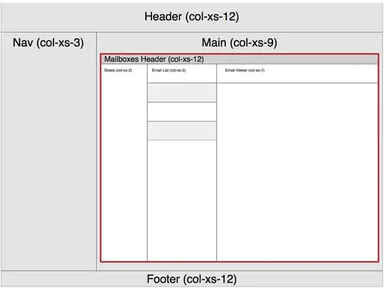
The zone with the red border is where I need to implement the flexbox.

As the development is done with Laravel Blade Tempting engine, we're using included files to generate the content of the three panes (left mailboxes, middle email list and right email viewer).

The basic code structure is as follows:

This first code snippet sets up the view for the Inbox:

@extends('layouts.master')

@section('content')
  <div class="content-container" ng-app="cs" ng-controller="MessagingCtrl">
    <div class="content-pane message-centre">
      <div class="row email-container">
        <div class="col-xs-12 header">
          <h3>Message Centre</h3>
        </div>
      </div>
      <div class="row email-panes">
        <div class="col-xs-2 mailboxes">
          @include('messages.partials.sidebar', ['active' => 'inbox'])
        </div>
        <div class="col-xs-3 emails">
          @include('messages.partials.message-list')
        </div>
        <div class="col-xs-7 email-viewer">
          @if(isset($message_opened))
            @include('messages.partials.message', ['message' => $message_opened])
          @endif
        </div>
      </div>
    </div>
  </div>
@stop

@section('scripts')
  {{HTML::script('assets/js/modules/cs.js')}}
  {{HTML::script('assets/js/app/configurations/messaging.js')}}
  {{HTML::script('assets/js/app/controllers/MessagingCtrl.js')}}
@stop

As you can see, we're using partials to include the three vertical panes. The mailboxes is a simple structure of 2 divs with a links. Clicking on one of them displays the list of emails in the middle pane which enumerates the emails as unordered list items. Finally, clicking on one of those items will display the contents of the selected email in the large right pane.

I need to make sure that the three panes or columns are of equal height, and as we know, css has limitations in sizing adjacent divs to be of equal height. Thus flexbox to the rescue.

My question is regarding how flexbox is supported in bootstrap 3, and if there are any special considerations I need to make in implementing flexbox. I have the following basic css (LESS) mixins:

.flexbox() {
  display: -webkit-box;
  display: -moz-box;
  display: -ms-flexbox;
  display: -webkit-flex;
  display: flex;
}
.flex(@values) {
  -webkit-box-flex: @values;
  -moz-box-flex:  @values;
  -webkit-flex:  @values;
  -ms-flex:  @values;
  flex:  @values;
}
.order(@val) {
  -webkit-box-ordinal-group: @val;
  -moz-box-ordinal-group: @val;
  -ms-flex-order: @val;
  -webkit-order: @val;
  order: @val;
}
.wrapper {
  .flexbox();
}
.item {
  .flex(1 200px);
  .order(2);
}

Specifically, I need some advice and help on how to implement the LESS to accommodate the bootstrap grid.

Any advice would be appreciated.

Ali Samii
  • 1,672
  • 4
  • 28
  • 49
  • @harry this will be my first foray into working with flexbox so I am being cautious. – Ali Samii Jan 02 '15 at 13:57
  • @Harry Iassume I should be able to override the bootstrap grid specifically for this layout, and I can modify the blade template. The issue really is properly implementing flexbox so it works smoothly. There are other less elegant solutions, I guess, if flexbox doesn't work, but I'd rather give flexbox a go before falling back on less flexible (pun intended) layout solutions. Thus, any help would be appreciated. – Ali Samii Jan 02 '15 at 14:11
  • Your Less seems pretty fine mate. [Here](http://www.bootply.com/ElgLVhk9ff) is a sample flex-box demo and you would find [this](http://philipwalton.github.io/solved-by-flexbox/demos/grids/) useful. – Harry Jan 02 '15 at 15:20

1 Answers1

3

I think one option will be to overwrite the bootstrap CSS for your flexbox area. As far as i understand you can apply the following CSS code after (or at the end of) the Bootstrap CSS code:

.row.email-panes {
display: flex;
}      
.row.email-panes .col-xs-2{
flex-grow:2;
background-color: green;          
}
.row.email-panes .col-xs-3
{
flex-grow:3;
} 
.row.email-panes .col-xs-7{
flex-grow:7;
background-color: red;
} 

Or Less (with some nesting):

.row.email-panes {
    display: flex;

    .col-xs-2{
    flex-grow:2;
    background-color: green;          
    }

    .col-xs-3
    {
    flex-grow:3;
    } 

    .col-xs-7{
    flex-grow:7;
    background-color: red;
    } 
} 

demo: http://codepen.io/anon/pen/yyVMVo

Cause you overwrite the Bootstrap's grid classes you will have a fallback for browsers that not support the flexbox too.

My code does not contain vendor prefixes. In your example you use mixins to set these vendor prefixes. Using (a) autoprefix post processor seems to be better practice by consensus of the community. also see LESS transition mixin with prefixes

Community
  • 1
  • 1
Bass Jobsen
  • 48,736
  • 16
  • 143
  • 224
  • What's the advantage of using `flex-grow: 2` rather than the shorthand `flex: 2 0 auto`? – Ali Samii Jan 02 '15 at 23:44
  • I agree about using a prefixer. I have the mixing defined for dev because I'm having problems with generating a source code mapwith gulp-less, gulp-prefixer, gulp-minify-css and gulp-sourcemap. Once I move to proud, I'll drop the mixin and re-enable the prefixer – Ali Samii Jan 02 '15 at 23:56
  • not using shorthand does not have any advantage, i just wrote an example howto use flexible boxes with the Bootstrap grid. Notice that `0` and `auto` are the initial values already, so you can also write `flex: 2`. Possible ask a new question for your gulp work flow. I think you should not use gulp-sourcemap, but use the source map options of your other plugins. – Bass Jobsen Jan 03 '15 at 00:13
  • I have a question regarding how flexbox wraps to a new row. I tried to add a col-xs-12 for the mailbox header and my understanding was that without the need for nesting, it is possible to have flexbox wrap to a new row automatically. thus col-xs-12 would be a full-width and col-xs-2, col-xs-3 and col-xs-7 could wrap and align next to each other on a new row. See this codepen: http://codepen.io/asamii/pen/myOmzq?editors=110 Any advice would be welcome. – Ali Samii Jan 03 '15 at 10:55
  • why not use two rows? `
    Some title
    – Bass Jobsen Jan 03 '15 at 11:08
  • I could, I just thought that one of the benefits of flexbox was the ability to allow it to wrap automatically and provide a more flexible structure. – Ali Samii Jan 03 '15 at 11:17
  • i don't know what should be flexible for a 100% width – Bass Jobsen Jan 03 '15 at 13:02
  • I took your suggestion and asked a question about my gulp setup. Perhaps if you have a moment, you might take a look. http://stackoverflow.com/questions/27764782/problems-generating-source-map-files-with-current-gulp-setup – Ali Samii Jan 04 '15 at 11:00