I'd make a usercontrol to handle the case. Should be easy... I've crafted this quickly on a ContentControl but could be easily expanded to suit your needs:
<ControlTemplate x:Key="MyControl" TargetType="ContentControl">
  <StackPanel>
    <Expander x:Name="ExpanderControl" IsExpanded="True"/>
    <TextBlock x:Name="MyTextBlock" TextTrimming="CharacterEllipsis" TextWrapping="Wrap" Text="Lorem ipsum dolor sit amet, consectetur adipiscing elit. Donec ex est, hendrerit a ante nec, molestie aliquet nunc. Mauris est mi, aliquam nec nulla id, placerat vulputate est. Nulla tristique elit eu sapien ultrices fringilla. Nulla ac dictum lorem, ac mattis elit. Sed augue arcu, bibendum nec mauris nec, volutpat pulvinar lacus. Mauris et volutpat nibh, eu luctus leo. Pellentesque non dapibus nisi.
Quisque in nulla eu purus sagittis bibendum. Pellentesque orci ipsum, porttitor vitae risus at, faucibus pellentesque justo. Aenean ut nibh pharetra orci euismod vehicula. Aenean commodo vestibulum placerat. Nam condimentum dictum purus nec suscipit. Duis semper ligula massa, in pretium diam scelerisque tincidunt. Vivamus placerat porttitor orci et finibus.
Aenean ut purus eu mi venenatis dapibus id vel urna. Donec enim odio, molestie sed pharetra vel, blandit non purus. Sed in leo eget felis suscipit consectetur. Suspendisse sagittis, sapien ac iaculis venenatis, velit purus viverra turpis, vitae suscipit mi odio pellentesque velit. Proin pulvinar sem consequat nunc varius semper. Maecenas vitae nisl quis risus auctor suscipit. Aenean libero tortor, placerat non ex et, gravida efficitur sem. Aliquam volutpat mauris fermentum, rhoncus arcu et, finibus tortor.
Praesent sit amet pretium risus. Quisque bibendum nibh vel risus rhoncus eleifend. Nunc in eros sit amet neque euismod laoreet. Aliquam dictum ac magna quis interdum. Lorem ipsum dolor sit amet, consectetur adipiscing elit. Duis varius diam dolor, mollis tristique nisl malesuada ac. Nulla sed vehicula sapien. Vestibulum venenatis lobortis sodales. Aliquam rhoncus metus at velit accumsan, at fringilla sapien condimentum. Aliquam erat volutpat. Aenean iaculis mi augue, quis bibendum nibh suscipit ut. Nam commodo, arcu et gravida accumsan, magna diam rhoncus ante, quis posuere nibh tortor nec ligula. Quisque id metus lacus. Quisque ac magna vel ligula commodo tempor. Nam scelerisque fringilla commodo. Curabitur volutpat libero ac metus aliquam, in egestas ipsum luctus.
Ut fringilla lacinia efficitur. Nulla odio tortor, eleifend sed porttitor ut, accumsan sed nunc. Morbi malesuada nisl in lobortis auctor. Nam suscipit neque ac neque blandit dictum. Duis pulvinar commodo enim eget laoreet. In sodales arcu nisl, sit amet posuere orci blandit nec. Nullam a dapibus est, lacinia maximus ante. Mauris rutrum ex nunc, non vehicula orci volutpat vehicula. Praesent mattis tortor non odio molestie, sit amet congue urna sollicitudin. Sed lobortis est et mauris suscipit mattis. Maecenas porttitor elit nec nulla pulvinar, nec porttitor odio placerat. Vivamus maximus lobortis erat a fringilla. Sed vitae hendrerit tortor." />
  </StackPanel>
  <ControlTemplate.Triggers>
    <Trigger SourceName="ExpanderControl" Property="IsExpanded" Value="False">
      <Trigger.Setters>
        <Setter TargetName="MyTextBlock" Property="Height" Value="100"/>
      </Trigger.Setters>
    </Trigger>
  </ControlTemplate.Triggers>
</ControlTemplate>
And use it like:
<ContentControl Template="{StaticResource MyControl}"/>
Result, expanded:
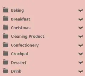
And contracted:

Of course, you'd need to style it to your needs. Could (and should) make a property to have the text defined in the UserControl and not in the template, the desired contracted height, etc.
Checking if it actually needs a button requires some codebehind (checking if Height is ActualHeight comes to mind, but for a better way you'd ideally create a FormattedText object with the TextBlock's typeface, apply the same text and check if it's height is the ActualHeight of the control... I'd put this on an attached dependency property).