1

I am having some serious problems with layout() and it is driving me crazy when adding one figure with multiple layers.

I only seem to have a problem when adding a layer on one of the figures within the jpeg I am trying to create.

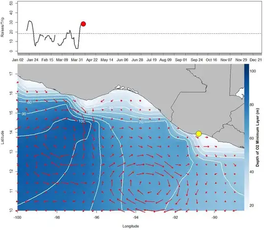
The layout is to have a 1) simple line plot on top for a time series of fish catch data and on the bottom 2) have a larger image of a map of oceanographic data layers.

I am making a series of maps using image.plot() plus contour(... add=T) and arrows my.symbols(... add=T) from library TeachingDemos.

Data is sliced from large netCDF files.

The image and contours are dissolved oxygen depth and the red arrows are surface current.

Below is my R code, data is looped through variable 'n':

   jpeg(paste(interpdate[n],"DailyDOLayerCenAm.jpg", sep=""), width=1150, height=1000, res=100)

   layout(matrix(c(1,2),nrow=2), heights=c(1,3))

   #first plot on the top, fish catch data by time, moving each day
   par(mar=c(1,4,.3,.5)) 

   plot(Date[15:n],sail$X7.day.Average[15:n], xlim=c(Date[15],Date[350]), 
    xlab='',ylab='Raises/Trip',ylim=c(0,50), type='l', xaxt='n', lwd=2.5)
    axis(1, Date, format(Date, "%b %d"), cex.axis = 1)
   abline(18.4,0, lty=2)
   points(Date[n],sail$X7.day.Average[n], pch=21, col='black', bg='red',    
   cex=3)

   #second plot, Ocean data

   par(mar=c(3,3.7,.5,1))

   # layer 1 plot the main layer, interpolated grid O2 minimum depth
   image.plot( as.surface( expandgrid, ww),xlim=c(xmin,xmax),     
    ylim=c(ymin,ymax), ylab="Latitude", xlab="Longitude",main="",
    col=pal(256), legend.lab="Depth of O2 Minimum Layer (m)",
   zlim=c(20,zlimit), cex=1.5)

   #layer 2 add the contours
   contour(as.surface( expandgrid, ww),xlim=c(xmin,xmax), ylim=c(ymin,ymax),   
   col='white', lwd=2, nlevels=10, labcex=1, add=T)

    #layer 3 add current arrows
    my.symbols(lonx,laty,ms.arrows, angle=theta, r=intensity, length=.06,      
    add=T,xlim=c(xmin,xmax), ylim=c(ymin,ymax), lwd=2, col="red", 
    fg="black")

    #layer 4add the map of land/countries
    plot(newmap, col="GREY", add=T)

    #add a point of home port in Guatemala
    points(-90.81, 13.93, pch=21, col='black', bg='yellow', cex=3.5)

    dev.off()

When I plot just my ocean data, it plots fine: https://fbcdn-sphotos-f-a.akamaihd.net/hphotos-ak-xap1/t31.0-8/10861076_10101738319375937_3436888929444896713_o.jpg

plot it within layout() I get this mess, The contour lines are fine within the x-space, but squished in y space, as are the arrows and map overlay: https://scontent-b.xx.fbcdn.net/hphotos-xfp1/t31.0-8/10923795_10101738319625437_7583695382864373718_o.jpg

milancurcic
  • 6,202
  • 2
  • 34
  • 47
  • I'm going to assume you're using `imaage.plot()` from the `fields` pacakge. In order for `image.plot()` to draw the legend, it needs to take control of the layout. It seems to be incompatible with layout() options. Because you didn't share any sample input data, your problem isn't [reproducible](http://stackoverflow.com/questions/5963269/how-to-make-a-great-r-reproducible-example) so it's difficult to offer work-arounds. – MrFlick Jan 27 '15 at 04:33
  • The data is coming directly from netCDF files on a server, sliced by time/lat/lon, I was just hoping someone may have had experience using layout() and image.plot() with contours added. Will image() without the legend work.... – Mark Fitchett Jan 27 '15 at 04:37
  • 1
    Well, you really need to clarify which `image.plot()` function you are using. Knowing what's possible would involve looking at the source of the plotting function you are trying to use. – MrFlick Jan 27 '15 at 04:40
  • How about using the `rasterVis` package, based on `lattice`? –  Jan 27 '15 at 04:44
  • @MrFlick `object<-list(x=x,y=y,z=ExpandDOmindepth[,,n]) expandx<-seq(min(x),max(x),,length(x)*10) expandy<-seq(min(y),max(y),,length(y)*10) expandgrid<-make.surface.grid(list(expandx,expandy)) ww<-interp.surface(object,expandgrid) image.plot( as.surface( expandgrid, ww),xlim=c(xmin,xmax), ylim=c(ymin,ymax), ylab="Latitude", xlab="Longitude",main="", col=pal(256), legend.lab="Depth of O2 Minimum Layer (m)", zlim=c(20,zlimit), cex=1.5)` – Mark Fitchett Jan 27 '15 at 04:51
  • @Pascal Thank you, I can create another image as a raster and perhaps insert that as a plot() function, I will try that and let you know how that works – Mark Fitchett Jan 27 '15 at 04:54
  • Be careful, `lattice` and basic `plot` are not compatible. –  Jan 27 '15 at 04:54
  • @Pascal true, I tried contourplot/levelplot and it did not work, perhaps creating one of the ocean data maps alone as a raster and inserting it into the layout() will work.... luckily these images don't take to long to run and are data from a snipped netCDF file... I will let you know if that does the trick – Mark Fitchett Jan 27 '15 at 04:57
  • It works with all the `Raster*` types, i.e., `raster`, `stack` and `brick`. –  Jan 27 '15 at 04:59
  • @Pascal will rasterVis retain color attributes from jpegs or PDF I already have created? – Mark Fitchett Jan 27 '15 at 05:02
  • fixed it, thanks, 'image()' instead of `image.plot'.... yes, 'fields()' does not work with layout. I made a legend and everything works well, images look great, see my answer below. – Mark Fitchett Jan 27 '15 at 07:57

1 Answers1

3

I fixed this by not using imageplot() but by using image() and adding the color legend described by Aurélien Madouasse:

https://aurelienmadouasse.wordpress.com/author/aurelienmadouasse/

I looped the images from a large arrays of oceanographic data and created a series of plots in a function.

My code (sans data) is here, from within a loop:

jpeg(paste(interpdate[n],"DailyDOLayerCenAm.jpg", sep=""), width=1150, 
height=1000, res=100)

layout(matrix(c(1,2),nrow=2), heights=c(1,3))

#first plot on the top, fish catch data by time, moving each day
par(mar=c(1,4,.3,.5)) 

plot(Date[15:n],sail$X7.day.Average[15:n], xlim=c(Date[15],Date[350]), 
   xlab='',ylab='Raises/Trip',ylim=c(0,50), type='l', xaxt='n', lwd=2.5)
axis(1, Date, format(Date, "%b %d"), cex.axis = 1)
abline(18.4,0, lty=2)
points(Date[n],sail$X7.day.Average[n], pch=21, col='black', bg='red', cex=3)

#second plot, Ocean data
#plot the main layer, dissolved oxygen minimum depth 
image( as.surface( expandgrid, ww),xlim=c(xmin,xmax), 
  ylim=c(ymin,ymax),ylab="Latitude", xlab="Longitude",main="", col=pal(256), 
  zlim=c(20,zlimit), cex=1.5)


#add the contours
contour(as.surface( expandgrid, ww),xlim=c(xmin,xmax), ylim=c(ymin,ymax), 
col='white', lwd=2,levels=seq(0,zlimit,10), labcex=1, add=T)

#add sea surface current arrows
 my.symbols(lonx,laty,ms.arrows, angle=theta, r=intensity, length=.06, 
  add=T, xlim=c(xmin,xmax), ylim=c(ymin,ymax), lwd=2, col="red", fg="white")

#add the map of land/countries
  plot(newmap, col="GREY", add=T)

 #add a point of home port in Guatemala
 points(-90.81, 13.93, pch=21, col='black', bg='yellow', cex=3.5)
 colr <- pal(256) # colors from 'blues'
 legend.col(col = colr, lev = ww) # legend from Aurélien Madouasse:
 mtext("Depth of O2 Minimum Layer (m)", 4, line=2.5, font=2)
 dev.off()

To see a plot of my new images which I am making into a movie, see this link: enter image description here https://fbcdn-sphotos-a-a.akamaihd.net/hphotos-ak-xpa1/t31.0-8/10856647_10101738461765587_2760202217270038911_o.jpg