Note: This question is about a problem with output, and not about creation of any shape.
I recently created a shape :
.prog {
    position: relative;
    top: 20px;
    width: 150px;
    height: 120px;
    background: green;
    display: inline-block;
    transform: skewY(20deg);
    transform-origin: 0% 100%;
    transition: 0.8s ease;
}
.prog:before {
    content: "";
    position: absolute;
    left: 150px;
    width: 150px;
    height: 120px;
    background: red;
    transform: skewY(-40deg);
    transform-origin: 0% 100%;
    transition: 0.8s ease;
}
<div class="prog "></div>In the above snippet, the green shape is the .prog element, and is skewed. The red shape is :before pseudoelement of the first element.
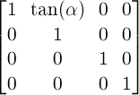
I skewed .prog (skewY) to 20deg. Now, I needed :before to be -20deg. For this, I first had to unskew it. Then skew it further 20deg.
So final skewY value will be -40deg. I applied this, and appropriate transform-origins.
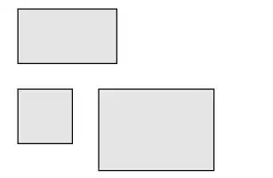
But the problem is that the top points of both the shapes aren't aligning. They should, but they aren't. Here's an image showing the problem :

The black lines are just for reference.
Now even more!
I skewed -20 -20 instead of -40 :
transform: skewY(-20deg) skewY(-20deg); <-- This works!
transform: skewY(-40deg); <---------------- This doesn't!


