2

Ok. Here is the thing.
Like we can use width:100% of an element and it'll take the full width of its container. How can we do that in case of fonts? I have tried using 100% or em etc but that's not working.

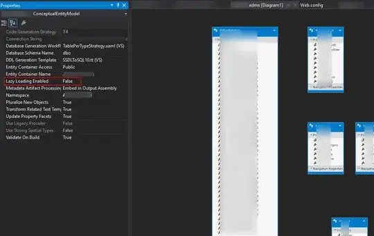
Let me explain the actual problem. Here are three versions of a div. Please see the images.

1- Desktop
enter image description here

2- Android enter image description here

3- iPhone enter image description here

You can see that the text "Quote and Buy Online" is in the same line for Desktop and Android (which is the requirement) while it is in two lines in iPhone. Whereas the font-size is the same for all three. Now, that's the problem.

One way is that I reduce the size of the font until the problem gets solved for iPhone but it would then be much smaller for Desktop and Android. If somehow, I tell the font to adjust its size according to its containing div then the problem will be solved.

Please note that I have checked the solution here but It says it won't be dynamic. So looking for a better alternative.

Here is the link where you can find the form.

Community
  • 1
  • 1
Awais Umar
  • 2,027
  • 3
  • 27
  • 46

2 Answers2

2

This is not possible with pure CSS. You have 4 options:

1) Define the font size for certain breakpoints, to fill up as much as the container as possible, cross browser/platform.

2) Use Viewport Percentage Units: vw as described in this SO answer

3) Use a JS library to fill the text of the parent container, eg:

4) Apply a font size that fits the container well, maybe tweak it after 600px +; and live with the fact the font won't fit exactly 100% of the container.

I recommend no.4 for your specific requirment - there will be no JS dependancy, it's simplest to apply and it won't make that much of a difference for your requirement. Maybe the form would look better if you align the text to the left as well. I think no1 and 2 are a bit of an overkill.

Community
  • 1
  • 1
Tony Barnes
  • 2,625
  • 1
  • 18
  • 29
  • Thanks for the comment. So, if I move to the JS solution, how'd that be possible with a simple code? I don't want to include a whole library just for a single element. I am currently referring this solution. http://stackoverflow.com/questions/10292001/how-to-set-font-size-based-on-container-size – Awais Umar Feb 07 '15 at 12:50
  • @Symbolwdd I agree about introducing a whole library to achieve the effect you want. The approach you posted could work, but you'd also need to set a timeout for window resizing which isn't the best; otherwise the text won't resize if the window is resized. Personally, because of this, I think one of the approaches I mentioned would be better. – Tony Barnes Feb 07 '15 at 13:03
0

You may want to look at using media queries to hit this across the device spectrum. One for iPhone portrait is below, but you will likely have a few to align for all devices.

@media screen and (max-width: 320px) {
.selector { font-size: 10px; }
}

.selector = your class or id of the button or any other html selector or tag.

I personally would go with a screen based fixed figure as you know it is going to render exactly over a scaling method. my 2c worth.

Further Reading: http://css-tricks.com/css-media-queries/

Leigh B
  • 86
  • 4
  • 1
    The device spectrum is ever changing - this is not a future proof solution. Should also be using mobile first media queries (`min-width` instead of `max-width`). – Tony Barnes Feb 07 '15 at 12:25
  • I have found better results with less time using max-width with my breakpoints over the last couple of years. but then I set a plethora of BP's for around 40 device screen standards. and start from full width and work down until i need something to change in that way I do not have to individually define when it goes to almost FW elements on extremely narrow. again my 2c worth. – Leigh B Feb 07 '15 at 12:46
  • 1
    Mobile first is better - instead of the desktop to mobile. There are some good points here: https://developers.google.com/web/fundamentals/getting-started/your-first-multi-screen-site/responsive?hl=en – Tony Barnes Feb 07 '15 at 12:50
  • Pretty subjective opinion, I use both on purpose but as most of the design to dev I do is Desktop scaled down this has worked for me. – Leigh B Feb 07 '15 at 12:55
  • 1
    Mobile first is better for performance. Doing mobile 'after desktop' is not a good practice. – Tony Barnes Feb 07 '15 at 12:58