I have the line chart below and I would like to plot a bar chart of the "V" column in the "bigDF" data frame on a secondary y axis. Is this possible? I have to use ggplot in this instance. Can this be done?
Here is the code which you can run:
library('ggplot2')
time <- as.POSIXct(c("2014-12-10 20:51:53.103","2014-12-10 20:56:54.204",
                     "2014-12-10 20:57:54.204"), tz= "GMT")
p <- c(49.32, 60,50)
s <- c("B","","S")
pointcolor <- c("green","","red")
V <- c(100,500,600)
share <- c(35,0,6)
pointsize <- c(10,10,10)
shapeType <- c(16,10,16)
bigDF <- data.frame(time=time, p=p, s=s, pointcolor=pointcolor, share=share,
                    pointsize=pointsize, shapeType=shapeType,V = V)
bigDF
ggplot(bigDF, aes(x=time, y=p)) + geom_line() +
  geom_point( aes(shape = as.factor(shapeType),
                  size = pointsize, color = pointcolor))+
  ylab("this is primary y axis")+
  xlab("this is the x axis")
scale_color_manual(values = levels(as.factor(bigDF$pointcolor)))
scale_size_manual(values = levels(as.factor(bigDF$pointsize)))
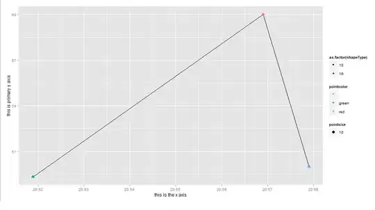
That code produces:
but I would like to show a bar chart of the "V" column in the "bigDF" dataframe on a secondary axis and I would like to label that secondary axis. Can you help?
Thank you.