18

I'm using Pseudo-element :before and :after to draw a line before and after a title. It's working with an image:

.mydiv::before {
content: url(img/line.png);}
.mydiv::after {
content: url(img/line.png);}

Here is the result :

you can see befor and after the 1px white horizontale line

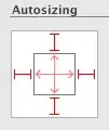
But, I would like the line to expand and fill in the whole div before and after the title, like this :

The line reach reach the both sides of the div

Is there a way to specify a percentage for the image for it to stretch? I try this, but it's not working :

.mydiv img {
  width: 100%;
  height: auto;
}
LcSalazar
  • 16,524
  • 3
  • 37
  • 69
Guillaume
  • 203
  • 1
  • 2
  • 8

3 Answers3

34

You don't need both :before and :after, either of the 2 will be enough and as you've been told, you don't need an image. See the approach below.

#header {
    width: 100%;
    height: 50px;
    margin: 50px 0;
    text-align: center;
    font-size: 28px;
    position: relative;
    background-color: #57585C;
}

#header:after {
    content: '';
    width: 100%;
    border-bottom: solid 1px #fff;
    position: absolute;
    left: 0;
    top: 50%;
    z-index: 1;
}

h3 {
    background-color: #57585C; /* Same as the parents Background */
    width: auto;
    display: inline-block;
    z-index: 3;
    padding: 0 20px 0 20px;
    color: white;
    position: relative;
    font-family: calibri;
    font-weight: lighter;
    margin: 0;
}
<div id="header">
   <h3>Last Projects</h3>
</div>
Midas
  • 7,012
  • 5
  • 34
  • 52
Sleek Geek
  • 4,638
  • 3
  • 27
  • 42
  • 1
    It works fine. I like the way you use the background-color to hide the line. Thanks – Guillaume Feb 10 '15 at 15:19
  • Doesnt work if content is resized (changes location a bit). Is there a way to make it relative? Doing position: relative makes it dissapear with a width of 0. – nullwriter May 09 '18 at 21:25
  • @nullwriter The real element must have position property value of relative to keep it within itself. Why zero width? – Sleek Geek May 09 '18 at 21:38
7

In case you need <h3> title to have transparent background - you can use both :before and :after and display: flex

More about flex-grow you can read here https://developer.mozilla.org/en-US/docs/Web/CSS/flex.

body {
  background: linear-gradient(0.25turn, #3f87a6, #000000, #f69d3c); /* example of custom background */
}

#header {
  display: flex;
  flex-wrap: nowrap;
  justify-content: flex-start;
  align-items: center; /* making vertical centerign of all children */
}

#header::before, #header::after {
  content: '';
  flex: 1 1 auto; /* the first digint is 'flex-grow: 1', helps elemet to occupy all free space */ 
  border-bottom: solid 1px #fff;
}

h3 {
  flex: 0 1 auto; /* the first digint is flex-grow: 0 */ 
  padding: 0 15px 0 15px;
  color: #fff;
}
<div id="header">
  <h3>Last Projects</h3>
</div>
focus.style
  • 6,612
  • 4
  • 26
  • 38
  • 2
    I would recommend this solution, for sure. Even if you think you don't need the title to be transparent, it doesn't hurt to be future-proof. Bonus points for elegance. – isacvale Jan 26 '21 at 22:10
0
<style>
.mydiv::before{
    content: '';
    position: absolute;
    left: 0;
    width: 100%;
    height: 2px;
    bottom: 1px;
    background-color: black;
}
</style>

<div class="mydiv">About us</div>
Eman Jayme
  • 230
  • 2
  • 8
  • 4
    Consider adding extra information to your answer to set it apart from other answers. As it stands, you're only repeating information already given and not providing anything new or useful. – Nathan Jun 13 '20 at 19:33