21

I'm creating a website and I want to crop an image to a square image based on the orientation of the image. I'm not really familiar with CSS so I'm not sure how to tackle this problem.

If it's a landscape image (800x500) then I want the cropped image to be like this (500x500):

Cropping 800x500 image

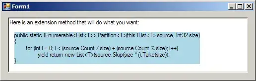
If it's portrait (400x600) then it should crop out this part (400x400) of the image:

Cropping 400x600 image

How should I go about to achieve this? Preferably a method I can use along with Bootstrap's "img-responsive" so I can resize the cropped when needed.

Thanks,

Community
  • 1
  • 1
FljpFl0p
  • 348
  • 1
  • 2
  • 10

4 Answers4

23

@FljpFl0p fix it [jsfiddle][1]

[1]: https://www.bootply.com/92024 and there is another answer here How to automatically crop and center an image. Tks!

If you want it responsive and using bootstrap 4. Try this one:

CSS

.thumb-post img {
  object-fit: none; /* Do not scale the image */
  object-position: center; /* Center the image within the element */
  width: 100%;
  max-height: 250px;
  margin-bottom: 1rem;
}
0

Add class img-responsive to img tag, which will scale your image and keep width / height ratio. If you are not satisfied with the results I would try using Javascript.

Jimmy
  • 276
  • 1
  • 8
  • img-responsive will only rescale the image horizontally to the size of it's container, there's no restriction to the height of the image. – FljpFl0p Feb 11 '15 at 17:45
  • I guess you have to use the Javascript for this. You can restrict the height with max-height property, but in your case it is useless. – Jimmy Feb 11 '15 at 17:48
  • Yes, using max-height and overflow:hidden would help me to crop the image to the size I want, only problem is that it will always be the top of the image. – FljpFl0p Feb 11 '15 at 17:50
  • @FljpFl0p try this [jsfiddle](http://jsfiddle.net/teleginzhenya/0rhjwjjg/) if you don't fix smth :D – Zhenya Telegin Apr 26 '17 at 01:33
0

Not sure if you are pretty limited to a CSS approach only, but a JavaScript approach would help by getting the image's dimension and wrapping it with in a div with overflow:hidden.

$width = $(".box img").css('width');
$height = $(".box img").css('height');
$max = (($width < $height) ? $width : $height);

$(".box").css("width", $max);
$(".box").css("height", $max);
.box {
  margin: 5px;
  overflow: hidden;
  display: flex;
  justify-content: center;
}
<script src="https://ajax.googleapis.com/ajax/libs/jquery/2.1.1/jquery.min.js"></script>

<div class="box">
  <img src="https://placehold.it/300x200">
</div>
ajib
  • 309
  • 2
  • 17
0

A lifesaver from @Állan Fidelis Toledo

One might find it useful to use 'contain' on the css 'object-fit' to keep the aspect ratio of the image. By setting max-height it is useful in Bootstrap 4 as well. Works on all 'col' classes in Bootstrap 4.

.thumb-post img {
  object-fit: contain; /* keep aspect ratio */
  width: 100%;
  max-height: 147px;
  margin-bottom: 1rem;
  padding-right: 10px;
}
KJS
  • 1,176
  • 1
  • 13
  • 29