3

We have

<div class="col-md-6">left</div>
<div class="col-md-6">right</div>

For smaller screens than md, we'd like to have it in two lines. Looks like it is displayed as expected. Perfect.

The same result is when we add col-xs-12 so it is

<div class="col-xs-12 col-md-6">left</div>
<div class="col-xs-12 col-md-6">right</div>

That's one line for large screens and two lines for small screens.

The question is:

As result, is col-xs-12 class optional in this case or it is recommended?

Haradzieniec
  • 9,086
  • 31
  • 117
  • 212
  • You can have a look at this [topic](http://stackoverflow.com/questions/18146775/understanding-the-grid-classes-col-sm-and-col-lg-in-bootstrap-3). Explains how the grid works. – manosim Feb 18 '15 at 18:56
  • @iamemmanouil Thank you. I understand I shouldn't type col-lg-6 and col-sm-12. That's clear. The question was about col-xs-12 only in the case above. Should it be voided or it is recommended? Looks like the result is the same in both cases. – Haradzieniec Feb 18 '15 at 18:58
  • Technically you don't need it & I don't use any responsive framework's small classes unless they are needed. It's extra typing & classes that aren't needed to accomplish the same thing. I would only add the col-xs- in this case if it's anything other than 12 (full-width). To go further, it works small to large. So if you need large & small to be 6 columns each, you can just do one class of col-xs-6 and that transfers up to everything above it unless specified otherwise. – Andy Feb 18 '15 at 19:14

2 Answers2

10

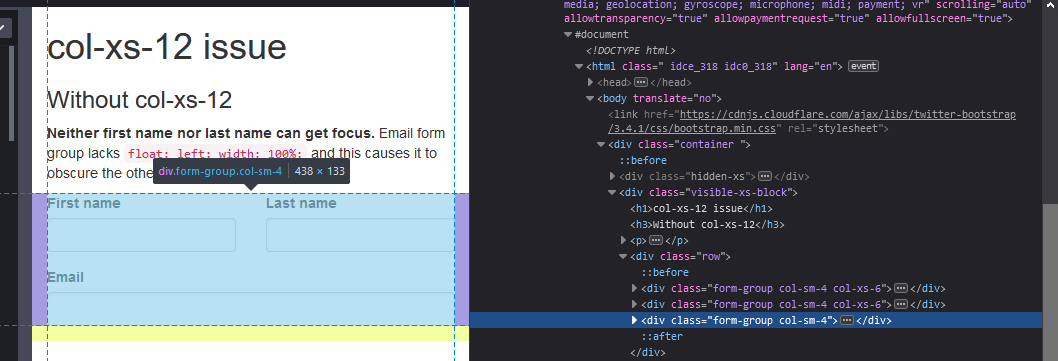
I previously thought that it may be a good idea to add col-xs-12 so default padding would be applied to element. But if you take a closer look at bootstrap's css, you would notice padding is defined somewhere else

.col-xs-1, .col-sm-1, .col-md-1, .col-lg-1, .col-xs-2, .col-sm-2, .col-md-2, .col-lg-2, .col-xs-3, .col-sm-3, .col-md-3, .col-lg-3, .col-xs-4, .col-sm-4, .col-md-4, .col-lg-4, .col-xs-5, .col-sm-5, .col-md-5, .col-lg-5, .col-xs-6, .col-sm-6, .col-md-6, .col-lg-6, .col-xs-7, .col-sm-7, .col-md-7, .col-lg-7, .col-xs-8, .col-sm-8, .col-md-8, .col-lg-8, .col-xs-9, .col-sm-9, .col-md-9, .col-lg-9, .col-xs-10, .col-sm-10, .col-md-10, .col-lg-10, .col-xs-11, .col-sm-11, .col-md-11, .col-lg-11, .col-xs-12, .col-sm-12, .col-md-12, .col-lg-12 {
    position: relative;
    min-height: 1px;
    padding-left: 15px;
    padding-right: 15px;
}

So padding is automatically applied to all elements that have at least one col-*-* class no matter of current @media screen size applied.

To answer your question: Yes, col-xs-12 (and other col-*-12 as well) is optional and you don't have to use it as long as you have at least one col-*-* class applied to element.

Buksy
  • 11,571
  • 9
  • 62
  • 69
  • I know it's been a while, but today I came the sad realization that `col-xs-12` (and probably other `col-*-12` as well.) aren't really optional as I also thought. See my [answer below](https://stackoverflow.com/a/62602234/88709). Now back to adding missing col-xs-12's… – Daniel Liuzzi Jun 26 '20 at 20:20
  • indeed padding is fine as long as you have at least one other `col-*-*` rule in place. Keep in mind that in case you would like to have a row breaking behaviour on certain devices ((e.g. `col-xs-6`, `col-xs-6`, `col-xs-12`; so that the last element breaks to the next row) this won't work because of the missing `width:100%`. With a custom rule applied to the desired element you could easily fix that. The question is now if that is better that having an explicit `col-xs-12` on the element. Probably I prefer to keep it in such a case. – wprogLK Oct 08 '21 at 08:21
0

TL;DR: although optional, you might need col-xs-12 anyway

enter image description here

At least in Bootstrap 3.4.1, omitting it will cause issues in smaller screen sizes. Elements that don't have col-xs-12 won't have its corresponding float: left; width: 100%; styles either. This will cause them to grow taller, obscuring elements above, and preventing them to gain focus.

I put together this pen to show the problem in action.

Related

Daniel Liuzzi
  • 16,807
  • 8
  • 52
  • 57