I have a screen-test application that is supposed to show to people how one single hardware pixel looks like on their screen and compare it to a logical pixel.
The idea is to let people experience how screens with different pixel ratios map the hardware pixels to logical pixels.
document.getElementById('devicePixelRatio').innerText = window.devicePixelRatio;
document.getElementById('screen.width').innerText = window.screen.width;
document.getElementById('screen.height').innerText = window.screen.height;
#logical-pixel {
width:1px;
height:1px;
left:15px;
top: 15px;
position: relative;
background:black;
overflow:hidden;
}
#hardware-pixel {
width:1px;
height:1px;
left:15px;
top: 15px;
position: relative;
background:black;
overflow:hidden;
}
@media (-webkit-min-device-pixel-ratio: 2) {
#hardware-pixel {
width:0.5px;
height:0.5px;
}
}
@media (-webkit-min-device-pixel-ratio: 1.5) {
#hardware-pixel {
width:0.6666px;
height:0.6666px;
}
}
@media (-webkit-min-device-pixel-ratio: 3) {
#hardware-pixel {
width:0.3333px;
height:0.3333px;
}
}
.pixel-wrapper {
border-radius: 50%;
border: 1px solid red;
width: 30px;
height: 30px;
}<meta name="viewport" width="device-width" content="target-densitydpi=device-dpi" />
<div class="pixel-wrapper">
<div id="logical-pixel"></div>
</div>
<div class="pixel-wrapper">
<div id="hardware-pixel"></div>
</div>
<dl>
<dt>devicePixelRatio</dt>
<dd id="devicePixelRatio">...</dd>
<dt>screen.width</dt>
<dd id="screen.width">...</dd>
<dt>screen.height</dt>
<dd id="screen.height">...</dd>
</dl>But as you can see that code has two problems:
- It's ugly with all the media queries. They can actually be more ratios: http://bjango.com/articles/min-device-pixel-ratio/
- The size of the hardware pixel and logical pixel seem to be the same! If you zoom-in really crazy, the difference will show up but still! Is the browser rounding up those pixel values somehow?! Below is the output of the above code on a screen with pixel ratio of 2.
At 100% zoom the hardware pixel looks the same size as the logical pixel:
At 15% the hardware pixel mysteriously disappears:
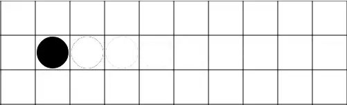
And at 200% you can notice the difference between the hardware pixel and the logical pixel:

And here is a 500% zoom for reference:
How can I show something exactly one hardware pixel in such screen without much Javascript code or writing one CSS rule for every possible device pixel ratio or converting my whole page using <meta name="viewport" width="device-width" content="target-densitydpi=device-dpi" /> (ref)?