106

I've been trying to implement the new srcset approach to responsive images, using the following HTML

        <img class="swapImages"
        srcset="assets/images/content/large.jpg 1200w,
                assets/images/content/medium.jpg 800w,
                assets/images/content/small.jpg 400w"
        sizes="100vw"
        src="assets/images/content/small.jpg"
        alt="responsive image">

Im using chrome 40 and all I get is the largest image, resizing my browser, clearing the cache does nothing.

I read somewhere I had to polyfill, so I used the picturefill plugin, although chrome should support it.....still doesn't work.

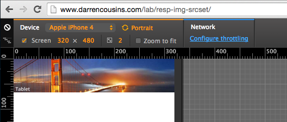
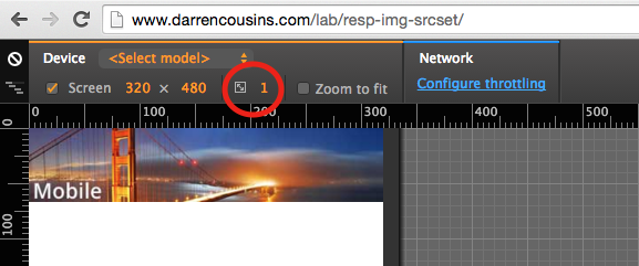
I put together a demo page for it: http://www.darrencousins.com/lab/resp-img-srcset/

What am I doing wrong/not getting?

Any help is massively appreciated.

sygad1
  • 1,392
  • 3
  • 12
  • 19

10 Answers10

132

You have it correct.

The thing is, that once your browser has the higher resolution picture (loaded, in cache), there is no point for it to download lower quality one, even when you make your window smaller (the point of this is to save traffic).

So if you want to test this, just make your window smaller and THEN load the page (after clearing the cache / or use incognito mode). You will get the mobile or tablet version. Then by making the window bigger, you'll at some point see your browser switching to higher resolution picture.

Update 2022; Simply use Ctrl + Shift + R shortcut (for Mac: Cmd + Shift + R) after resize, instead of clearing cache, so that the browser will reload, and ignore cache for current tab till done (In other words, full-reload without losing entire cache).

Top-Master
  • 7,611
  • 5
  • 39
  • 71
TondaCZE
  • 2,590
  • 1
  • 19
  • 20
  • 38
    This isn't working for me, even though I'm clearing my cache! :/ – J86 Nov 02 '15 at 11:03
  • 2
    Try Incognito mode of the Chrome to be sure (if you were already testing with it, close all the windows / tabs and start over). First make the window smaller, THEN load the page, the order is vital. It should work, maybe try to provide information about your browser. – TondaCZE Nov 02 '15 at 15:06
  • Caching might be something to look out for but it certainly isn't the issue at hand. The OP's code still loads the 800w image on mobile browsers < 800px and incognito screens at 320px – Ben Racicot Nov 11 '15 at 19:24
  • 4
    I had issues with Chrome (48) and I have tried to change the pixels ratio and it worked, see my answer below: http://stackoverflow.com/a/34222310/4063626 does anyone know why this happens? – MeV Dec 11 '15 at 11:21
  • If you have a retina display or desktop 4k your browser will choose the higher image because of the resolution. It's not that easy with these srcsets, because the browser gets smart ;) – Tob Nov 29 '16 at 20:49
  • 7
    I found that a good way to get Chrome to retry, without using Incognito, is to make sure you have devtools open, right-click the refresh button, and choose "Empty Cache and Hard Reload". – Sam Rueby Jun 04 '18 at 11:30
  • 18
    to get this working in chrome, I had to resize the actual browser window, not use "responsive" mode slider – Nadia Dec 01 '18 at 23:38
  • 3
    @Nadia comment worked for me. I was using the toggle mobile mode to test when I disabled that and then manually resized the window the proper image was downloaded. Kind of defeats the purpose of that feature quite a bit! – Hunter Nelson Oct 03 '19 at 05:32
  • @Nadia, tried what you mentioned and it worked. So the observation is , if we keep the desktop window small, its loads the small image, if we resize the window to use large image, it will download the large. Now if we resize again to small size, its uses large image itself and compresses it and doesnt download small image again. Not sure what this feature intends to offer. – NANCY May 06 '20 at 14:14
  • @Nadia ... I can't believe this is still the case in 2020. Thanks for your comment – Dagmar Oct 05 '20 at 15:53
  • 1
    @Tobias, your comment was the key for me. I kept seeing the largest images getting selected on my iMac with Retina. Switching to my secondary (lower resolution) monitor (and refreshing/clearing cache) showed the expected results. Thanks! – TheRealMikeD Oct 15 '20 at 18:10
  • @Nadia good stuff, also happy with this comment remaining here after so many years! I assume, what's happening, is that the actual viewport of the browser is larger, and the "responsive mode" is just an emulation on top. It means that the browser will use the original window to get the right image. – tobi-or-not-tobi Nov 18 '20 at 09:21
  • I want to give a shout out to Sam's answer, which is to right-click the refresh button and choose "I found that a good way to get Chrome to retry, without using Incognito, is to make sure you have devtools open, right-click the refresh button, and choose "Empty Cache and Hard Reload". which is not the same as holding shift and refreshing. This worked for me, after resizing the window using the dev tools panel, and in addition to making the size twice as small as you'd think because my screen is retina. – jerclarke Mar 21 '22 at 23:47
78

When used in an img tag, the srcset attribute leaves the decisions up to the browser in terms of which image to load as mentioned by TondaCZE. If you want to force browsers to load images at specified viewports, you want to use the picture element.

<picture>
  <source srcset="large.jpg" media="(min-width: 1200px)" />
  <source srcset="medium.jpg" media="(min-width: 800px)" />
  <img src="small.jpg" />
</picture>
sandstrom
  • 14,554
  • 7
  • 65
  • 62
mike.pj
  • 1,026
  • 8
  • 6
  • 10
    You are correct. Only correction is the default image tag should have `` instead of ``. – WayBehind Feb 24 '16 at 17:34
  • 1
    Using `img`'s `sizes` attribute should be appropriate for forcing the browser to use a particular image at certain breakpoints. https://developer.mozilla.org/en-US/docs/Learn/HTML/Multimedia_and_embedding/Responsive_images – Sam Rueby Jun 04 '18 at 11:32
  • 10
    It's also worth noting that blindly suggesting to use `` isn't ideal because `` has different semantic meaning than ``. https://cloudfour.com/thinks/dont-use-picture-most-of-the-time/ – Sam Rueby Jun 04 '18 at 11:36
  • My image doesn't even load when I use this approach. Perhaps some more info on the difference between `` and `` tag is required? – JCutting8 Mar 21 '19 at 04:50
  • 2
    You are a savior. – sai Apr 29 '20 at 06:50
  • We used this method in our solution as well. It works as expected. – Neil Monroe Apr 05 '22 at 16:30
27

I have just noticed that your demo page (http://www.darrencousins.com/lab/resp-img-srcset/) was never displaying the mobile version (even when resizing the browser or using the DevTools - Device mode) on Google Chrome (version 48).

Changing the device pixel ratio to 1 seems to load the correct image.

enter image description here

enter image description here

I don't know why, I am wondering if the w descriptors take the device pixels ratio into consideration

MeV
  • 3,761
  • 11
  • 45
  • 78
  • 7
    The browser will multiply the value from the sizes attribute by the device's pixel ratio prior to choosing from the list of widths in the srcset attribute. – dsluis May 23 '18 at 18:48
  • "Changing the device pixel ratio to 1 seems to load the correct image" Game changer (Y) – Jono Aug 10 '20 at 13:54
  • 1
    This made my srcset start working (with 'disable cache while devtools open' enabled, and hitting f5-refresh to reload the page), in Chromium 94. The setting was slightly hidden, when in Mobile view the mobile toolbar where you set dimensions, orientation etc (the main page area, not the dev tools) has a triple-dot menu with 'Add device pixel ratio'. Hit that and you get the DPR dropdown where it showed a default of 2. I presume this correlates with several answers above. – Neek Nov 12 '21 at 15:28
15

We faced the same issue while working with srcsets for the first time in our project. After investing some time, one of our team members was finally able to crack the issue. The reason why your code doesn't work is because of the mismatch of the sizes in srcset and sizes attribute. You have to provide double the width in the srcset for the browser to be able to match it with the width in sizes. For example,

 <img
        srcSet="image1920w.png 1920w,image720w.png 720w"
        sizes="(min-width: 960px) 960px,
        360px"
        src="www.image1920w.com"
         alt="Sample"
     />

Here's a sample working code for you to try out.

Make sure you open it in incognito (since once the browser loads higher resolution image, it will not go back lower resolution image) and run the code first in browser size less than 1920px to see the smaller resolution image(sunset) and once you start increasing the browser size, you will be able to see the larger image (flower).

  • FWIW, yours is the first answer I've seen on the web that showed a camelCase for `srcSet` (rather than `srcset`) which in my case finally got it to work. Thanks! – vincent Aug 02 '21 at 18:40
  • 3
    Pretty sure thats not a thing as the actual specification says its all lower... – Rick Kukiela Aug 12 '21 at 19:37
  • It doesn't work in Google Chrome. Try to run you url and after resizing screen several times, you won't be able to see a picture with sunset – Andrey Molochko Nov 16 '21 at 13:35
  • 1
    this does work for me, but why on earth so? i haven't seen it documented anywhere that width needs to be double the pixel size. – Mattias Martens Feb 13 '23 at 06:02
  • This is likely due to the Device Pixel Ratio (DPR) setting for your browser. Chrome seems to default DPR to 2, which means if the pixel width of the display is 500, it can actually display 1000 pixels. – LarryJ Jun 19 '23 at 13:15
6

I guess you are testing on chrome browser, and the only reason its not working there is because its a chrome feature. See below stack overflow thread (it holds good for latest version of chrome v54 as well):

Google Chrome version 40 srcset attribute problems

Checked your page on IE8 and Firefoxv49 and things work like a charm!

The other thing I observed is that though chrome doesn't download other images, it resizes the one downloaded pretty well. So, in a way we are still in a much better condition had it only been this on page:

<img srcset="assets/images/content/large.jpg 1200w" alt="large image">

Community
  • 1
  • 1
Kaashan
  • 352
  • 3
  • 12
5

For anyone using Chrome DevTools sidebar, you can tell Chrome to disable the cache when DevTools is open. Changing your viewport and refreshing will then serve the correct responsive image if it's giving you the largest (cached) image all the time.

  1. Open DevTools (F12)
  2. Go to Settings
  3. Scroll down to Network
  4. Check Disable cache (while DevTools is open)
BadHorsie
  • 14,135
  • 30
  • 117
  • 191
4

Have you tried to change DPR to 1.0? You can find it in the top bar of Chrome DevTools in responsive mode (try 380px width). After changing DPR, right-click on the reload page icon, then select "Empty cache and hard reload" best to do that in incognito mode. The browser should preload a 400w image.

la_petite_kozel
  • 826
  • 5
  • 26
4

In my case, the problem was a space in the webp image name. I renamed the file to remove the space character, and it worked!

<picture>
    <source srcset="img/landing-small.webp" type="image/webp">
    <source srcset="img/landing - small.jpg" type="image/jpeg">
    <img src="img/landing - small.jpg" alt=""/>
</picture>
Nata
  • 986
  • 9
  • 4
  • This is an important thing that I haven't seen documented anywhere else that can definitely cause the image to not show up correctly. Make sure your filenames don't have spaces and save yourself the hours of work that I just spent trying to figure it out. – B1gJ4k3 Mar 20 '23 at 21:56
2

It's work based on device pixel ratio (DPR). For example, say we have a device that has a viewport width of 412 px and a DPR of 2.6. So the browser chooses an image close to 803 px (412 _ .75 _ 2.6).

If You want to choose the image based on the viewport only, try using media attribute like this:

<amp-img
  alt="grey cat"
  media="(max-width: 469px)"
  width="226"
  height="340"
  src="/static/inline-examples/images/cat-small.jpg">
</amp-img>
<amp-img
  alt="grey cat"
  media="(min-width: 470px) and (max-width: 669px)"
  width="450"
  height="340"
  src="/static/inline-examples/images/cat-medium.jpg">
</amp-img>
<amp-img
  alt="grey cat"
  media="(min-width: 670px)"
  width="650"
  height="340"
  src="/static/inline-examples/images/cat-large.jpg">
</amp-img>
icaksama
  • 712
  • 10
  • 15
  • Hello, @icaksama could you take a look at my question? https://stackoverflow.com/questions/75204977/intersectionobserver-to-create-a-lazy-load-images-with-data-srcset-and-imagekit – Sophie Jan 24 '23 at 11:57
-7

Open your development tool, then go to network tab and disable catch. That's all, nothing else.

Ryan M
  • 18,333
  • 31
  • 67
  • 74
satywan kumar
  • 207
  • 2
  • 3