0

I've almost finished a website, but encounter a huge issue with chrome on android. Stock browsers work fine, but chrome is messing with my text size. My h4 should be 24px, the paragraph 14px. Though, on chrome mobile the text is increased many steps.

I encountered giving a specified height for the results in the original text size (as in the first section where the id="fotostyle" has a height of like 500px).

Is there another way around this problem? Don't want to give ALL my sections on the website fixed heights ;).

Thanks for your ideas! :D

Menno

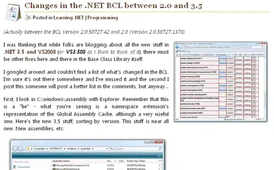
Image to show the wrong result << enter image description here

 <section class="box welcomeBox" id="fotoStyle"> 
                    <h4> Fotografiestijlen </h4>
                    <p class="contentBlockSubTitle"> Diverse fotografiestijlen kunnen gebruikt worden. De meeste ouders stellen portretfoto&#39;s op prijs, omdat ze deze meestal niet zelf kunnen maken. De foto&#39;s in creatieve stijl worden meestal zelf gemaakt. De keuze wordt dan ook altijd in overleg met de schoolleiding gemaakt.</p>
                    <div> ...............

<section class="box accordeonBox">
                    <h4> Afhandeling foto's </h4>
                    <p class="contentBlockSubTitle"> Wij bieden 4 mogelijkheden om een fotopakket te bestellen. Neem voor vragen graag contact met ons op.</p>

                    <div class="accordion"> .........


.box {
    background-color: white;
    padding: 50px;
    border-radius: 3px;
    box-sizing: border-box;
    -moz-box-sizing: border-box;
    box-shadow:  0px 2px 4px 0px rgba(0,0,0,0.27);
}

.welcomeBox {
    width: 100%;
    padding-top: 26px;
    margin-top: 36px;
}
Menno
  • 89
  • 1
  • 9

1 Answers1

1

Hmm interesting, looking at your html the only difference between the first (OK) and second (NO) section seems the id="fotoStyle" part. Might this effect the OK paragraph?

Try looking what happens if you add that ID to the second as well section and you might find the source of the smaller text.

Comment if you still havent found the problem!

Thomas Wagenaar
  • 6,489
  • 5
  • 30
  • 73
  • Hi Thomas, Thanks for your answer. The css consists of the following: `code #fotoStyle { position: relative; height: 540px; }` I discovered giving all the white boxes a specific height results in a normal text size. Though, I don't want to give all boxes a specified height! As said before, it only happens on chrome mobile :/ – Menno Feb 23 '15 at 11:11
  • Ik heb even gezocht en volgens mij kan het antwoord op deze ongeveer gelijke vraag jou oplossing wel bevatten: http://stackoverflow.com/questions/27074259/html-css-table-font-size-different-in-mobile-device – Thomas Wagenaar Feb 23 '15 at 12:06
  • Let's stick to english- so other people can see the answer too! :). When I searched for similar problems, I couldn't find anything, but you did! And the solution was there indeed! I just used the `code ` which worked perfect. Thanks for your help Thomas! – Menno Feb 23 '15 at 19:27