
I apologize in advance because of huge post, but everybody who ever tried to make some kind of universal app knows that this is pretty problematic stuff, so please be easy on me...
The goal
What I am trying to achieve (shown on image above) is to use @2x assets on both iPhone 5 and 6, and maintain same look of an app. And if possible, to do all that without manually calculating scale and position properties of nodes based on detected device... So in short, how to achieve that app automatically constrain proportions of, and between elements (and scene)? Also I would like to have same look of an app on iPhone 6+ using @3x assets, but because of simplicity I've concentrated only on iPhone 5 an 6.
What I have found on the web is that some people saying that this (downsampling) is done automatically by iOS, for example they suggest this:
"Make @2x assets at the size for iPhone 6, and then iOS will do downscaling automatically for iPhone 5".
But that's obviously not true when it comes to Spritekit scene, or I am missing something.
The problem
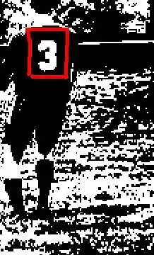
Even though iPhone 6 and iPhone 5 have same aspect ratio and same PPI, using the same asset won't look the same compared to the scene size (look menu sprite on 1st and 2nd image compared to the scene size) because PPI are related to pixel density, and iPhone 6 has more space (bigger diagonal, more inches) which means it has more pixels than iPhone 5. And this is where my problem comes from and I don't know what would be an efficient way to handle it.
What I have done so far
The second image is not a problem for GUI, but for a gameplay, in my case it is, because I want same look and feel on different devices. Just look first and third image.
Thanks to Skyler Lauren's suggestion I've managed to have same look of an app across all iPhone 5 devices either on 7.1 or 8.1 systems as well as on iPhone 6. So now, the problem is how to adapt this code to works with iPhone 6+ using @3x textures, as well as on iPhone 4s. Here is the solution for iPhone 5 and 6:
View controller.m
GameScene *scene = [GameScene sceneWithSize:CGSizeMake(375,677)];//fixed instead of view.bounds.size
 scene.scaleMode = SKSceneScaleModeAspectFill;
So the scene always has fixed size at iPhone 6 dimensions and view size is changing according to device. I am using assets catalog for launch images and not xib file. Images are sized at recommended size - 640x960px for 4s, 640x1136px for 5, 750x1334px for 6 and 1242x2208 for 6+ model. Assets are sized for iPhone 6 so for that model there is no scaling at all.
Related to 4s model, when I am using this method described above, there are two black bars from each side...
So far I've tested this only on simulator and iPhone 6 device (what I see looks like on first image either on device or simulator).
Question
For now as I said everything works on iPhone 4s(with two black bars because of different aspect ratios), 5, 6 using @2x assets, but how make everything to work with iPhone 6+ using @3x assets ? If I use 375x667 dimensions for the scene, then everything is positioned properly and has good proportions, but quality suffers (because of upscaling @2x)

