5

in R, with ecdf I can plot a empirical cumulative distribution function

plot(ecdf(mydata))

and with hist I can plot a histogram of my data

hist(mydata)

How I can plot the histogram and the ecdf in the same plot?

EDIT

I try make something like that

https://mathematica.stackexchange.com/questions/18723/how-do-i-overlay-a-histogram-with-a-plot-of-cdf

Community
  • 1
  • 1
JuanPablo
  • 23,792
  • 39
  • 118
  • 164
  • Definitely check out the question and answer I reference for why this kind of visual is not supported in ggplot2. That said, it is possible in base R. But will definitely take more than a one-liner. – vpipkt Mar 26 '15 at 21:42

6 Answers6

8

Also a bit late, here's another solution that extends @Christoph 's Solution with a second y-Axis.

par(mar = c(5,5,2,5))
set.seed(15)
dt <- rnorm(500, 50, 10)
h <- hist(
  dt,
  breaks = seq(0, 100, 1),
  xlim = c(0,100))

par(new = T)

ec <- ecdf(dt)
plot(x = h$mids, y=ec(h$mids)*max(h$counts), col = rgb(0,0,0,alpha=0), axes=F, xlab=NA, ylab=NA)
lines(x = h$mids, y=ec(h$mids)*max(h$counts), col ='red')
axis(4, at=seq(from = 0, to = max(h$counts), length.out = 11), labels=seq(0, 1, 0.1), col = 'red', col.axis = 'red')
mtext(side = 4, line = 3, 'Cumulative Density', col = 'red')
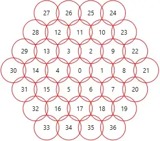
Histogram with CDF, two scales and two y-axes

The trick is the following: You don't add a line to your plot, but plot another plot on top, that's why we need par(new = T). Then you have to add the y-axis later on (otherwise it will be plotted over the y-axis on the left).

Credits go here (@tim_yates Answer) and there.

Community
  • 1
  • 1
symbolrush
  • 7,123
  • 1
  • 39
  • 67
4

There are two ways to go about this. One is to ignore the different scales and use relative frequency in your histogram. This results in a harder to read histogram. The second way is to alter the scale of one or the other element.

I suspect this question will soon become interesting to you, particularly @hadley 's answer.

ggplot2 single scale

Here is a solution in ggplot2. I am not sure you will be satisfied with the outcome though because the CDF and histograms (count or relative) are on quite different visual scales. Note this solution has the data in a dataframe called mydata with the desired variable in x.

library(ggplot2)
set.seed(27272)
mydata <- data.frame(x=  rexp(333, rate=4) + rnorm(333))

 ggplot(mydata, aes(x)) + 
     stat_ecdf(color="red") + 
     geom_bar(aes(y = (..count..)/sum(..count..))) 

ggplotecdfhist

base R multi scale

Here I will rescale the empirical CDF so that instead of a max value of 1, its maximum value is whatever bin has the highest relative frequency.

h  <- hist(mydata$x, freq=F)
ec <- ecdf(mydata$x)
lines(x = knots(ec), 
    y=(1:length(mydata$x))/length(mydata$x) * max(h$density), 
    col ='red')

baseRecdfhist

Community
  • 1
  • 1
vpipkt
  • 1,710
  • 14
  • 17
3

you can try a ggplot approach with a second axis

set.seed(15)
a <- rnorm(500, 50, 10)

# calculate ecdf with binsize 30
binsize=30
df <- tibble(x=seq(min(a), max(a), diff(range(a))/binsize)) %>% 
        bind_cols(Ecdf=with(.,ecdf(a)(x))) %>% 
        mutate(Ecdf_scaled=Ecdf*max(a))
# plot
ggplot() + 
  geom_histogram(aes(a), bins = binsize) +
  geom_line(data = df, aes(x=x, y=Ecdf_scaled), color=2, size = 2) + 
  scale_y_continuous(name = "Density",sec.axis = sec_axis(trans = ~./max(a), name = "Ecdf"))

enter image description here

Edit

Since the scaling was wrong I added a second solution, calculatin everything in advance:

binsize=30
a_range= floor(range(a)) +c(0,1)

b <- seq(a_range[1], a_range[2], round(diff(a_range)/binsize)) %>% floor() 


df_hist <- tibble(a) %>% 
  mutate(gr = cut(a,b, labels = floor(b[-1]), include.lowest = T, right = T)) %>% 
  count(gr) %>% 
  mutate(gr = as.character(gr) %>% as.numeric()) 

# calculate ecdf with binsize 30
df <- tibble(x=b) %>% 
  bind_cols(Ecdf=with(.,ecdf(a)(x))) %>% 
  mutate(Ecdf_scaled=Ecdf*max(df_hist$n))
  
ggplot(df_hist, aes(gr, n)) + 
   geom_col(width = 2, color = "white") + 
   geom_line(data = df, aes(x=x, y=Ecdf*max(df_hist$n)), color=2, size = 2) +
   scale_y_continuous(name = "Density",sec.axis = sec_axis(trans = ~./max(df_hist$n), name = "Ecdf"))

enter image description here

Roman
  • 17,008
  • 3
  • 36
  • 49
  • The normalization of the ECDF line is not correct (I also don't know how to do it better). It would be better to normalize in relation to the tallest histogram bar. – Yan Foto Nov 12 '20 at 15:05
  • thanks for the quick response and update. In the meantime I came up with an answer of my own, which you might want to verify its correctness (I'm no pro in R!). – Yan Foto Nov 14 '20 at 09:29
2

As already pointed out, this is problematic because the plots you want to merge have such different y-scales. You can try

set.seed(15)
mydata<-runif(50)
hist(mydata, freq=F)
lines(ecdf(mydata))

to get

enter image description here

MrFlick
  • 195,160
  • 17
  • 277
  • 295
2

Although a bit late... Another version which is working with preset bins:

set.seed(15)
dt <- rnorm(500, 50, 10)
h <- hist(
    dt,
    breaks = seq(0, 100, 1),
    xlim = c(0,100))
    ec <- ecdf(dt)
    lines(x = h$mids, y=ec(h$mids)*max(h$counts), col ='red')
    lines(x = c(0,100), y=c(1,1)*max(h$counts), col ='red', lty = 3) # indicates 100%
    lines(x = c(which.min(abs(ec(h$mids) - 0.9)), which.min(abs(ec(h$mids) - 0.9))), # indicates where 90% is reached
          y = c(0, max(h$counts)), col ='black', lty = 3)

enter image description here

(Only the second y-axis is not working yet...)

Christoph
  • 6,841
  • 4
  • 37
  • 89
0

In addition to previous answers, I wanted to have ggplot do the tedious calculation (in contrast to @Roman's solution, which was kindly enough updated upon my request), i.e., calculate and draw the histogram and calculate and overlay the ECDF. I came up with the following (pseudo code):

# 1. Prepare the plot
plot <- ggplot() + geom_hist(...)

# 2. Get the max value of Y axis as calculated in the previous step
maxPlotY <- max(ggplot_build(plot)$data[[1]]$y)

# 3. Overlay scaled ECDF and add secondary axis
plot +
  stat_ecdf(aes(y=..y..*maxPlotY)) +
  scale_y_continuous(name = "Density", sec.axis = sec_axis(trans = ~./maxPlotY, name = "ECDF"))

This way you don't need to calculate everything beforehand and feed the results to ggpplot. Just lay back and let it do everything for you!

Yan Foto
  • 10,850
  • 6
  • 57
  • 88