I've made regression model with 4 variables. And I have gotten the following regression equation
$$ Y= 0.0761 - 0687X_1 - 3.46X_2 - 1.937 X_3$$
I calculated Confidence intervals for these four beta values by using Bonferroni methods. I got these beta values;
$-0.123461 \le \beta_0 \le 0.27596$
$-3.18842 \le \beta_1 \le 1.81442$
$-8.96 \le \beta_2 \le 2.04036$
$-3.435 \le \beta_3 \le -0.4389$
And then,I calculated Confidence intervals for these four beta values by using Scheffé methods. I got these beta values;
$-0.1685 \le \beta_0 \le 0.3207$
$-3.75314 \le \beta_1 \le 2.379$
$-10.20212 \beta_2 \le 3.28212$
$-3.773 \le \beta_3 \le -0.100704$
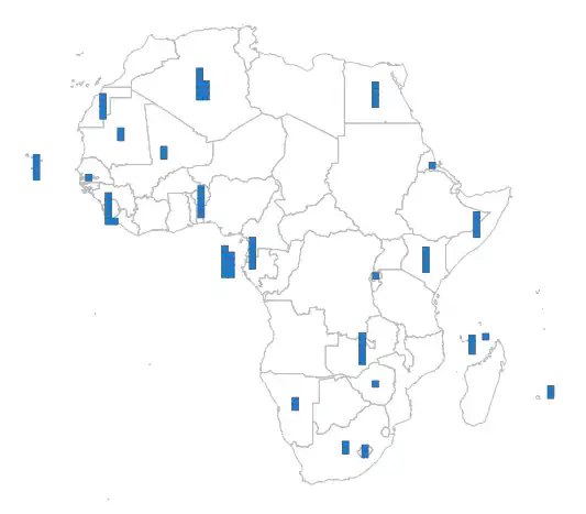
Now, I want to plot graphs for these beta values like that

but i cannot draw such a graph for each beta value. Please show me a way for this by using minitab or by hand.
Note that I dont know how to use R. I only know minitab and e-view
