2

There are already many questions about hyphenating words, but I couldn't find a question about hyphenate only when one word that is by it's own too long for one whole sentence.

example:

I like this to be intact (not trying to put the word "verlichtingssysteem" in the upper line with hyphenates)

enter image description here

So I don't want this:

enter image description here

But I want to have a word that doesn't fit the whole line/div/page is hyphenated. Otherwise I can't see the text in full as you can see below. (it cuts off the last 3 characters)
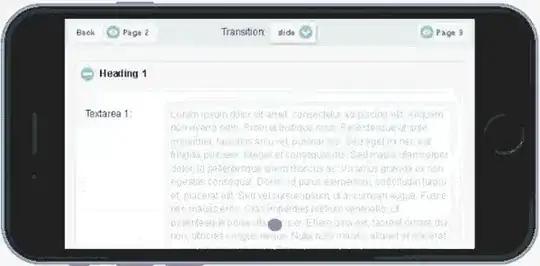
enter image description here

All the solutions I have seen before on other questions does hyphenate on both last 2 examples instead of only the last example.

So it needs only to hyphenate when a word by it's own width doesn't fit the whole div/page, so when you have two words it just needs to place the word on the next line instead of hyphenating.

I only have this word fall off screen problem on mobile. But an (soft) hyphenate messes up on other devices that have a bigger width as you can see on picture 2. So I only need it for one word that by it's own to big on one line.

I don't think I am the only one who has this desire?

2 Answers2

2

you can use ­

It only breaks a word when it would overlap the content width.

use it like this­text­is­getting­long = this­text­is­getting­long

see this fiddle: http://jsfiddle.net/2r70mhnw/1/

you probably have to set the width of the container to 100%, that's all!

http://en.wikipedia.org/wiki/Soft_hyphen

In computing and typesetting, a soft hyphen (ISO 8859: 0xAD, Unicode U+00AD soft hyphen, HTML: ­ ­) or syllable hyphen (EBCDIC: 0xCA), abbreviated SHY, is a code point reserved in some coded character sets for the purpose of breaking words across lines by inserting visible hyphens.

Doml The-Bread
  • 1,761
  • 1
  • 11
  • 17
  • I have edited my question for clarification. If I do ­ in "verlichtingssysteem" like "Verlichtings­systeem and I have a window that gives more width. You get the same problem as the second picture. He tries to cut the long word with the soft hyphen to fit it on the first sentence while I want the browser only doing it when one word that is to long on the whole width is hyphenated. – Martijn Hoogers Mar 30 '15 at 12:17
  • added a fiddle. you probably have to set a width of 100% to the container – Doml The-Bread Mar 30 '15 at 12:20
  • But the width has the same length as the container. I only have this word fall off screen problem on mobile. But an (soft) hyphenate messes up on other devices that has a width size that is enough to have the word in full. Because then I have the problem like the second picture. – Martijn Hoogers Mar 30 '15 at 12:25
  • well another option would be to use a `
    ` tag which has `display: none` in `@media all and (min-width: 420px)` (or whatever size your mobile query has). and `content: "-"` in your mobile query.
    – Doml The-Bread Mar 30 '15 at 12:33
1

In some cases using

/* using those two for compatibility reasons with old browsers */
overflow-wrap: break-word;
word-wrap: break-word;

could be a valid solution. Beside its probably not a good solution for text content, I found it really useful to use e.g. in navigations or titles.

It breaks only single words if this particular word does not fit into the line. While it does not add "-" and does no real hyphenation, though.

Tobias Gaertner
  • 1,155
  • 12
  • 30